Students vs hamburgers from hell — An information architecture case study
How we improved the UX for Student Body Council in Iceland by working on the Information Architecture of their website — remote workshops & unmoderated usability testing! (+ Card Sorting Freebie 🤓)


Stúdentaráð Háskóla Íslands (SHÍ) is the Student Body Council at the University of Iceland. SHÍ has approached us at Breyta, with a request to redesign their website — student.is.
The organization was founded in 1920. and they wanted to celebrate the 100th anniversary with a fresh & new website look!
The initial demand was a website redesign with a focus on the User Interface. We could tackle some low-hanging fruit related to website usability, but without adding additional functionalities.
The Client
The main goal of the Student Body Council is to fight for the interests of students, inform them of the latest news and events, but also to organize fun events such as October festivals. They also have the possibility to assist students who believe that their rights have been violated. Their website would serve as the main touchpoint in communication with students.
Target Audience
The primary visitors of this website would be the actual students of the University of Iceland. The following would be the University staff, future students who would like to sign up, or foreign students willing to participate in an exchange program.

Some of the students’ interests:
- Student housing
- Access to the buildings, libraries, and study halls
- Student safety
- Student mental health
- Student loans
- Student rights in general
- Student social life
- International students
- Newspaper
- Student cafeteria
- Student bar and events
Project team
- Ari Tómasson, Project Manager at Breyta
- Benedikt Hauksson, Consultant at Aton.JL
- Aleksandra Lazovic, Designer at Breyta
Information Architecture Audit
After conducting a UX audit, I drew up an overview of the Information Architecture of the current website. A couple of issues were discovered, which we wanted to discuss with the client and propose options for improvements.
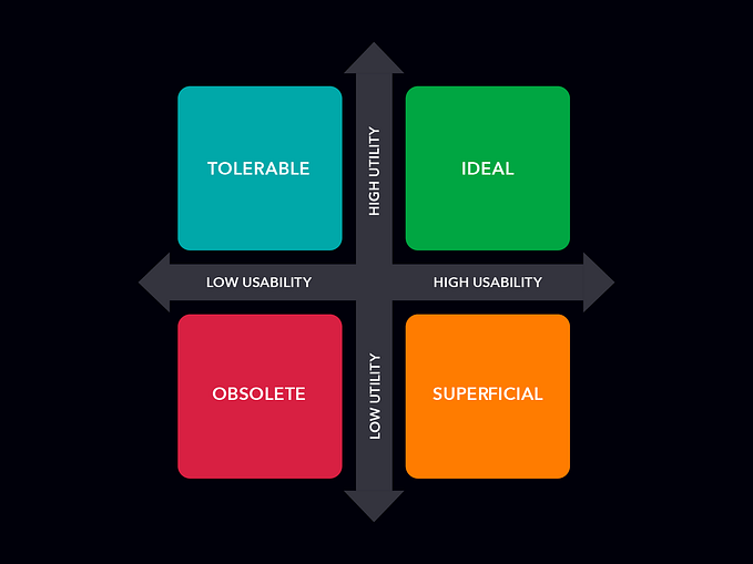
The goal of a good Information Architecture is to help people understand their surroundings and find everything they need without big effort. — IAI
1. The Navigation Hiding Behind the Hamburger Icon

Where did the hamburger menu come from?
- Hell.
The above quote is from a really funny article that I stumbled upon while investigating the hamburger menus. Please, read it, it will make your day. But now seriously, experts from Nielsen Norman Group are talking about how hidden navigation under hamburger menus has a negative impact on the UX metrics.
The navigation shouldn’t be hidden, especially on desktop, where we have plenty of space to display it.
2. Too Many Items in the Top Level of the Global Navigation
On one hand, there are opinions that a website should have 5 to 9 items in the navigation in order not to overwhelm the users. On the other hand, this article from Nielsen Norman Group battles this opinion by saying that we can place more navigation items if the categories are clearly named, and are mutually exclusive.
The image below shows the current sitemap of the Student Body Council website. With 13 items placed at the top level of navigation, it is hard to believe that all of them have the same hierarchy and that the content is properly placed in logical clusters. This is what I wanted to test out.

3. Confusing Content Organization
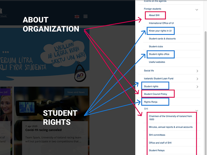
This is how the navigation looks like when opened from the hamburger icon. When a student wants to read something about the Student Body Council, the content is placed in 2 categories — in Foreign Students and in SHÍ. If the students want to learn about their rights, they will have to think whether what they are looking for is in Foreign Students, Students Rights, or in Rights-Ronja (for students with disabilities).
Even though this way of organizing content is maybe adequate for the current students because their mental model adapted to this structure, there is definitely a place for improvements.
We’ve decided to challenge the Status Quo and see if we can organize the content in a more efficient way.
The Remote Card Sorting Workshop
In order to achieve a new website structure that is ready for testing, we’ve decided to do an open card sorting exercise directly with the users at the University of Iceland. Luckily, our clients are the actual students of the University, so we could gather them all up and do the magic.
Preparation
In order to do an open card sorting exercise, I’ve collected all the pages that are currently listed on the website and placed them on cards that were ready for printing and cutting. There were also blank cards for adding new content pages or duplicating existing ones, as well as cards in a different color for naming categories.
Next to that, I’ve created a document that contained detailed instructions on how to organize the exercise, which behaviors to follow during the exercise, and how to do a debriefing after the work is done.


Since Breyta’s office is in Belgrade (Serbia), we had to get help from our amazing colleague in Reykjavik — Benedikt Hauksson. As an experienced Strategist, he knew exactly how to work with the students and conduct the workshop with positive results. Just look at those pictures! 😍


⚡ Bonus freebie ⚡ If you’d like to conduct your own Card Sorting exercise, I’ve based my detailed guide on the book Methods of UX Design and on lots of other UX case studies. You can read and download the document here. 🤓

The Workshop Results
During the exercise, Benedikt separated all the students to do the task individually. In the end, they had a discussion in order to come to a common result.
The image below shows how the students organized the website content. The pink post-its are the categories, the yellow ones are the pages with content, and the orange arrows are external links. Now we have all the content segmented into 8 main categories.

In consultation with our Project Manager, Ari Tómasson, we’ve continued working on this structure to make it even better. We’ve moved some content into “Maybe Laters”, proposed an idea of how the Homepage would be structured, and reorganized the categories in a different way.

The idea behind the new categorization was that all the services and help that the Student Council provides could be put into one category — “I need help with…”. This name was inspired by the name of a category in their original work (previous image).
This way we could separate the content into 4 main categories:
- About the Council
- News
- I need help with…
- Contact page

The Following Steps
We did all this work, but we can’t know for sure if what we did is an actual improvement. That is why we’ve organized an unmoderated user testing with students at the University of Iceland.
Did we succeed? What did we learn? 👉 Read PART 2! 🤓