Successful iconography, as told by Etsy
No joke, I go on Etsy every single day. I browse Instagram as much as any other person, but when that becomes tiresome, I open up Etsy to casually scroll. I think what makes me come back to it repeatedly, without being triggered by a notification or alert, is that there’s a mix of finding what I’m looking for and being surprised and delighted with things I wasn’t expecting.
Nir Eyal talks about the importance of the surprise and delight model (as related to Pinterest) in his book Hooked. When users get something extra out of an experience that they weren’t expecting, they come back for more.
That’s how I feel about Etsy. I may start by casually browsing for handmade ceramic mugs, and suddenly find myself in an awesome vintage sweatshirt shop. It’s always fun, and the experience feels seamless.
But the point of this post isn’t to delve into Eyal’s model for stellar product design, or the fun of shopping for homemade trinkets when you’re bored, this post is about iconography.
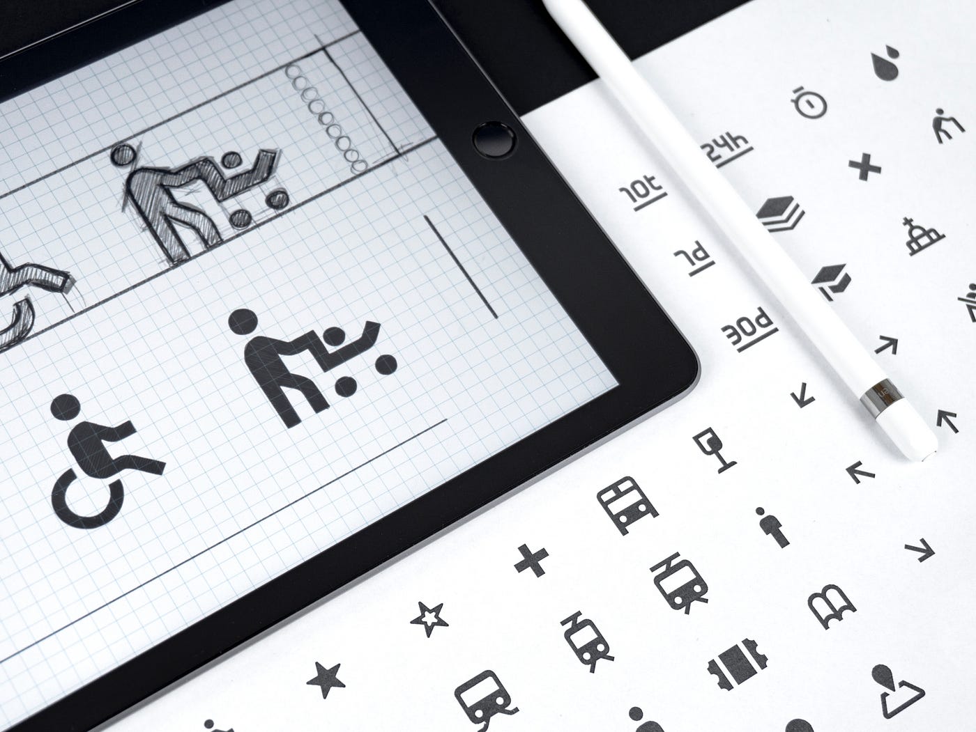
Icons have been around forever. According to some sources, Saint Luke the Evangelist created an icon of the Virgin Mary and popped it on a panel for people to carry around with them. Cavemen and Egyptians used them too. Icons were an easy way to communicate with those around them and created a shared written language for people to use.
Nowadays, icons are arguably more important than ever as we continue to push the boundaries in digital design. We’re trending toward minimalist designs that feature extreme amounts of whitespace, as well as usable products that sit on tiny screens like Apple Watches. We don’t have space for tons of text, so instead we rely on icons to convey what we want users to do, how to do it, and when.

So what does Esty do well with their icons?
- They include text labels. A heart can mean so many things…like, favorite, love, etc. Etsy makes it clear that hearts mean favorites on their site, so the user doesn’t have to piece that together through trial and error.
- They alter the state depending on where the user is in the flow. On iOS, the icon becomes a solid shape when the user has pressed it. When you’re on the home screen, the home icon is black, and when you’re on your profile, the profile icon is black. This gives the user tactile feedback that they’ve made a decision and completed a task. It helps reinforce the behavior associated with using that icon.
- Their icons are simple. No crazy details, intense drop shadows, wild colors, or extravagant animations. The focus is on assisting the user in completing the task, not distracting them with fluff that doesn’t help them.
- They play off conventional shapes. The cart icon looks like a grocery cart, the profile icon like a head and body, and the home like a little house. These are not only reflecting real-life items, but more importantly the icons users see in other apps and sites they visit daily. This takes the burden off of the user in learning a new design system, and helps them upskill quickly.
So what does that mean for the rest of us?
- Include text labels. Your interface may not look as sleek and clean as it could, but it will be way easier for the user to engage with. Eventually, you can pull an Instagram and phase out text once users are fully accustomed to how things work.
- Keep it simple. Some people are saying that skeumorphism is back, and I don’t really know if I agree with that. I think a very muted version of skeumorphism is back…more like skeuflat or flatmorphism if anything. Over complicating icons with hyper-realistic shading, color schemes, and highlights just makes them harder to see clearly (particularly from an accessibility POV).
- Reduce, reuse, recycle. Icons aren’t the time to get wild and crazy with brand new things no one has ever seen before. Most of the time, it’s best to use symbols that users see elsewhere and feel comfortable with.