Supercharging the audio experience of the most trusted newspaper in America— a UX case study
The Economist, a London-based global newspaper, is among the most respected news sources in the world

Don’t take it from me, on a recent poll by the Reynolds Journalism Institute, The Economist was named “The most trustworthy news source by Americans from across the political spectrum.” [Sources at the end]

The Economist’s audio version is a blessing for readers on the go 🎧
For me, their best feature is the audiobook-like edition.
Included with every issue, I can listen to any article read word-by-word by professional voice actors. It’s an absolute pleasure to listen to.

With a 4.8 ⭐️ on the App Store, the Economist is among the best-rated news apps — Why a redesign?
I’ve been a huge fan for years, but using the app almost daily I think it’s clear that it was designed for readers, with audio added later as a bit of an afterthought.
The result is an app that, for listeners, can be awkward to use and lacks some of the features one would expect.
My goal: to improve the usability and functionality for listeners without compromising the experience for readers of the app.


Validating assumptions & finding new insights
After seeing the excellent App Store ratings, I began to doubt my assumptions:
- People seem to like it… Is there a need for a redesign?
- Would users care?
- Is it in the best interest of the business?
- What business metrics are we trying to impact through a redesign?
First: What business metrics are important for a redesign?
It’s important to remember that the job of the designer is to create experiences that further the strategy of the business.
1. “25 to 30% of users download the audio edition”
✅ Insight: This is a substantial number of users. Even small improvements will have a wide-reaching impact.
2. The audio edition is “a very valuable retention tool” said Tom Standage, Head of Digital Strategy at The Economist. He continued: “The main reason people cancel their subscription is that they do not have time to read it and the magazines pile up. Audio is a very, very good way for people to read our content without having to read it.”
✅ Insight: Audio is clearly a valuable feature worth investing in. It helps to retain existing subscribers and attract new subscribers.
3. The Economist subscriber base is ~70% male and of an older demographic.
⚠️ Insight: The Economist is open about wanting to attract a younger, more diverse audience. A better digital experience will be essential for digital natives who have higher expectations of digital products they choose to use.
Second: Understanding user needs through interviews.
I recruited 4 listeners who use the app regularly. (Note: I understand this is a small number, but it was all I could get access to on this short project.)
1. “I love the Economist because it makes me feel informed and connected with the world.” a user said to me. It’s hard to explain, but I could feel how passionate users were for the insights the publication provides.
⚠️ Insight: Content is King 👑. This might seem obvious but it’s especially true here. Users come to get informed not to be entertained. Any functionality needs to enhance and never, ever, get in the way of experiencing the content.
2. Listers listen and readers read. Users have a preferred way of consuming the content and rarely switch.
💡Insight: This insight was key as it later opened the door to create separate, fully-featured experiences for readers and listeners.
3. The functionality of the audio section is limited and cumbersome. Older users were happy to put up with the buggy, unintuitive experience to enjoy the content. Younger users not so much. One user stopped using the app (on Android) because of constant bugs and poor UX 😨
⚠️ Insight: There is a lot to unpack here. Some subscribers don’t care about the app as long as they can access the content. That said, digital natives expect an excellent user experience from the apps they use every day and might leave if their expectations are not met.
❓An interesting hypothesis: Does a subpar experience lead (some) new users to abandon the app before they have time to fall in love with the content? — this is hard to validate without a careful look at user data but I would bet that this is happening at least to some extent.

I observed 2 distinct ways users listen, I call them swimmers and divers:
- Divers: I called them divers because once they start listening, they “dive in” and rarely come back up to the home page. They use the ‘Play all’ button to listen to one article after the other. If an article doesn’t interest them, they use the skip button form inside the player to move on to the next.
- Swimmers: Swimmers, on the other hand, stay near the surface (the home page.) They pick and choose the articles they listen to by reading the titles on the homepage.
💡Insight: Identifying these two types of users opened the door to provide a better experience for both.
Insight based user personas
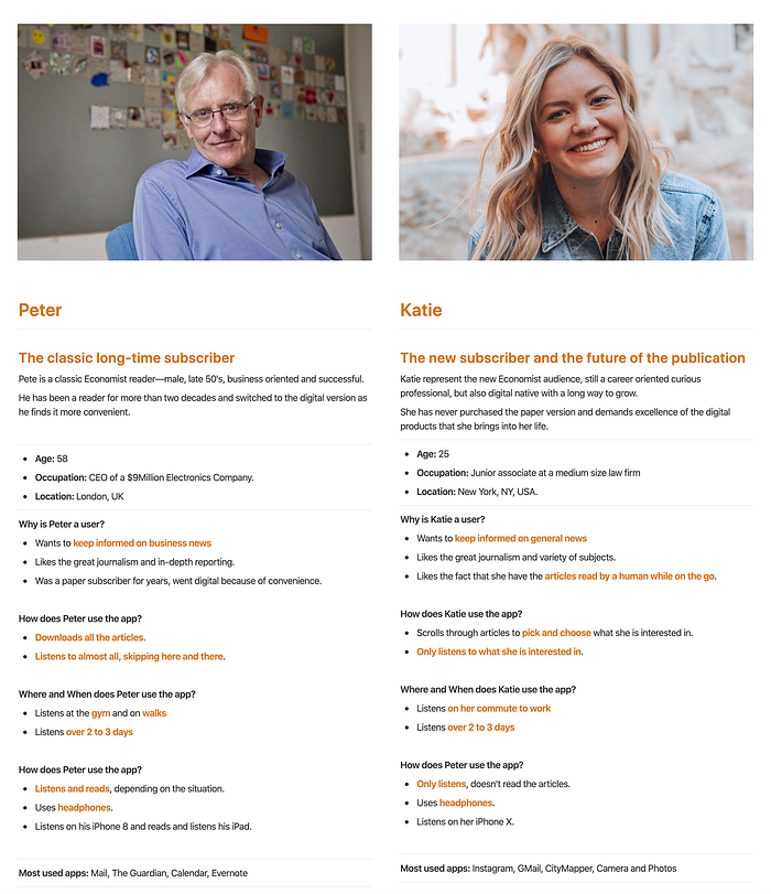
Long-Time Subscriber
Male, on his late 50’s with a successful career. He represents the bulk of Economist subscribers and must be respected.
The New Subscriber
Female, late 20’s and career-oriented. She represents the future of the publication. She expects a great digital experience, especially when investing £215 a year on a subscription.
🧠Why these personas? through the interviews, it became clear that there are not only generational divide between subscribers but also different ways of listening. Personas proved an excellent tool to condense research insights into prototypical users.

Ideas flow better on paper
I used pen and paper throughout the project to note down and explore ideas before bringing them into Sketch.


Remote and in-person user tests using high fidelity prototypes
Throughout the project, I conducted remote user tests with 3 Economist subscribers as well as in-person guerrilla usability tests with people that had never used the app before. The results helped me progressively refine the design.


Solution 1 • Creating a tailored experience for both listeners and readers
Problem 🤔
Listeners enjoy limited, sometimes cumbersome functionality due to a design focus on readers.
With text and audio living under the same screen, a lot of the audio functionality has been stripped out to make the UI more usable.
Supporting insights 💡
- As we discovered during research, 20 to 30% of subscribers are listeners and audio is a very valuable retention tool. It makes sense to invest in a better experience for listeners.
- All users interviewed rarely switched between reading and listening.
Ideation, testing, refinement ♻️
After exploring different buttons and being unhappy with the result, the idea of a toggle came to mind.
⚠️ 2 users had trouble finding the toggle during an initial iteration. This was later fixed using the primary colour which made it stood up.
Exploring a variety of solutions:

Narrowing it down to 2 finalist designs:

Sometimes the best option it’s not the one that performs best…
⚠️ During several guerrilla usability tests, the bigger toggle with text performed best. This was to be expected because of it’s bigger size and text next to the icon.
However, un the end, the smaller toggle proved a better option:
Solution


Results 📏
⚠️ When asked to listen to an article while on “text mode”, 2 out of 3 users had trouble noticing the toggle. Note: this was to be expected as it changes the functionality they were used to.
✅ Making it solid red made it easier to find.
✅ After using the toggle, all 2users stated a very strong preference towards the new design while 1 user expressed a slight preference.
✅ Remember that switching between text and audio is a secondary action (it won’t be used very often.) The smaller top right design made room for more relevant information while still keeping it accessible.
Solution 2 • Making listening 2x faster
Problem 🤔
Listening to specific articles in unnecessarily cumbersome.
- Currently, the only way to listen to a specific article is from inside the text version.
- With ~75 articles per issue, this can quickly become — as one user put it — a “pain in the butt”.
Flow on the current app:

Solution ⭐️


Solution 3 • Allowing users to queue interesting articles
Problem 🤔
Each new issue has 4+ hours of listening time (~75 articles) on a variety of topics. Some users want to listen to a handful of articles but there is no good way to do that.
With the current design, to play non-consecutive articles, users must:
- Wait for the current article to finish.
- Pick up the device and open the app (remember they are listening — usually on the go — so this is very inconvenient.)
- Find the next article they want to listen.
- Play article.
- Repeat 🔁
Supporting insights 💡
Remember the two types of listeners? Divers and swimmers.
Divers don't have this problem, they tap the ‘Play all’ button listen to one article after another from inside the player.
It’s a big problem for swimmers. Swimmers listen to selected articles (anywhere from 2 to several dozen articles per issue.) Repeating the process outlined above every time they want to listen to a new article is a real pain point.
Solution ⭐️


Results 📏
- Results here depended on the user’s reading styles. For those who listen to most every article, it wasn’t a useful feature. For those who listen to only some, it as a welcomed feature.
Solution 4 • Making articles easier to scan
Problem 🤔
On the home screen, article descriptions are short and sometimes cryptic. It can leave users wondering what it’s about.
- With ~75 articles per issue, many users don’t read every article.
Supporting insights 💡
- Some users, especially swimmers, would benefit from more information about the content to help them decide if they want to read it or not.
- This is in line with what other big publications like the NYT and FT do.
Ideation, testing, refinement ♻️

After running user tests, the compact view with a description received very positive feedback. In order to keep the UX simple, this will become the main and only view.

Solution ⭐️


Note: Editors at The Economist wouldn’t need to take on extra work as short descriptions are already present on the website and could easily be included on mobile APIs.
Results 📏
✅ 3 out of 3 users had a strong preference for the version with the short summary when compared to the current version. The 4th one said he had no preference.
Solution 5 • Bring graphic content to listeners for the first time
Problem 🤔
Every edition of the Economist is full of insightful illustrations, graphs and maps that support their reporting. These are accessible on the text edition ONLY.

Supporting user insights 💡
⚠️ 1 listener didn’t even know that the graphic content existed.
⚠️ 3 out of 4 users said they never look at the graphic content as it’s too inconvenient. 1 user said only when reading.
✅ 4 out of 4 users would like to have easy access to graphic content while listening.
Solution ⭐️


Results 📏
✅ 4 out of 4 users said they prefer the new player.
✅ 4 out of 4 users said they would interact with the graphic content regularly.
Solution 6 • Proposal for all new functionality
Problem 🤔
- There is a wealth of insights on every issue but it’s hard to save and revisit later.
- Bookmarking articles helps, but with articles being several thousand words long, how can users save exactly what they were looking for?
A proposed solution ⭐️
On top of bookmarking whole articles, what if you could highlight your favourite parts for future reference?
Since the audio edition follows word-by-word the text edition, a highlight functionality could be introduced that translates directly to the text editor.


🔧 Technical note: I’ve shown my designs to some front & back end devs who say that although not easy, it should be doable 🎉
Results 📏
✅ 3/4 users showed interest in the functionality and said they would use it regularly, especially if they could share highlights with friends and colleges.
⚠️ Take result with a pinch of salt as I didn’t design a complete flow for managing highlights. It looks promising but I felt it fell outside of the goals of this case study.
7 • Other changes
More changes made to try to improve the UI, these include:
- Small changes in layout, spacing and architecture to fit the new UI. All conforming to an 8px grid.
- A whole new player.
- Moving previous editions to the navbar.
- Improved issue section divider.

The Economist team has been at work improving the app over the last few years.
If anything I wish this unsanctioned design proposal serves as a small push to keep on improving and pair quality content with a digital product that gives subscribers more reasons to subscribe, renew and recommend.