Surface delight won’t help you build better products
“ Pleasant things work better. If you put plank on the ground — I can walk on it. It’s functional. But if you put it 300 feet in the air I’m not going near it.
Fear paralyzes you. It changes the way you think.” — Don Norman

Delight has been a big buzzword in the last few years. It’s a scientific fact that users’ experience of the product is influenced by their feelings. But does that mean that emotions are what you layer on top of your features when you’re done? Maybe just a custom images and animations.
Whatever will fit into the sprint before the release, right?
Well, after thorough research into user delight at Kentico, we realized that most designers got this wrong.
Let’s start with what we know.
Why you should care about delight
I’m sure you all have a memory like this from your childhood:
You had that hard tree to climb, a video game or a puzzle that was crazy difficult to “play with”. It drove your young brain nuts! After months of trying, you finally solved it. And you loved it for it!
How is that possible, from the usability view, that something so hard, full of obstacles and obscure rules was so enjoyable to “figure out”?
As a child, you see a world through a prism of relationships and emotions. That’s true for adults as well, but it’s much stronger for children. You are affected by emotions before you even unwrap the present. The anticipation, who you get it from, if your friends already have it. It all builds up in your mind, as you hold it for the first time.
How you perceive the object is influenced by all these emotions. Your interest builds up over time. If it’s dear to you, you will have more patience discovering the rules, you’ll be more willing to learn and you’ll actually learn faster.
The same is true for digital products. If you feel like something is or should be easy, it magically is.

The emotional relationship makes us experience things and tools differently
In his book Designing for Emotion, Aaron Walter introduced the model called the Hierarchy of User Needs. It’s similar to well-known Maslow’s Hierarchy of Needs. First, the product needs to be considered functional, reliable and usable so that it’s considered useful.
Only then do more superficial elements of experience like aesthetics, branding or tone of voice become relevant to the user. What this theory tells us is that when designers only focus on delightful animations, humorous copywriting or fun interaction, they are missing deeper, more important aspects of user experience. This is what we call Surface Delight.

Surface Delight–gives your product soul
Sadly, this is often the only delightful design that’s ever talked about.
As we described earlier, if the underlining product lacks the strong usability and functionality foundation, these elements will be seen as tacky or as gimmics. Remember Clippy in MS Word?
What happens if the underlying foundation is solid though? Shiny surface starts working in your favor: building up trust and feeling more human.
On the other hand, if you focus only on the foundation, as many MVPs do, you’ll have a product that’s usable, reliable and functional, but lacks any soul–emotional connection with the user.
These methods may help you to produce more Surface Delight in your product, if you are absolutely sure that’s what you want:
Tailored Experience
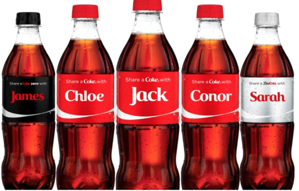
Personalization and custom experience helps user feel recognized. It saves valuable time with offering relevant information that they might be looking for or skipping unnecessary content your users already experienced and don’t need anymore.
Animations
Animation may be used in a wide range of scales and contexts to unite beauty and function. Of course, animation needs to be functional above all else. It can be combined with great writing or brand to create big personality for otherwise robotic software.
Tactile transitions or gestural commands
Tactile feedback can serve as an additional level of communication on top of mostly visual digital software. Same with gestural commands, that give user a layer of timing, actions and a sense of weight to their actions.
Microcopy & Brand Personality
Great writing in a consistent tone-of-voice is a strong way to draw user in, explain complicated features or technicalities and persuate people to invest more time and energy.
Beautiful, relevant high-resolution imagery and graphics
As most digital products became visual-only, with no hardware element at all, it’s crucial that all graphic design and assets are the highest quality you can deliver. This can make or break trust in the service or product. Just one low-quality asset is enough to look like something’s wrong with your product.
Deep Delight–maximum level of empathy
What Therese Fessenden calls Deep Delight is achieved when all the needs are met, including functionality, reliability, usability, and pleasure from using the product. Note that:
Pleasurable product can never be really useful without great usability, but usable product can be alright, even if they’re not very pleasurable.
Amazing products happen though when their designers spend time with good research and they build empathy for their users, understanding their problem-space well.
When products are both highly usable and pleasurable, Deep Delight happens: (in case of Fiskars Splitting Axe)

Here, radically different Amazon reviews for three products show us how user’s expectations change between different levels of surface+deep delight. It’s kind of funny how all users gave their products 5 stars rating–satisfied with different value these products offer.
These are the methods that can help you reach Deep Delight in your product:
Focusing on research
Understanding your users well is the basic component of all Deep Delight. Without knowing who’s your user, what their workflow and problems really are and how they are using your product, you’ll never be able to design really deep experience for them.
Smoother experience with no frustrations
Reducing obstacles is about minimizing pain points and frustration that users may experience throughout their journey. Empathy is key: you should anticipate user’s questions, identify moments of anxiety and use them as an opportunity to delight users.
Great training and onboarding
Showing people how to really use the tool is critical part of delightful experience. Imagine getting the best bicycle in the world, but you don’t know how to ride one. It would take you years to figure it out on your own. We need to realize that features that might be obvious to us might be overwhelming to our users and finally start doing a better job designing proper onboarding. Think training wheels.
Explaining value proposition well
One part of product design that often miss the mark is actually explaining what the product is for. In physical products, designers can build affordances to explain intended functions. With digital products that job is a lot harder. Especially now since the flat design is a norm and graphic design is so monotonous. In this world, anyone standing out in a good way is the winner.
Anticipating users needs
Having a deep empathy for your users that you can actually anticipate their needs before they can. It results in a lot of positive emotions for the product and your brand. Great example of this is Budnitz bike wrench, which is build for screw tightening, but always features a bottle opener.

MVP or MLP — Does delight always matter?
There’s a big difference between launching new product or a new feature as a MVP (minimum viable product) or as a MLP (minimum lovable product). We believe one good way to describe the difference is more Deep Delight in the lovable product. Remember our Hierarchy of User Needs?

I think in this article, Pieter Peremans actually describes the problem really well: While MVP is usually focused on the foundation of the pyramid, MLP actually tries to “scrape” the whole problem space:

It all makes sense when you view the difference through the optics of delightful design:
MLP doesn’t just build the foundation of a pyramid, it cuts a small piece of the whole experience, bottom up.
Summary
There’s a big difference between aesthetic, pleasing Surface Delight and deeper, more wholesome Deep Delight.
If your product or service lacks basic functionality and reliability, delightful features will likely fail to provide any sustainable benefit to your user base. If your product has a good usability, that’s half the battle.
Forced Surface Delight comes with potential branding risks. If your product is perceived as formal and serious, attempts at humor, animation or other gimmicks may come off as non-genuine.
Deep Delight is best achieved by knowing your users well through methodical research and then building up an emotional design on a foundation of usable, reliable and functional product.
As our understanding of how to make pleasurable products grows, maybe we can design all products to be lovable, instead of just utilitarian.
And as more companies investing into the user experience design and launching more refined products as MLPs, we can expect more users to be used to certain standard of pleasurable user experience. Don’t waste your chance to catch up with your competitors and please your users.
Get to know them and engage them deeply with excellent research, design and product management.

Sources
- MVP vs MLP by Pieter Peremans https://www.ae.be/blog-en/why-minimum-lovable-product-viable/
- Dangers of delight by John Saito https://uxdesign.cc/the-dangers-of-delightful-design-bb5834a1b684
- A Theory of User Delight by Therese Fessenden https://www.nngroup.com/articles/theory-user-delight/
- Delightful Experience by Nick Babich https://uxplanet.org/delightful-experience-be7098a44666
- On Delightful Products by Zak Slayback https://medium.com/the-mission/on-delightful-products-going-for-gratitude-not-simply-delight-e97890d52f35
- Don Norman https://en.tiny.ted.com/talks/don_norman_on_design_and_emotion
- A Theory of User Delight by Therese Fessenden https://www.nngroup.com/articles/theory-user-delight/
- The Aesthetic-Usability Effect by Kate Moran https://www.nngroup.com/articles/aesthetic-usability-effect/
- Delightful Experience by Nick Babich https://uxplanet.org/delightful-experience-be7098a44666
- On Delightful Products by Zak Slayback https://medium.com/the-mission/on-delightful-products-going-for-gratitude-not-simply-delight-e97890d52f35
- Don Norman https://en.tiny.ted.com/talks/don_norman_on_design_and_emotion


