Systemizing color for change
In the age of “dark mode”, how can websites and applications adapt to platforms that change?
People were excited when Apple announced dark mode on Mac this year. Dark mode is nothing new; dark mode has been supported on other operating systems and integrated into many applications for years now. As “dark mode” becomes more prevalent application and website developers are tasked with building software that supports it.
Blending In
Customization has always been a part of software. People react emotionally to color and identify with their favorites. The push for dark mode is one part customization and one part optimization.

Screens move with us as we travel between dim and bright environments. In bright environments screens have to compete with the light around them, and there, dark-on-light (DoL) interfaces perform better. Inversely, when you check your phone in a movie theater DoL interfaces seem too bright. Screens can blend in to their environment by adjusting the brightness of the screen or through changing the color of the interface.

Choosing not to offer a dark mode negatively impacts the experience a user has with your product. If dark mode is enabled and your product is the only application that doesn’t change, the user will blame your product.
Designing Color Systems for Customization
At Frankly, we work with a wide range of partners who want the applications and websites created by our platform to invoke their brand. Similar to dark mode, branding often involves changing the color scheme of a website or application. We use color pairs to make customizing color systems a breeze.

Color Pairs
The simplest interfaces are composed of a background and a foreground element. Instead of applying color to elements, apply colors as a pair to the component:
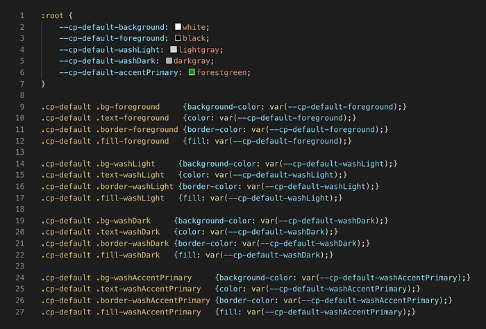
<component class="cp-default"/>At its core a color pair is one background color and one foreground color. Components often contain more than two colors, but never contain more than one background color.
Naming
Color pairs rely on describing color functionally instead of visually. Typically we see three main sets of colors: the core, washes, and accents.

The core is made up of the background and foreground colors. These colors should be high-contrast to ensure visibility of foreground elements.
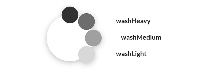
A Wash is a mix between the foreground and background color. Often these colors are grays or tints (a mix of hue & white) but the term wash is more appropriate because it isn’t specific. Usually washes exist in a scale of two to five colors and are used for elements like borders, dividers, and disabled/empty states.

Accents describe hues that add meaning to the interface but are not required for the interface to work. An accent can be a stand-alone color or be scaled like washes. Typically accents are used for calling attention, denoting interaction, and error states.
There are many ways of naming colors functionally and this is just one of them. A good naming system keeps pairs free of duplicate colors, keeps them small in size, and enables pair swapping.
Fallbacks
The default behavior of a color pair should be to make foreground elements visible to the user. Structure your color system so that the fallback color of foreground elements is the foreground color:
.cp-default {
    color: var(--cp-default-foreground);
    fill: var(--cp-default-foreground);
    border-color: var(--cp-default-foreground);
    background-color: var(--cp-default-background);
}
Storing Color Pairs
Consider the platform you’re designing for when deciding how to store color pairs. I prototype with CSS often and a tricky thing about CSS is that there are four ways to color something: background-color, fill, color and border-color.
Using the previous fallback code you will never need to specify the color of any element to be foreground except in the case that an element needs a background color of foreground. This is a rare case, but occasionally elements like dividers are just an empty div. To solve this we’ll make an element modifier that we attach to elements that require this behavior:
.cp-default .bg-foreground {
    background-color: var(--cp-default-foreground)
}
Modifiers
For every color other than background and foreground you need a modifier. Modifiers allow you to specify which elements require a color other than the default of foreground. If your color pair is large, this can be a lengthy process:
Nested Components
Not all components need a background color. When styling nested components don’t apply a color pair to an element that shares color pairs with its parent.
Modifiers are used to overwrite element styles when necessary by adding an additional class to any foreground elements within a component:
<component class="cp-default">
    <read-button class="text-accentPrimary">
        Read
    </read-button>
</component>....cp-default {
    color: var(--cp-default-foreground);
    border-color: var(--cp-default-foreground);
    background-color: var(--cp-default-background);
}.cp-default .text-accentPrimary {
    color: var(--cp-default-accentPrimary);
}
Here, the read-button takes a new text color without using a new color pair.
Layering Colors
Some systems may require layering colors. Treat layered colors as another modifier using the background or background-image property:
.cp-default .bgi-accentPrimary {
    background:
        linear-gradient(rgba(0,0,0,1), rgba(0,0,0,0)),
        var(--cp-default-accentPrimary)
}
Use Cases
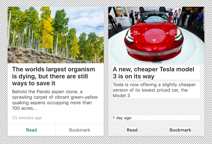
It’s important to outline the different types of color changes that might happen in your system so you can apply color pairs correctly. A default color pair is pretty self-explanatory:

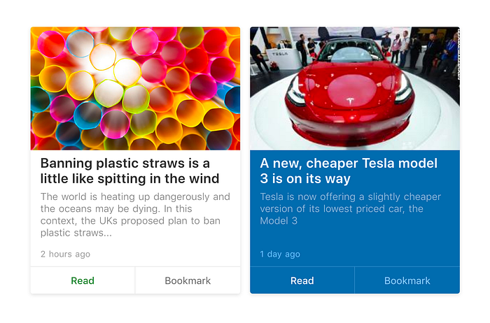
Changing a theme is a change to the default styles of a component. You can accomplish this by changing the values of the design tokens or by pointing to new tokens.

Occasionally a single instance of a component will need a different color pair. A layout might require variation to break up repetitive content or content might require a different background color to stand out in a list.

If the change is required for the layout to be effective, the color pair should be configurable on the layout:
<component class="cp-accentblue" />If the content requires the change, there should be a flag on the content that tells the component to change when it receives the flag:
<component :class="object.classOverride"This was a common pattern in the local broadcast space as “Breaking News” often required a colored background to stand out among other content.
Common Issues with Color Pairs
While building our color system we made a few mistakes. Some of them are obvious, but others less so:

Inverting Your Default Pair
You might be tempted to just swap your foreground and background colors when you are creating a dark interface but always test them. Many colors do not perform the same when used inverted and a different color may be needed to achieve the affect you are looking for.
Accessibility️️
It won’t be covered in depth here but it’s important to say anyway: Always test color pairs for accessibility. Make sure that the color and the size of the text pass accessibility standards. Here’s an unsolicited plug for a simple tool:
Opacity
Opacity can be a useful tool but its effects vary between different color pairs, especially when dealing with hues. When changing the opacity of an element be aware that swapping the element’s pair may cause the element to look more washed out than you initially intended.
Create Boundaries
Not every part of an interface needs to change when a user selects a theme. Parts of an interface may use a DoL scheme when in dark mode, just as every element doesn’t need to have a white background when in light mode.
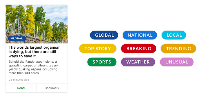
For our articles, we used category pills with different background colors to denote what category an article was at a glance. We decided to only use the category pills on top of images so we didn’t have to worry about the background color clashing with an interface theme.
Technical Problems
There are a few edge cases to be aware of when using backgrounds that are not white for interfaces, although they’re unlikely to encounter unless you’re dealing with users uploading photos.
PNGs and GIFs with transparency bits instead of alpha channels are built to think that white is the natural background of any element and create white artifacts when blending colors into transparency. Using spatial anti-aliasing with text will cause you to encounter the same problem.
The Future of Interface Color
I’ve been trying dark mode for the past few weeks, and most of my applications already support it. This makes it even more jarring when an application I’m using doesn’t. So far, the two biggest offenders have been my internet browsers and mail apps.

This should be unsurprising; website & email designers are not accustomed to this paradigm yet. There are whispers of a future where we can listen to device settings through media queries (cough cough), but they don’t exist yet. In the mean time, design using color pairs to make the eventual switch painless.
As product designers, it’s our role to think about every instance of our product and how users perceive it. In a future where our websites and applications are meant to listen to user’s UI preferences, we should gladly accommodate them.
Many thanks to Michael Bachman, Lauren Banks & Ashley Bauer for help on this project. Originally written in 2017, updated for 2018.

