Taking control of your audible library — a UX case study

Introducing Audible Collections
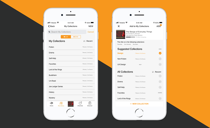
Audible Collections empowers users to take control of their Audible libraries while further integrating Audible into the Amazon digital ecosystem.
Want to see what this looks like? Check out my InVision Prototype.

Want to understand how I came to this solution? Keep reading below!
(Disclaimer: I am in no way affiliated with Audible or Amazon. I am an independent UX/UI Designer who is trying to design a better experience for a product I love.)
What Audible means to me
I have been listening to audiobooks since I was 9 years old when my Dad introduced them to me on family road trips. He would wax poetic about the various strengths and weaknesses of narrators, the intricacies of his Audible library, and how he could not fall asleep without a book playing in the background. Before long, I too was in love with audiobooks.
I’m not alone in this love. Audiobooks are a booming market. Audiobook sales increased 31% in the US between 2015 and 2016, with this trend only expected to increase. 26% of the US population claims to have listened to an audiobook in the last 12 months, with 48% of all listeners under the age of 35.
When it comes to audiobooks, the undisputed heavyweight is Audible. Purchased by Amazon in 2008, Audible boasts a massive library of titles and has been my dad’s and my own product of choice since I began my audiobook journey.
After my dad’s recent passing, I wanted to delve into a project that would allow me to feel more connected to him. As much as he loved listening to books through his Audible app, I remember his endless complaints about the lack of options to organize his ever-expanding Audible library. He hated having to hunt for a book he wanted to listen to — all he wanted was the ability to organize his books his own way and a sense of control over his library.
With Audible’s expansion into new audio-formats, including its new Channels feature and the incorporation of podcasts, organizing one’s ever growing library is poised only to become more and more difficult. With information overload and the paradox of choice potentially causing users anxiety, this appears to be a real problem space worth exploring. Currently, in-app options for organizing a user’s library are limited, and I believed a better solution could be designed.
My Process

Research
I started with a hypothesis that users struggled with a lack of organization options afforded to them by Audible and that my dad wasn’t just an edge case.
Reddit’s r/audible subreddit appeared to be the focal point of the online community, so it was my main source for user-generated information and a good place to start validating my hypothesis. The most common pain point that arose was a lack of a ‘folders’ option, or the ability to sort by series or genre. One user claimed to have quit the service because their library had become unmanageable.

I posted a survey on r/audible aimed at understanding the problem space better. I used a combination quantitative and qualitative data to better understand listener attitudes, organizational habits, and pain points.
130 responses showed that while many users expressed intense frustration with the lack of organization features currently available, quite a few users didn’t care at all.
In order to develop my understanding of user pains on a deeper level, I then conducted 3 interviews with current Audible users. These interviews showed that:
- The 2 participants were frustrated with a lack of organizational options while 1 did not care at all.
- For the participants who did care, it was critical that they would be able to control what type of categories their books where sorted into.
With research-backed validation that a lack of organization option was indeed a real problem for users, I conducting a competitive analysis of the current audiobook market to see what solutions had already been designed. Currently, there are no competitors that provide a feature that allows users to create AND easily manage folders or categories of their audiobooks. With no good solutions currently in existence, Audible has a major opportunity to increase the UX of their product and further increase their competitive advantage in the audiobook market.
Empathize & Define
After confirming my hypothesis, I wanted to synthesize the specific goals, needs, and frustrations of Audible users. To do this, I constructed two personas based on my research.
Katie became my primary persona and represented users who had over 50 books in their library and who experienced frustrations around not being able to organize their libraries in a personal and meaningful way.
Nick, on the other hand, represented users with smaller libraries and who valued ease of use and functionality over organization. These personas showed me how critical it would be for me to make design decisions that would help Katie achieve her goals without hindering Nick’s experience.

I also created empathy maps for both Katie and Nick to gain further insight into both their motivations for using Audible and the their context of use. These showed me that while Nick saw Audible as primarily a tool for ingesting content, Katie saw her library as a metaphorical garden that she tended to and carefully returned to over time.
Combining my research and empathy development, I defined the problems I needed to address into 3 How Might We statements:
How might we…?
- How might we empower users to organize their libraries in a customizable and meaningful way?
- How might we allow users to explore and search for books by custom categories?
- How might we provide this feature without disrupting the core functionality of the Audible app?
Ideation, Information Architecture, & Interaction Design
With my problems clearly defined, it was time to explore and ideate. After tossing around some concepts such as folders or more sorting options, I decided to use a user-defined tagging system. Tagging requires less cognitive load and allows the user greater flexibility and control of their organization schema. Tagging would also allow users to add a book to multiple collections easily and seamlessly.
As I was attempting to decide the best method to allow users to organize their libraries, I realized that this feature already existed to a certain degree on Amazon’s Kindle with their Collection’s feature. With the recent push by Audible and Kindle over the last few years to integrate their products, it seemed reasonable that Audible Collections could simultaneously solve a problem, enhance the user experience for Audible users, and support Amazon’s larger business strategy.
Based on my research, I made the assumption that users might fall into 2 use-cases: users that prefer to create collections first then add books to it later (aka Collections-first) verses users that prefer to create categories based off or starting with specific books (aka Book-first).
While Kindle’s Collections feature does a great job of creating and managing collections, it falls short by not allowing users to add books to collections from a Book-first perspective. I wanted to ensure that both a Book-first and Collections-first use case was supported by my design.

In line with my goal of uniting user and business goals, I also decided to ideate on a subset of the feature which would give users recommendations based on the content of their collections. My hypothesis is that it would lead to increased user engagement and purchasing of audio material.
With these ideas in mind, I began sketching out various UI options using pen and paper before narrowing down my options and turning them into mid-fidelity wireframes.

Prototyping and Validating
I conducted 5 usability tests with current Audible users, asking them how they would go about using and creating new collections of their libraries. I also asked them how they would add a book to multiple categories. I conducted 3 of the tests in person and 2 remotely using Google Hangouts.
After collecting the findings of these tests into an affinity map, a couple of patterns became clear:
- My hypothesis that users would take either a book-first or a collections-first approach was validated. Users were split between which method they used to add a book to a collection.
- While 4/5 users were successful in adding and managing collections, they struggled with adding books to new and existing collections in my book-first use-case due to a lack of clarity on my “Add to a Collection” screens. They often felt overwhelmed by their choices.
- My decision to make changes to the Library UI did not affect their ability to refresh their library nor choose, select, and listen to a title quickly and easily.
Using this information, I further iterated my wireframes to establish a stronger visual hierarchy and to clarify the screen’s CTAs. I also removed the option for creating new suggested lists based off the title’s metadata in order to further simplify the process and reduce a user’s choices on that specific screen.

(Even) More Prototyping and Iteration
You can never test too much, right?
I wanted to make sure my changes were effective, so I created another InVision prototype and remote tested it with 5 different Audible users that I recruited through my network. None of the participants struggled with adding a book from a Book-first flow, thus validating that my design changes had fixed the issues that plagued my first version. Surprisingly, almost every user, including users who were most represented by Nick, expressed how much they wanted a feature like this to be implemented.
“It’s not something I thought I needed, but now I realize it’s something that would make Audible more usable, like a digital bookshelf.”
“I wouldn’t have thought I would ever use this type of thing, but I could see how this might actually be very useful for me.”
“I love that I could organize my series.”
“I don’t want to go back to the real app — I’m going to miss having this feature already.”
Some minor issues still remained, so I continued to iterate my designs in order to clarify the “create new collection” CTA and to ensure that the UI was consistent with Audibles current patterns, copy, and visual style. After making this second round of revisions based off user feedback, I created a master application map which showed Audible Collections holistically and in a way that I hoped could be understood by a product design and/or development team.

Conclusions
Attempting to design a new feature for Audible proved to be a challenging but immensely rewarding project. It felt personality meaningful to me to design a solution that I believe my Dad would have loved and that also has value to the larger Audible community.
Moving forward, I would love to flush out Audible Collections with more features such as deeper Kindle integration, the ability to use predictive measures to see what books a user needs to complete a series, and the ability to make collections public. While it would need to be tested, I also believe that adding a feature like Collections would both boost Audible’s sales through a new means of generating recommendations and increase users’ feelings of ownership of and engagement with Audible as a core part of their daily lives.
Throughout this project, I came away with two major takeaways that I hope will stay with me as I continue my journey as a UX/UI Designer:
1. Validate the problem space first. To engage in real, human-centered design, it was important for me to set aside my own ego and bias and try to understand if a problem actually existed or not. It was only after I conducting multiple different forms of research that all lead to the same conclusion that I felt validated in knowing I was actually going to be helping people and not wasting time with an unneeded solution.
2. Uniting user goals and business goals can make everyone win in the end. Audible already does a very good job of delivering an excellent audiobook experience to the user, but there is still so much untapped potential. As a UX designer, by facilitating the increasing ubiquity of a product in a user’s life and integrating it into a larger constellation of products seamlessly, you can create value for everyone involved.
Special Thanks to Matt Farley for his support and advice, as well as to all of the people who took the time to tell me about their experiences and test my prototypes.
Thank you for reading! If you have any questions or feedback, you can contact me at jack@jackdickson.design or find my internet footprints at my Portfolio or LinkedIn.


