UX Writing Challenge: Completed!
A case-study of how my UX copy succeeded and how it could be improved

I’m a copywriter with experience in UX writing and I wanted to keep my writing sharp by practicing every day so I signed up for the UX writing challenge.
Practice makes permanent you know?
I spent 15–30ish minutes each day iterating on the copy. I kept it really simple by asking myself:
Based on the prompt, what does the user want to do right now?
Below, I walk you through, the copy, What Worked and What Didn’t Work
1: Flight Canceled

Prompt
Tell the user their flight has been delayed.
Title
Original copy
“Flight canceled”–was too abrupt.
“Flight grounded”–was too confusing. The user could wonder if it means canceled or just delayed?
Better copy
I needed to ease people into the news and not make them feel stranded. That’s why I said “changes.”
Body
Had to break the news and use the word “canceled” at some point.
After giving them the disappointing facts, I wanted to quickly provide a solution and resolve any question about added fees immediately so they could get to the next flight as quickly as possible.
Buttons
What does the user want to do right now if their flight is canceled? They want to book another one ASAP.
2: Sports App Home Screen

Prompt
Write a Home Screen for a sports app
Title
“Catch” tells users what they can do with a sport-y term. Win-win.
Body
Elaborates with more details about the app’s benefits.
Button
A common phrase in sports with an energetic voice.
3: Invalid Email


Prompt
Tell the user their email is invalid.
Body
There were a few options to go for this one:
- If the email is incomplete, the prompt can tell them to just complete their email.
2. If the email doesn’t exist, the prompt can encourage users to create an account. (Maybe the button on the second one should say Create account instead.)
4: Coffee Delivery
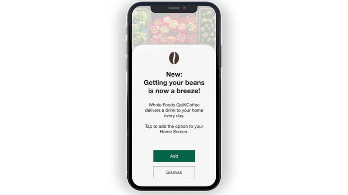
Headline
“New” grabs the user’s attention by telling them it’s something they haven’t seen before.
Got a little flashy on the rest of it, but I think the coffee bean icon clarifies what “beans” means.
Body
Add to “Home Screen” informs them that they can access the option for daily delivery on their Home Screen.
Buttons
Add–Uses the same language which described the process.
Dismiss–it works, but “Maybe later” could have been a better option so people know they aren’t closing the option for good.
5: Crashed App
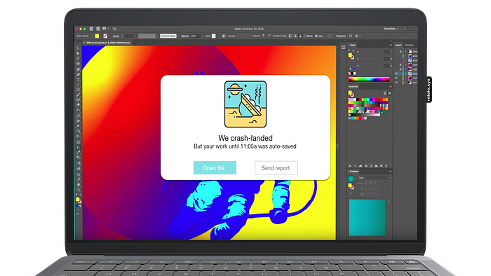
Headline
Honestly, I don’t think it’s the most appropriate line because somebody has lost their work.
Body
BUT if it’s auto-saved then it may not be that much of a tragedy and a little humor could be justified.
Button
Open file–tells them they’ll be taken directly to the file ASAP and won’t waste any time.
Send report–Another option if they want to add a ticket. Also, I should have added an X at the top right.
6: Traffic Delay Notice
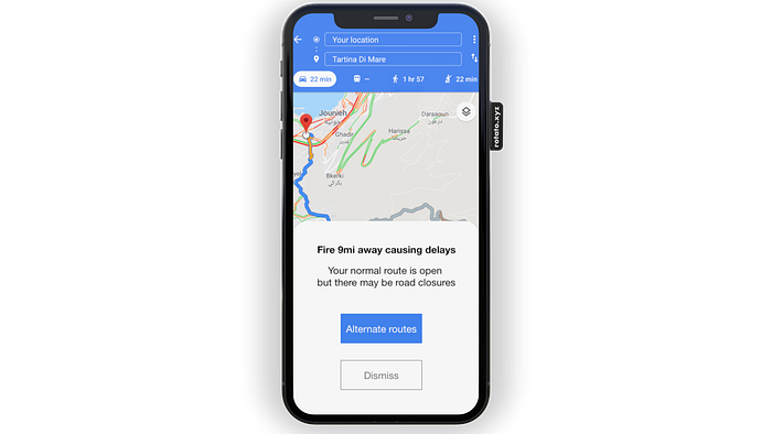
Prompt
Tell users as they pull up their maps that a fire could affect their commute, but it’s unclear by how much.
Headline
My original headline was going to be something like:
“Houston, we have a problem.”
But that’s useless.
I just need to make them aware.
Body
Tells them how it could affect their commute.
Buttons
Alternate routes–a solution if they don’t want to take a risk.
Dismiss–I was going to say “Onward” or something equally annoying. Glad I didn’t.
7: Football Update
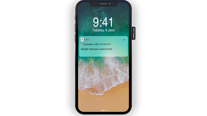
Prompt
Create a notification for someone who’s at a wedding, but wants to stay updated on the football game.
Headline
If users are trying to be discreet at a wedding, the emoji tells them it’s good news and that’s all they need to know.
Body
Elaborates a bit so they have some idea of the play.
8: Favorite Artist is in Town

Prompt
Tell a user on their music app that one of their favorite artists is coming to town, and encourage them to buy tickets in a compelling way.
Title
Tells the artist. Tells the location. All you need.
Body
To encourage them, I took a cue from Spotify who shared with users how much music they listened to.
Sometimes data can be creepy, but it was well-received when Spotify did it.
Design
This is my least favorite design as far as IA goes. Everything seems of equal value and I don’t know where to place my eyes.
As a writer, I’d have to go back and share that with the designer
9: Renting a car
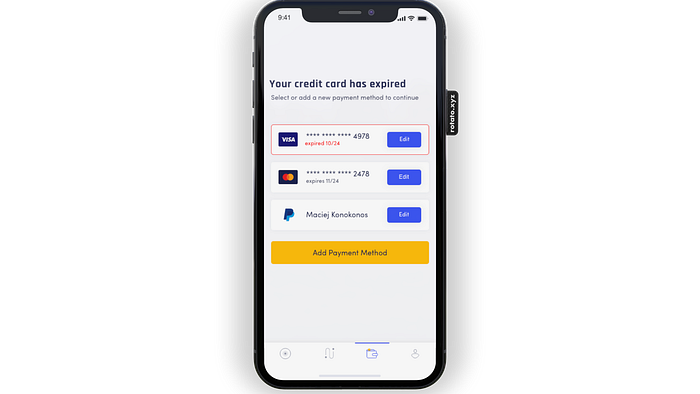
Prompt
Tell the user who’s about to rent a car that their credit card has expired.
Headline
Tells them the problem. Ba-da-bing.
Body
Tells them the solution. Ba-da-boom.
I was originally going to just say “Add new credit card” but they could always pay with other forms as well so I needed to adjust the copy for that.
10: Enter Zip Code
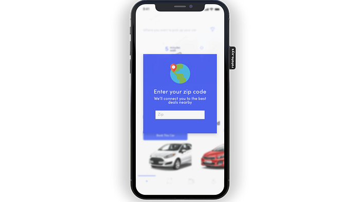
Ask for the user’s zip code without sounding intrusive.
Headline
Location access is always kinda creepy.
Body
So I needed to give them the value prop of getting deals close to them.
Saving money and time=worthwhile trade. It shows the user that the company wants to help them find deals, not use data to push ads.
11: Buy Contact Lenses

Prompt
Create an SEO-optimized title and meta description for elderly people searching for contact lenses.
Title
Company name + telling them exactly what the company does. Clear for the elderly. Clear for everyone.
Meta
Web pages are supposed to be experts on one thing. This reiterates what people can expect.
The description contains a question in it because that’s what a lot of searches consist of.
Didn’t want to use the word “Subscription” because that might not be the clearest word for elderly people. Used “automatically” to get the idea across.
12: Invalid Username
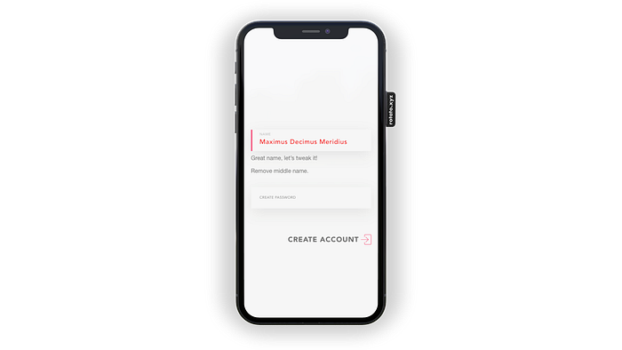
Prompt
Tell people the AI doesn’t believe their name is a real name without insulting them.
Body
Didn’t mention the AI part at all because it’s unhelpful trivia.
We just want them to change their name a bit.
I’m happy with the copy, but I should have said:
“Let’s tweak that! Remove symbols & middle name.”
13: Reset Password Email
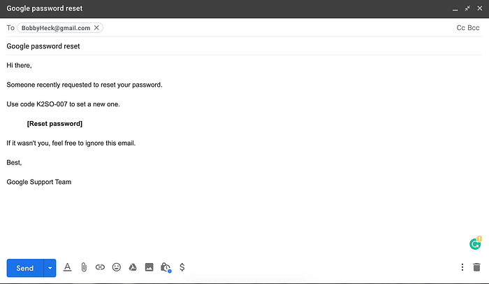
Prompt
Send users an email allowing them to change their email.
Subject line
Straightforward as can be.
Button
Smack in the middle telling them where they can enter their reset code.
Sign-off
Almost ended it with “Regards” but that’s way too formal after the greeting “Hi there.”
14: Can’t Access App
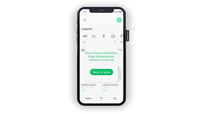
Prompt
Tell users the price comparison feature on their shopping app has crashed, but encourage them to stay on the app.
Body
I almost wrote:
Continue browsing to find the clothes you like and try again later.
Isn’t the one on the screen so much better?
Conclusion
Writing short is an art.
What are your thoughts? How would you improve these? Let me know in the comments!
P.S. For the mockups, I used Rotato a free and robust software that allows you to create videos of your digital products. Super helpful.