Taming complexity
Making the complex world understandable through intuitive design
“Modern technology can be complex, but complexity by itself is neither good nor bad: it is confusion that is bad.” Don Norman, Living with Complexity (2010)

Complex or complicated?
Our world is definitely complex. Great designs help us navigate and manage this complexity. They help us make use of things we don’t have full understanding of.
Consider the television for example. One does not have to understand electricity, signal processing, TV production, nor the complicated media economics in order to turn on the television and enjoy the show.
In fact, this how most of the world works. We operate in our daily lives quite happily with only basic understanding on many essentials. We only carry with us the understanding how to operate something, not how the design makes it happen. This does not only apply to high technologies such as our smartphones, fitbits, and GPS, but many of our more basic needs such as electricity, water systems, heating, and air conditioning.
The magic of great design is that it makes these complex phenomena understandable. Bad design, on the other hand, makes our appliances complicated and confusing. These designs fail their core purpose: serving us as an interpreter between the complex world and our very human interface.
Great designs act as an interpreter. They make our complex world intuitive and understandable.
To the user, good design feels intuitive and simple. The design is easy to pick up, setup, and use.
We have come a long way from the time appliances that came with manuals. Actually, if you remember reading them you are probably older than 30. Today, one does not have to be able read in order to use a tablet.
Design and prioritization
As many us are acutely aware, not all designs serve their users. Rather, they frustrate and confuse us. Their logic seems bizarre and alien. What is more, their lack of negotiation is infuriating: they demand us to bow to their failed logic not meeting us half-way.
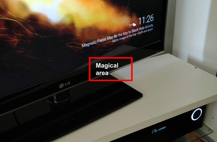
Let me illustrate this with a few personal examples. My TV is turned on by an essentially invisible button. Nor can the button be felt, as it is embedded in the surface.
This leads to a occasional game of “where is the button”: I brush the magical area below the screen to see what happens. One third of the time I open the menu, one third of the time I miss the button completely, other times the screen turns on.
Essentially, the TV has a built-in screen lock. If you don’t know the TV, you cannot turn it on. As a consequence, I don’t even try to explain this to my guests.

Another favorite example is my amplifier’s remote controller. It has a stunning 56 keys — of which I typically use 2 to adjust the volume. Occasionally, I use one of the input selection keys above.
A bonus sector! The top right button in the top right-hand corner does not turn the device off as one would expect but mutes it as a misuse of common conventions.
Luckily, designs have since evolved. Soon, these remote controllers are falling off the technology adoption chart and will become an internet meme young people don’t understand.
Today, design teams are better at prioritizing and listening to users. Let’s take Kindle as an example. When reading, the user needs three options. They either go to the next page, previous page, or access options that allows the customization of the device and reading options.
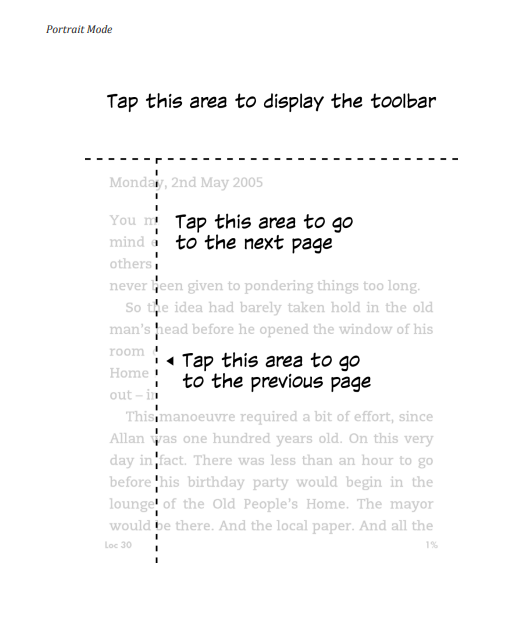
My point is not to compare apples to oranges but to illustrate the increasing adoption of user-centric methods in design. When the design team understands what the user seeks to accomplish, they can clear the clutter. The vast majority of users needs can be served by merely a few features, interactions, and inputs. In a simple design there is nothing redundant or excessive that could confuse or mislead the user.
What’s cooking?
Creating a new design is like cooking food. You take fresh ingredients and combine them in a unique way taking into account the preferences, allergies, and diets of your dinner guests. You can explore different cuisines or if you are particularly skilled you can improvise on the spot. Regardless, the range of possibilities is practically endless due to combinatorics.
I highlight how majority of design is incremental in nature. This means that even new designs leverage established practices. The core of creation is on adjusting to a particular user group’s needs, wants, and cultural context.
Yet, some designs take smaller and some larger leaps from established practices. When you consider larger steps, the attention turns towards the fundaments of the design, its function.
Do we need context-specific buttons or could we have multipurpose dials? Should we have buttons at all or could we have a touchscreen? Do we actually need to press anything or could we operate our designs with our voice?
All of these large shifts leverage the possibilities created by new technologies. While these shifts are rare, they often define industries and companies seek advantage from reaching them first. Now, let me tell you a personal experience with a discovery of a new design in the field of games.
Spy Academy: Helsinki
Some months ago my friend told me about an idea they had had: they used WhatsApp’s GPS feature as a game. They had one of their friends share their live location and trying to stay hidden. Meanwhile the task of the other players was to shadow that player throughout the city. Brilliant!
This is actually a neat example on how games drive the adoption of new technologies. GPS-based mechanics have been successfully used in only a small number of games, most prominently of course Pokemon Go. Yet, I had never heard of anyone using the mechanic in this way.
What would information asymmetry, location-tracking and urban environment allow? Suddenly, the abstract pieces came together.
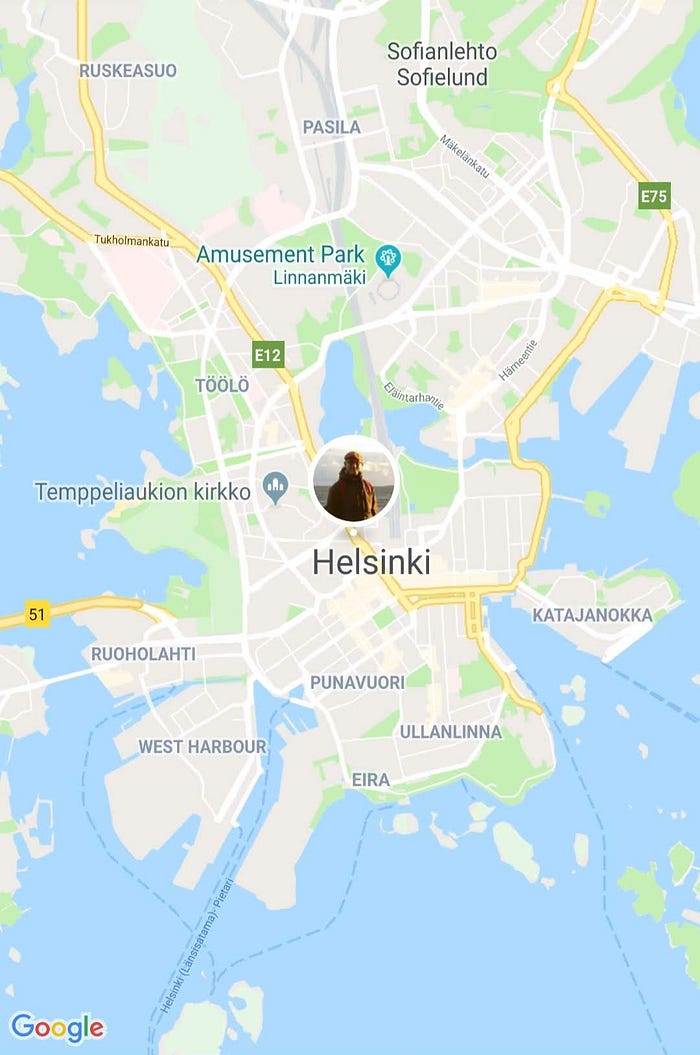
The game is simple. A team of 6–10 players join a WhatsApp group chat. Two people are randomly assigned to be tracked. Their aim is to complete tasks throughout the city while remaining undetected by other players.
The tracked players get a head-start into the urban environment. Then, they share their live location in the chat for other players to see. Now, the rest of the players try to find and shadow the two other players without being seen. To add to the fun, everyone can make use of the local transportation and rapidly travel from place to place.
I have organized this game a couple times in Helsinki and it has been a blast. Most excited I am design-wise: the game takes simple elements and boils them together to create an engaging experience.
Taming complexity
The world around is complex, and designs can serve to make it understandable and exciting. While the example is entertainment, it bows to the principles that facilitate its simplicity:
- User-centricity: The game leans on personal experience in similar games and what appeal they hold to the players.
- Intuitive. The game is easy to understand and can be rapidly explained to new players.
- Depth. The game design offers a wide range of opportunities that arise from the interaction the players have with the environment and each other. The players learn to collaborate, blend in the crowd, and disguise themselves.
- Platform. You can build on top of the core mechanic to create new experiences. Is it a bad weather? Play the game indoors. A larger group? Give the players tasks that divide them into smaller groups. In the countryside? Play the game in the forest without lights.
Complexity everywhere
There is simplicity hiding in all complex phenomena: in politics, energy production, economics, psychology. Our world is full of interconnected phenomena that we strive to wrap our heads around.
When one can grasp a complex topic, summarize it, and share it, there is something that tickles us.
Simplifying complexity is not only intriguing. It makes the world around us understandable.
Lauri Lukka is a Helsinki-based service designer, psychologist, and podcaster who works with user-centered design.
What does it mean to “be yourself” at work? Read more on my next essay!
To read more on the topic, I highly recommend Don Norman’s wonderful book Living with Complexity.
Cover photo: Helsinki Central Station, Alexandr Bormotin, Unsplash.

