UX Collective

We believe designers are thinkers as much as they are makers. https://linktr.ee/uxc

Follow publication

Tears of the Kingdom: how Nintendo improved (and ignored) UI issues

The latest Legend of Zelda title has both pleased and pissed off gamers when addressing certain user interface issues.

Daley Wilhelm
UX Collective
Published in
8 min readJul 11, 2023

Illustration: Link, a blonde elfish adventurer, kneels on the stone ledge of an island floating in the glaringly blue sky.
Link’s new adventure takes him above and below Hyrule with new abilities, and some new UI to analyze. Image from — https://www.cnet.com/tech/gaming/the-legend-of-zelda-tears-of-the-kingdom-what-to-know-before-playing/

This article started as, and could easily end up, as a love letter to The Legend of Zelda: Tears of the Kingdom. Its legendary predecessor, Breath of the Wild, started a kind of video game renaissance in my life. I dedicated time, tears, and two Nintendo Switches to my adventures with Link in Hyrule.

But in the time between the first game and the release of the second, I metamorphosed from a video games journalist to a UX professional. My education opened my eyes to the ways that Nintendo created both a great and sometimes groan-worthy interface for Breath of the Wild. Now, after enjoying a couple dozen hours of Tears of the Kingdom, I can recognize where Nintendo has improved upon and utterly ignored various issues concerning the user interface of the new latest Legend of Zelda series.

No spoilers! This article touches on gameplay and UI, but very little of the story.

The good

Designed with the Switch in mind

Image: Two hands, one white and the other black, hold a horizontal, flat device with a glowing eye on its center screen.
The Purah Pad, which just looks like a Switch with a really cool skin. Image from — https://www.ign.com/wikis/the-legend-of-zelda-tears-of-the-kingdom/Purah_Pad

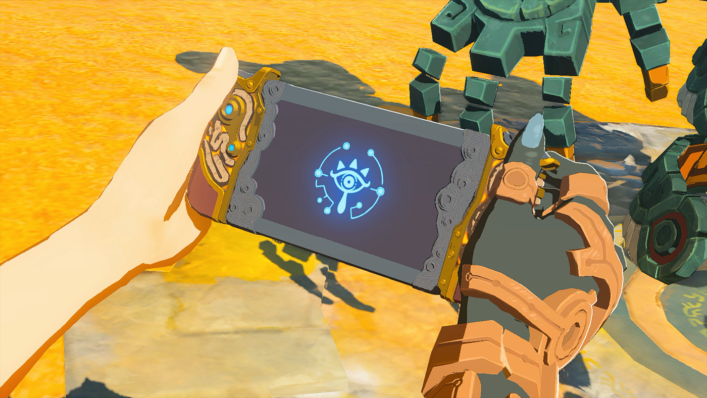
Breath of the Wild was the launch title for the, at the time, revolutionary and even controversial Nintendo Switch. Skeptics of the console acknowledged that launching with a highly anticipated Zelda game essentially forced their hand into purchasing what seemed like a tiny, gimmick-y system that paled in comparison to what Xbox and PlayStation were putting out.

Image: Two hands hold a rugged-looking tablet with a built-in handle on the left side. A glowing blue eye icon shines in the center screen.
The previous game’s Sheikah Slate doesn’t look very Switch-like in comparison. Image from — https://segmentnext.com/legend-of-zelda-breath-of-the-wild-sheikah/

Just like Breath of the Wild before it, Tears of the Kingdom fully integrates the design of the Switch within its gameplay. In the first game, Link carried around a familiarly designed “Sheikah Slate” that allowed him to access his map, Hyrule compendium, and inventory among other functions. The sequel sees Link geared with a “Purah Pad” that…

Create an account to read the full story.

The author made this story available to Medium members only.
If you’re new to Medium, create a new account to read this story on us.

Or, continue in mobile web

Already have an account? Sign in

Written by Daley Wilhelm

A fiction writer turned UX writer dedicated to crisp copy, inclusive experiences, and humanizing tech.

Responses (10)

Write a response

Don't even get me started with rapidly pressing "A" to pick up items near a cliff, and then the wind gust ability accidentally getting triggered from pressing "A" and watching all your treasure blow off the edge. 😭😅

--

I do feel like the game can be overwhelming with the amount of items you can get in the game, and not having a way to sort them kinda sucks.

--

*Every* video game should have Fortnite-levels of rebinds and Forbidden West-levels of accessibility options.

Anything less is laziness on behalf of the developers.

--