Ten rules of good Product Design
Good design is relative. Everyone has an opinion about good and bad design but when you break down the KPIs in terms of conversion rate, retention or growth, you’ll see that only a few companies are out there who are using the power of design and its tremendous leverage to disrupt whole industries.

When we look at the rising stars like Airbnb, Deliveroo or Lyft, the success kicked in because people fell in love with the simplicity and frictionless experience of their services. Their approach of linking design and technology gave them the foundation for growth, retention and conversion by any accounts.
But are there any rules and patterns which can give you a direction to good product design? What kind of guidelines could help, to build products that people will love?
Even its not often obvious, there are major underlying rules which affect the appearance and in fact the positive perception of a product in a subconscious way. This article represents gathered rules and my paradigms from my past years as a product designer around the world.
Let's dive into 10 rules that will help you to build a frictionless flow and a game-changing product.
1. Three Click Rule
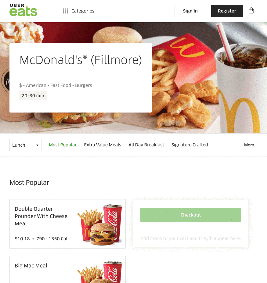
— Users are impatient. If they can't find the information on a website within three clicks they’ll get frustrated and leave the page. Keep this rule in mind when it comes to design a conversion channel. Users of a website should be able to find any key information with no more than three mouse clicks. If you take a look at landing pages from the most influential startups like Instagram, Dropbox or Quora, you’ll notice that they reduced trigger attention to their call to actions — in this case to their download buttons.

2. The Rule of Thirds
Our brains are programmed to look for patterns and is attracted to symmetry. This basic principle of design could help you for visual harmony so that your work appeals to every user. The rule of thirds states that you can use a grid to guide your design — this grid splits any canvas into 3 equally sized horizontal and vertical sections. This 3×3 grid is like a roadmap to show you where to place emphasis and how to align your objects.
3. Miller’s Law
The average human can hold 7 ±2 objects in working memory. Try to keep this rule in mind when you start to think about to map a registration funnel, sign up process or sales funnel. Focus on a small amount of steps to keep your user in line. This rule can be applied in different scenarios like the amount of sections of a landing page or the information that are given. Additionally, try to prioritize the order of the information you want to give the user. The more important the element, the more it should be prioritized.

4. Simplicity First
The simplest solution is almost always the best which is also stated as Occam’s Razor. Cut out every unnecessary design element and focus on simplicity and minimalistic design elements. Occam’s Razor can also be used for the userflow as a powerful rule. Therefore, when evaluating your designs and flows, analyze each element and remove as many as possible, without compromising the overall function. This should ensure that you remain with elements you have minimized as much as possible but which still work perfectly
5. Five Second Test
A 5-second test involves showing users the interface of a software application or a website for 5 seconds. The participant then has to recall what they saw on the page. This is a great method to see whether the key visuals or call to actions have been a correct impact. It gives a clear picture of how to formulate the key message right. Repeat this test until you are satisfied with the results of what should be got caught in the users head.
6. Hick’s Law
Every additional choice increases the time it takes to make a selection. Especially in user experience design, this law is useful to increase the conversion rate of call-to-action UI elements. It implies to be clean with a minimalistic approach in the usability interface which reduces the responding time and amplify a frictionless flow. Especially for navigation bars, menu points or forms. Use tools like Hotjar or CrazyEgg to see heat maps of your product to figure out useless design elements. Designers can improve the efficiency of the user flow by understanding the implications of Hick’s Law. You can improve the speed and the usability of your product or website by simplifying layouts and by reducing options. Focus on core elements of your website or application to have an effective user flow.
7. Focus on the Pareto Principle
20% of the elements are affecting 80% of the action. Find these crucial parts by analyzing user flows to reduce friction and to create a seamless walkthrough. Concentrate on these crucial elements and make them more straightforward by optimizing color, font, size as well as position. The main purpose to have a website is predominantly to convert the visitor into a customer, getting a signup or registrations. Call-to-Action buttons are the most straightforward way to guide users. Reduce noise around them and simply place the focus on the 20% of actions to maximize your output. Analysis tools are an important element to test and optimize your conversion funnel. You can use as well heatmaps like hotjar.
8. Implement Mental Models
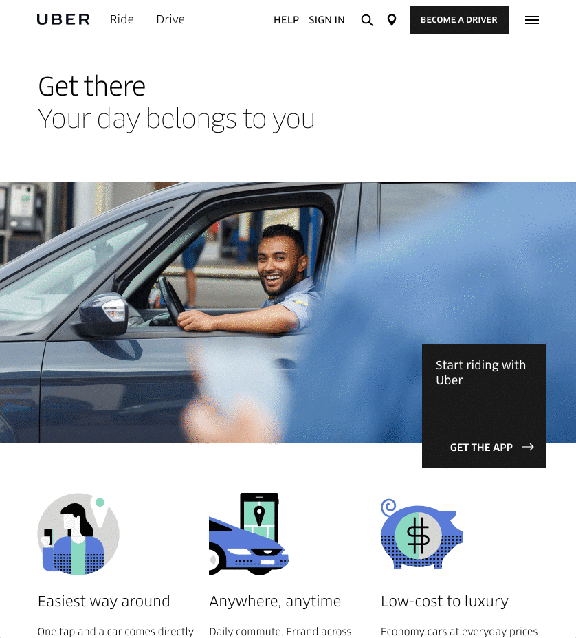
It’s easier for users to understand and learn something new if they can model it off of something they already understand. Users are creatures of habits. Use this effect to optimize your product by applying well-established designs patterns from big companies like Apple, Uber or Airbnb. Certain user flow action were already tested and optimized several time, so it will save you a lot of testing and iterations to optimize for product.
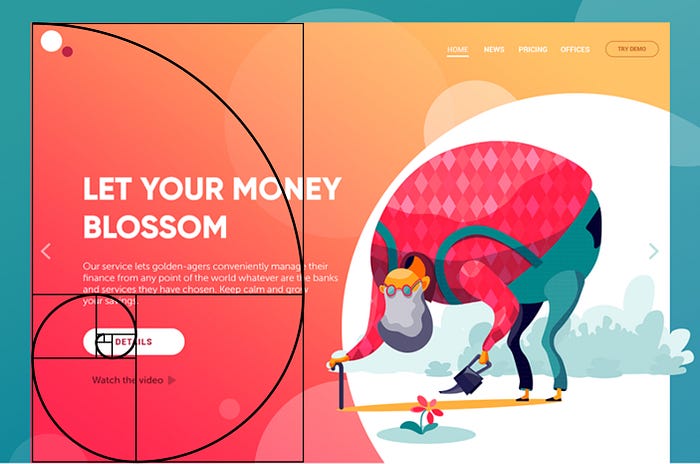
9. Fibonacci Sequence
Patterns based on the sequence are intrinsically aesthetic. Especially, when it comes to call to action buttons.
10. Guide with Feedback
Provide immediate feedback on user actions. Educate your user in difficult flows. To educate your user can help him to understand functions better and make quicker decisions. This can lead to higher conversations and retention.
When users try a product for the first time, their subconscious decides if they like it or not. The psychology principle known as a visceral reaction states that people decide whether they like something or not within a few seconds of looking at something. This reaction goes faster than our consciousness so we don’t even realize it. There is a high chance that when applying those rules as your product and design foundation that users are loving what you built.
About me: I am currently the chief product of @Coinance. I used to work for @RocketInternet, @Shop.Co and @Zenrooms. Feel free to contact me via Dribbble or Linkedin.

