‘That’s just the way it has always been’ — a UX case study

There’s a saying, “if it ain’t broke, don’t fix it.” But commercial real estate in Canada might have taken that saying too far, because there is currently no optimal way to search for available commercial real estate.
RE/MAX Commercial, LoopNet, CoStar — these are just a few of the successful real estate search tools available in the United States that aggregate listings into one place. This makes searching for real estate much easier for brokers because they can focus on finding the right space for their clients straight away.
However, these multiple listings services (MLS platforms) are mostly useful for residential listings, where listings are public and are typically shared amongst brokers. This means that there’s both a selling broker and a buying broker. So when a potential buyer comes along, the commission earned gets split up between the two people.
In the commercial real estate arena, brokers don’t want to share their commission.

“I don’t typically cooperate with other brokers.”
— Commercial real estate broker in Vancouver, BC
Private listings is standard practice and sharing information with the competitors is frowned upon. Yet at the same time, brokers from one company will look at the listings of another to see if something meets their client needs.
“There is no way any broker can know who all the buyers for a property are. No matter how successful you are as an individual or how large a firm you work (at), you are simply not going to get listing information in front of all prospective buyers if you seek to identify the buyer on your own.”
— Kevin Maggiacomo, CEO of Sperry Van Ness
extracted from The Financial Post
This was the problem our client, David Hemmings from William Wright Commercial Real Estate came to us with.
While solutions, such as Spacelist have been introduced, it hasn’t been well adopted. Not all of the listings are posted on there, and if they are, there is no incentive to take down expired listings because Spacelist is driven by user-generated content.
So David was not only spending his time cold calling brokers who owned expired listings, he was also doing so by entering the same search criteria across 6 or 7 platforms. This also meant he kept seeing the same listings over and over again.

The generational gap between new brokers and more experienced brokers who have been in working in commercial real estate for 20+ years is one of the key factors leading to this lack of technology adoption.
“That’s just been the way it’s always been done” is a typical phrase we heard from the brokers we interviewed for this project, with a clear implication of ‘so that’s the way it’s always going to be’.
More experienced brokers already have a client list who they can go to when they get to know about a new listing.
“The way the industry works today, most brokerages will try to sell a client’s property on their own stable of clients.”
— Derek Lobo, founder of Rock Advisors Inc
extracted from The Financial Post
So there’s less of an incentive from those brokers to sign their companies onto platforms that aggregate their listings into one place for more exposure to other buyers.
Introduction
Our team comprised of Kate Leenutaphong (Research, UI Product Design), Jeremy Tran (Research, UX Product Design (Mobile)), Andy Wong (Research, UX Product Design), and myself (Research, UX/UI Product Design).
We took on the challenge to build a platform that took care of the more immediate concerns facing the newer generation of commercial real estate brokers, such as aggregating the listings into one place (the way Spacelist does) and keeping them updated on their status.
Unlike Spacelist, our client, David, observed that most private brokerage websites are maintained and updated daily or weekly. So by pulling the most up-to-date commercial property listings from the five major commercial real estate brokerage websites: Avison Young, CBRE, Colliers, Cushman & Wakefield, and Lee & Associates, we could create a search engine that could help brokers search listings more efficiently, without necessarily cooperating with them.
From our kick off meeting, we were able to come up with our goals that could be attained in the 3-week timeline of this project.

Research
With this in mind, we wanted to prove the assumption we were making that creating this search engine would be time efficient.
In order to prove our hypothesis, our team conducted research using multiple methods to triangulate our data. What’s triangulation?
Triangulation is a research strategy used to 1) gain different perspectives on a single subject and 2) to validate results using two measurements.
— Sarah Christopher (UX Researcher @ 9Now.com.au)
We used 3 research methods: a content audit of other competitors, an online survey, and finally 5 semi-structured interviews.
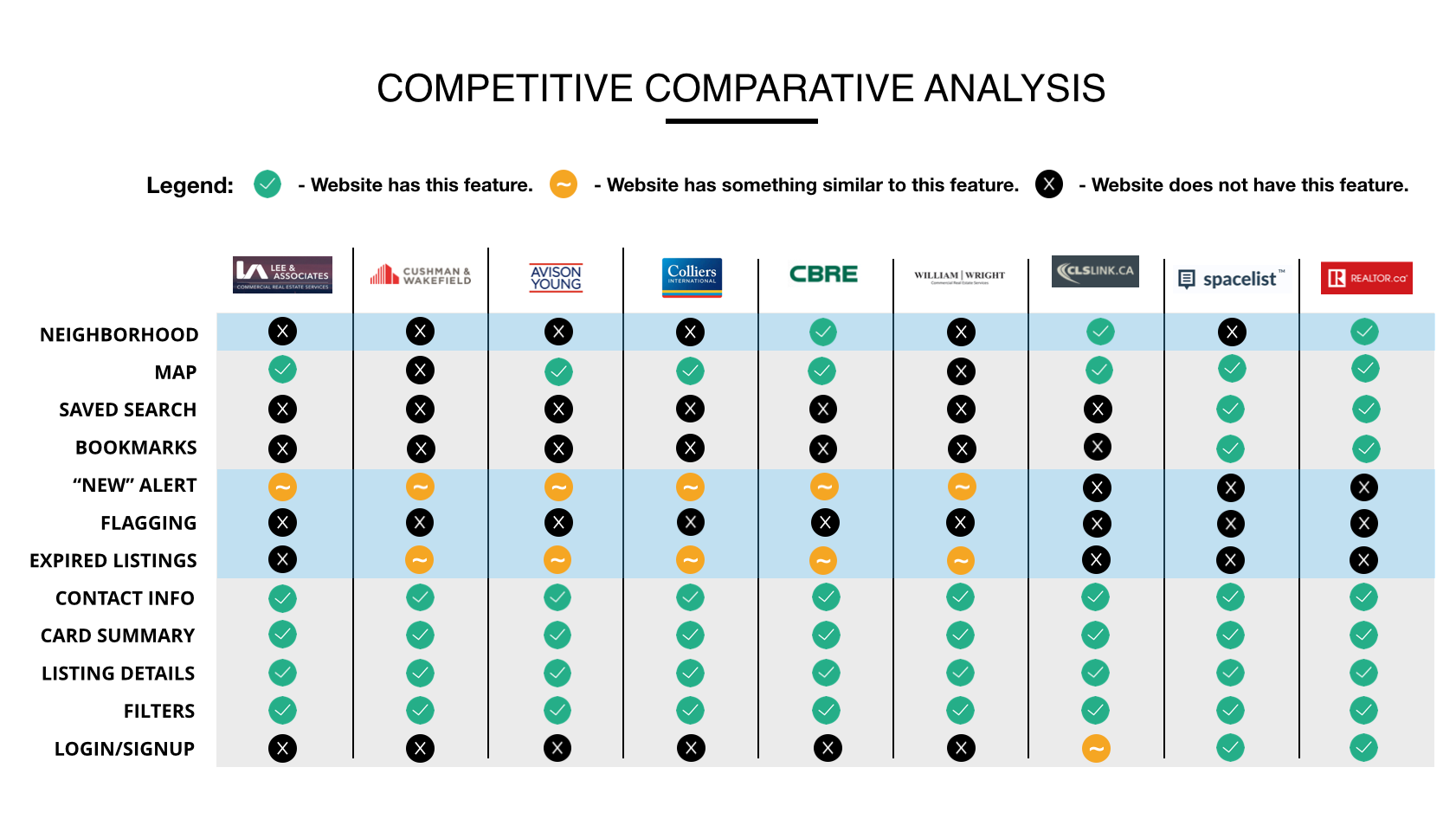
Competitive Comparative Analysis
We compared nine platforms, which were a mixture of commercial real estate company websites, as well as MLS platforms in the commercial space.
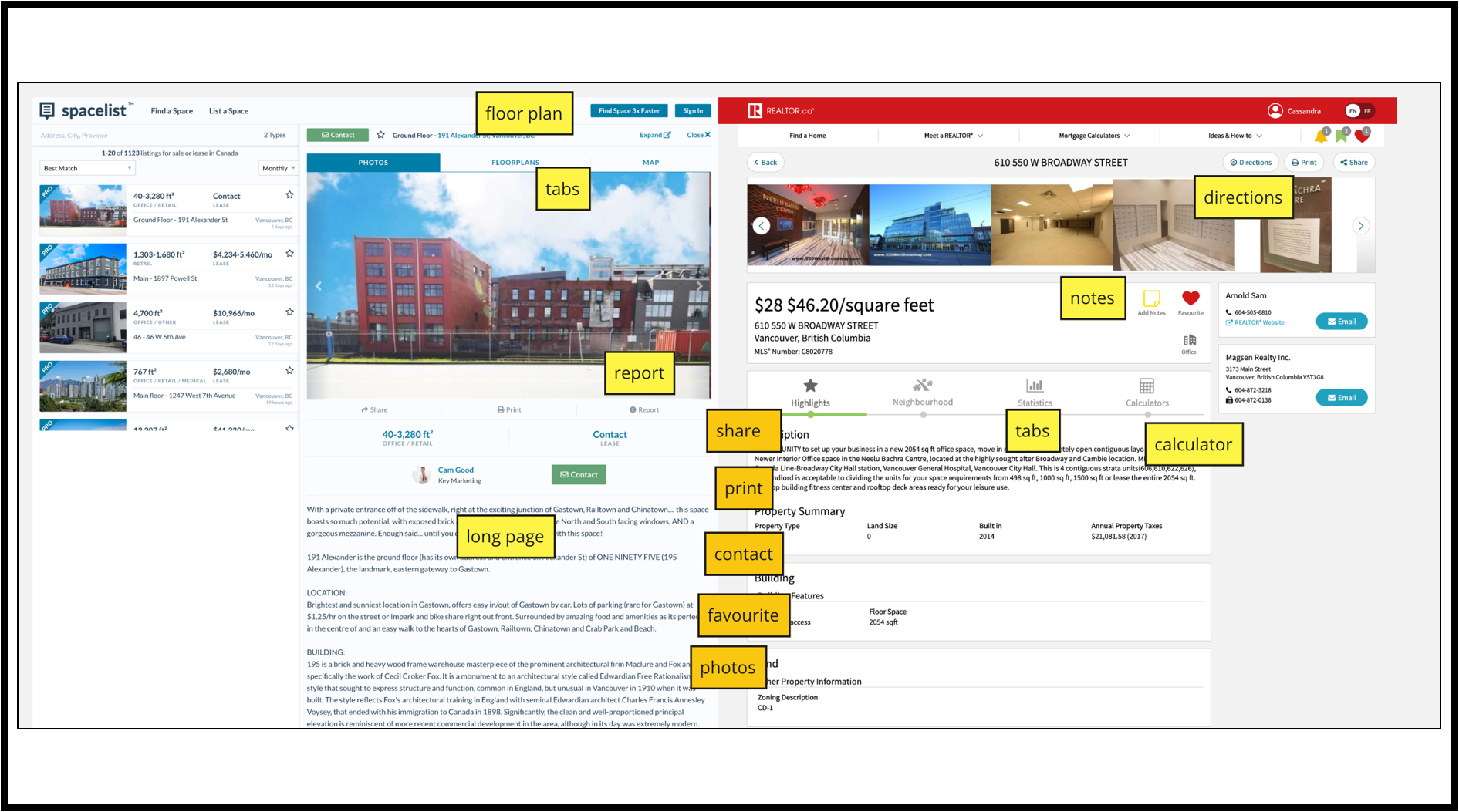
Content Audit
We dug into our immediate competitors in the space, and performed a content audit of Spacelist and Realtor.ca.
Survey & Interviews
Our survey and interviews gave us a lot of insight to how the commercial and residential real estate worlds differ, which echoed a lot of what my preamble talked about — cooperation between commercial brokers is frowned upon, more experienced brokers have more listings than clients, search is frustrating and time-consuming, and while expired listings generate leads, they also waste a broker’s time.
Planning
Affinity Diagram
We then created an affinity diagram to make sense of all of it. An affinity diagram is used by UX researchers to categorize information into meaningful sections to help analyze data better.
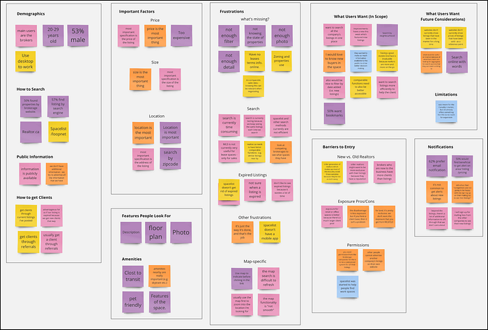
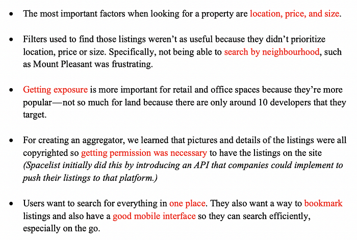
The key takeaways were:
Feature Prioritization
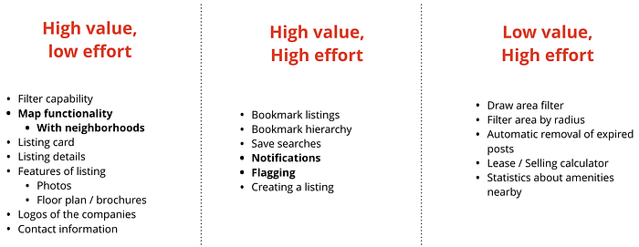
After organizing our research, we were able to figure out what features to focus on implementing for our minimum viable product.
Persona
Our team were then able to create our user persona, that embodied the pain points, characteristics and motivations of our target user.

Customer Journey Map
We graphically represented Steve’s pain points through a customer journey map, that showed his current work flow.

User Stories
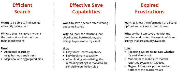
Using the journey map, we were able to come up with a set of user stories that helped guide our design decisions. This connected the motivations and pain points of Steve to the feature list we came up with earlier.
User Flow
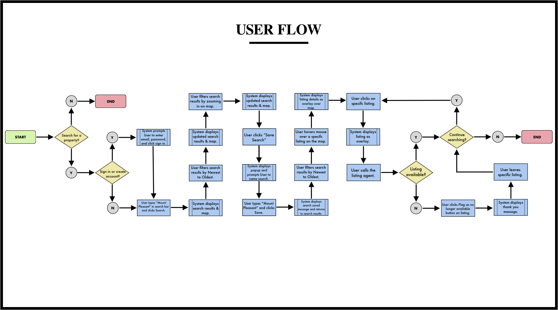
Once we had an idea of the features that we wanted to incorporate in the website, we used a user flow to focus on what Steve needed to accomplish and how to deliver that in the most effective manner possible. This lead to better user experiences as it placed Steve at the heart of the design process.
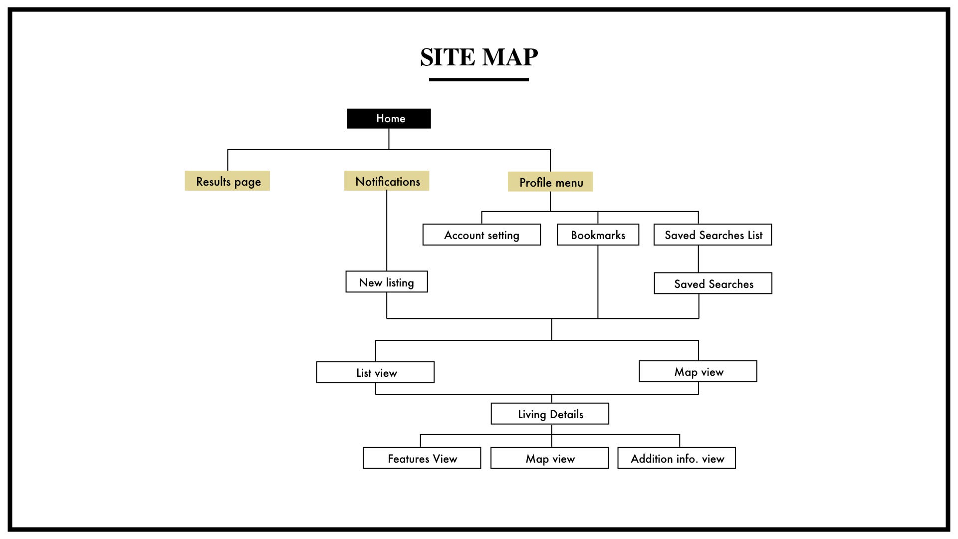
Site Map
Finally, we created a site map to figure out how Steve would navigate through the website in order to complete his task, which was to search for an available listing.
Design and Testing

We started off by making a paper prototype to rapidly test different variations of key features. We then created medium-fidelity wireframes on Sketch. I’ll be highlighting some of the user testing we did with them.
Tab Manipulation and Prioritization (paper prototype testing)
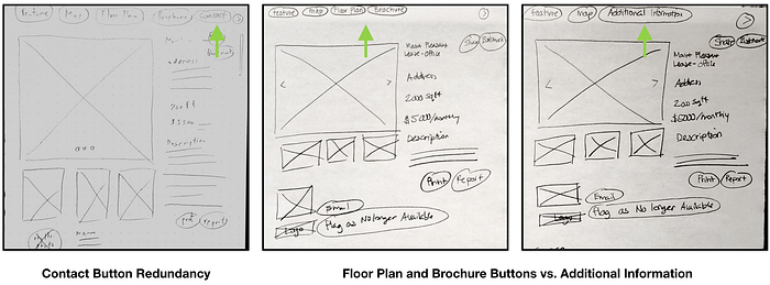
On the site, after a user does a search and see the search results, they can click into an individual listing. We first tested having a contact tab at the top. While users were able to effortlessly contact the broker through that tab, we got the feedback that the tab was redundant as the brokers contact information is found lower in the page.
We also did A/B testing with one page that contained Floor Plan and Brochure tabs and another page that only contained an Additional Information tab. Overall, users were able to navigate to the floor plan and brochure through the Additional Information tab. Since we had the extra screen real estate on the desktop version, we made them separate tabs, but on the mobile version it’s in one.
Overlay or Replacement of Screen (medium fidelity wireframe testing)


Once an individual listing is selected, we were unsure about how much screen real estate it should take up. Users reported that they preferred the listing only covering the map, so that they could see the other available listings to the left of the individual listing they had clicked on.
Mobile version modifications (paper and med-fi testing)

It was confusing on the paper prototype for the listing to feature the map on top when they clicked into a listing instead of the image. While location is more important, the user has already seen the location on the map from the results page, and it was more consistent for them to continue to see the photo on top.
We also realized that the common actions once a user got to a listing was to contact the broker — so we made a fixed footer on the bottom with call/message that was continuously available. (Shown in the high fidelity mockup.)
High Fidelity Mockups
This is what the final version looked like!
Desktop View:


Future Considerations
I created a timeline of the features that were low priority but of high value for our client. It shows how we can improve the MVP in the future to make an even more useful product for commercial real estate brokers.

Conclusion
Overall, the team worked well together to create a platform aimed to reduce time wastage for commercial real estate brokers. The final product matched David’s expectations, and fulfilled the business goals, user goals, and project goals.
If you liked my case study, please clap and leave a comment! All feedback is welcome! 🏢