The anatomy of a credit card form
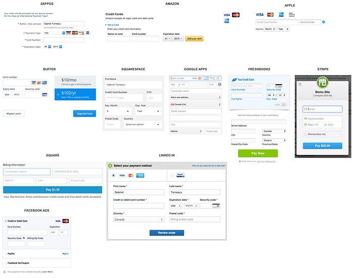
Paying for something online with a credit card is simple, right? Yes and no. Yes, because we’ve been doing it since the early days of the Internet (e.g. Amazon), and no, because no two credit card forms are alike.
Over the past 20 years, we’ve built a mental model of paying online: I pull out a credit card from my wallet, enter the card details into a web form, and click a submit button. But getting from A to Z can be a tricky journey, riddled with questions the user has to answer. And obviously, nobody wants an instruction manual.
Paying for something online is still 2–3x clunkier than paying in-person. Nothing beats tapping/swiping your card at a physical terminal. Zero typing required. You don’t even care about the information printed on your card. In a magical world, you could tap your card on your monitor to buy a swag new T-shirt from your favourite band. Or get rid of physical cards altogether, so you don’t have to pull out a card from you wallet. We’ve made significant progress in the physical world with Apple Pay.
Online, we’re getting closer. Paying online will become easier, and faster. The latest HTML spec includes specifications for credit card inputs, and browsers are pushing the boundaries. Chrome 42+ supports autocomplete. Safari supports credit card autofill. But you still need a physical card to manually input your security code with every transaction.
But before credit card forms become a thing of the past, we still have the present-day task of adding clarity, simplicity, and security to the credit card form.
At Wave, our Invoice product enables business owners to create and send invoices to their customers, and to have those invoices paid via credit card. My job was to design the credit card form, given a set of business requirements and constraints. This post is about the design considerations our team explored to arrive at the finished product.

Our goal was to make sense of all the various inputs and questions a user may have, including:
- What payment cards are accepted?
- Deciding how much to pay
- Name on card
- Card number
- Card type being used
- Expiry date
- Security code
- Why is there a ZIP code?
- Is this form safe and secure?
- What happens when I click submit?
- Handling card errors
- Designing for different screens
1. WHAT PAYMENT CARDS ARE ACCEPTED?
When the customer is presented with the credit card form, one of their first questions is “Is my credit card accepted”? This behaviour is the virtual equivalent of the physical-world scenario. When you’re at a physical counter ready to pay, you look for stickers to indicate the cards supported. So the common way to answer the question is by using credit card logos.
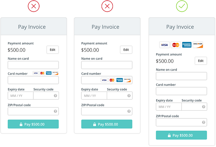
But, where do you place the logos on a web form? At first we tried to place them above the card number field. This placement reduces the height of the form, but the cards are small and look squished. Another option was to place them inside the input. This almost worked, but because we have a narrow input field, the cards took up too much space, overpowering the input. We decided to place the credit card logos at the top of the form. This placement makes them immediately visible, because they are the first element a user has to parse visually. The user doesn’t have to search for them. And they promptly call attention to themselves with a “this is where you pay” message. We felt the logos alone were sufficient, so we did not add labels for “Cards accepted”, or “Pay with”.
2. DECIDING HOW MUCH TO PAY
One requirement we had to satisfy was allowing the user to decide how much to pay. For large invoices, a customer may need to make a partial payment (e.g. a deposit), or pay the invoice with multiple payments as the work is completed. By default, the payment amount equals the total unpaid invoice amount. In other words, if a partial payment has been made, the payment amount equals the balance owed.
With web forms, we know that more inputs lead to lower completion rates, and higher bounce rates. To reduce the number of inputs, we show the payment amount in a read-only format, with a button to edit it, instead of displaying the text input by default. In edit mode, we considered having a Save or Done button, that would flip the input back to read-only. But we felt this was unnecessary, since the amount is already visible inside the input. Also, if the customer wanted to edit the amount again, they could simply change the input value, without having to deal with Edit/Done buttons.
We also wanted to confirm the payment amount when the user is ready to submit the form. A confirmation reassures the user of the amount that will be charged to their credit card. We display the payment amount inside the Pay button, at the bottom of the form. This amount updates synchronously with the amount entered in the payment amount input.

3. NAME ON CARD
The next thing we ask the user to provide is the name of the credit card owner. We considered several options for the label text:
- Name of card holder
- Card holder name
- Name on card
- Name (as it appears on your card)
- Full name on card
We felt that Name on card was the shortest and clearest way to ask for this input. This asks the user to simply type exactly what’s displayed on the card, instead of thinking about the card owner’s full or abbreviated name.
4. CARD NUMBER
When reaching the card number input, a common question that a user asks is: “My card number has spaces. Do I enter my card number with spaces, or without?” To solve for this, we limit the input values to numbers only, so 0–9. So if a user types a space, it does not register and it does not affect the number format.
At first, we wanted to mask the card number when the user leaves the input. This was an attempt to provide the user with a sense of security, similar to how password fields are masked. But we realized that the credit card number is not a “secret”. You can’t do much with just a card number. Furthermore, when a user is ready to submit the form, they may want to double-check their inputs for accuracy. A masked field would break the visual review of the form because the user would have to put the focus back on the card input to reveal its value.
5. CARD TYPE BEING USED
A helpful pattern we noticed in other payment forms is to indicate the card type being used in a visual way. This reassures the user that the card type input matches the card they are holding in their hand. We can determine the card type from the starting first number, as follows:
- 3 — Travel/entertainment cards (e.g. American Express and Diners Club)
- 4 — Visa
- 5 — MasterCard
- 6 — Discover Card
After the user enters the first two numbers, we display a card logo inside the input field, floated to the right.
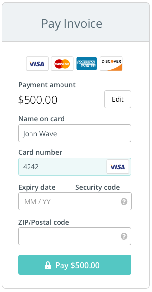
Of course, we could’ve done this differently, based on our designs from question 1:
- Dim out the credit card logos at the top of the form. But because the logos are placed away from the number input, the correlation would not be clear.
- Place all the credit card logos inside the number input by default, then as the user types in the first two numbers, all the card logos disappears except for the one that corresponds to the input.
6. EXPIRY DATE
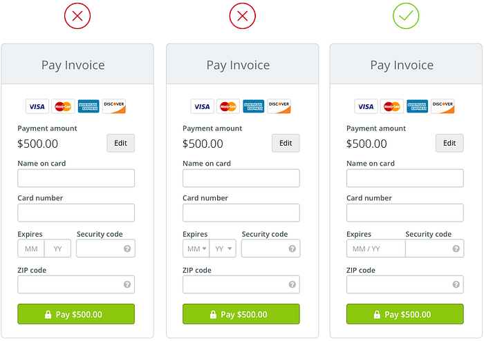
Most credit cards display their expiry dates in the format MM/YY (month and year). Some may include the full year, in an YYYY format. When designing the expiry date input, we wanted to keep the user in typing mode to speed their input. The user does not have to reach for a mouse to pick a date and year from a select menu, or navigate the options via up/down arrows. The user simply has to type in the numbers as they appear on the credit card. This also prevents the user from having to think of the actual month (e.g. 08 is August), so cognitive load is minimized.
Because this input requires a particular format for the date, we included placeholder text inside the input. Note that the placeholder text includes a “/”, but this is not required to be typed by the user. We limit the input value to numbers only, so if a user does type a forward slash, it is not registered. After the month is entered, the slash is automatically appended.
7. SECURITY CODE
The card security code was invented to reduce credit card fraud. In other words, it’s meant to make cards more secure. The problem is that this code suffers severely from non-standardized naming. What should we call it? Every card brand has its own naming convention:
- MasterCard — card validation code (“CVC2”)
- Visa — card verification value (“CVV2”)
- Discover — card identification number (“CID”)
- American Express — “CID” or “unique card code”
- Debit Card — “CSC” or “card security code”
And there are even more permutations:
- Card verification data
- Card verification number
- Card verification code
- Card code verification
Nuts, right? Acronyms create confusion. We wanted to stay away from them, but still indicate to the user that this code is all about security. So we decided to name this input “Security code”.
Next, a security code can be 4 digits (American Express, on the front of the card) or 3 digits (every other brand, on the back of the card). To help the user determine which code they need to enter, and where to find it, we included a visual tooltip. The tooltip has 3 states:
- Dual code: If the user has not yet entered a card number, the tooltip shows both options available.
- 4-digit code: If the user has entered an American Express card, the tooltip indicates a 4-digit code on the front.
- 3-digit code: If the user has entered any other card, the tooltip indicates a 3-digit code on the back.

8. ZIP CODE
As an extra security measure, we have to ask customers for the ZIP code associated with their card. There is a trade-off here: adding extra inputs to the form can increase bounce rates, but by adding it, our business is more secure and less prone to fraud.
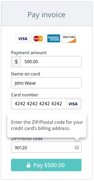
We realized that users may enter the ZIP code associated with their personal address, instead of the code associated with their cards. To add clarity, we added a note in a tooltip, which asks for the code from the credit’s card billing address.
US zip codes contain only numbers, up to a maximum of 10 (ZIP + 4 FTW). In Canada, zip codes contain letters, and spaces too. We restricted the input field to a max character count of 10.
And because we had to satisfy naming conventions for both US and Canadian customers, the input label reads “ZIP/Postal code”.
9. IS THIS FORM SAFE AND SECURE?
When a user first skims a credit card form, they often ask themselves “Is this form secure? How do I trust the website behind this form? Are they just spoofing my card details?”. There are many ways you can reinforce security through design. Some options we considered included:
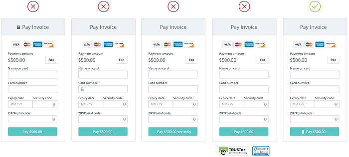
- Place a lock icon inside the form header, next to “Pay Invoice”, but this felt weak and disconnected from the form inputs.
- Place a lock icon inside the card number field, but the question became “Is only this input secure, or is the entire form secure?”.
- Label the Pay button with text “Pay $1.00 securely”, but the text would not fit for large payment amounts.
- Add a security badge below the form, but we felt badges distract from a clean aesthetic, and from the overall brand of the page. Also, users can’t tell two badges apart, so we scrapped the idea. Previous A/B tests also indicated no difference in conversion.
Given the existing mental model of paying with credit cards online, we felt the presence of one lock icon was sufficient. The design solution was to add a lock icon inside the Pay button. The position of the icon is key, because it reinforces security at the critical point: when you click Pay.
10. WHAT HAPPENS WHEN I CLICK PAY?
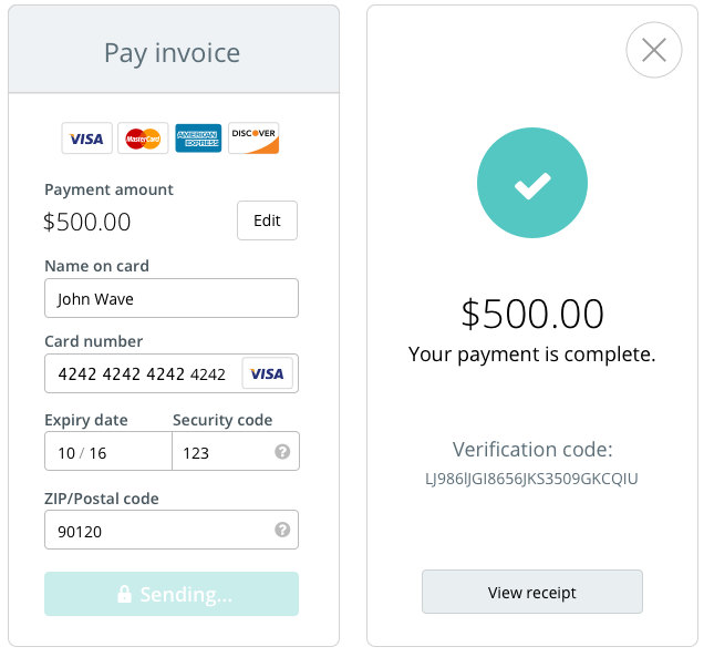
Once the user is ready to pay, they click the Pay button. The button changes state to a pending/loading state, and the text reads “Sending…”. We make a server request, and assuming an error-free state, we display a success message.
11. HANDLING CARD ERRORS
One of the most important, and often unloved parts of web form design, is error handling. Yes, it can be tedious at times. Yes, there are endless ways to design errors. But when done right, error handling can turn an ambiguous interaction into a clear one.
There are two general categories of error validation in Internet software: (1) client-side and (2) server-side.
Client-side validation
Client-side errors are caught before a request is sent to to the server. These errors are typically caused by formatting errors in the data, or missing data.
To make things interesting, you can validate client-side input in different ways. Luckily, Luke Wroblewski wrote a great article explaining the After, While, and Before and While validation methods. We chose the After method based on Luke’s research, and our gut feelings. The After method displays an error message after the user has indicated that she is done answering a question by moving on to the next one. In other words, validating on “blur”. Also to keep in mind, the user is not “locked” into a field if there is an error. They can tab on their keyboard and move to the next input, and come back later to fix any errors shown.
These were our validation criteria for client-side errors:
- All inputs, except Name on card and ZIP code, must contain numbers only (i.e. no letters or special characters)
- Payment amount: Must be minimum $1
- Card number: Length must be 16 numbers (15 for American Express), must begin with one of the four known card codes
- Expiry date: Length must be 2 numbers for month, and 2 for the year (i.e. MMYY). Month can only be 01 to 12, year must be minimum 15.
- Security code: Length must be 4 numbers if American Express, or 3 numbers for other card brands
- ZIP code: Length must be minimum 5 characters, maximum 10 characters
To visually indicate an error, we highlight the input field containing the error with red background and red border. We don’t make the input text red. As for the error hint, we display it below the error field, in red text.

Server-side validation
Server-side errors are caught after a request is sent to the server. They can be system-specific, or specific to the object being validated. In our form, we had to account for three types of server errors:
- Invalid data, including card number, expiry date, security code, or ZIP code (e.g. expired card, invalid postal code)
- System errors, for when there is a problem with the server (e.g. timeouts, lost connection)
- Card errors, for when the card being used has been declined by the payment network for some reason (and there are literally hundreds of reasons)
In the case of a system error, we leave the fields populated so that a user can retry the payment. When a card is declined (i.e. card error), this is usually a smell for fraud, so we clear the data entered by the user.

12. DESIGNING FOR DIFFERENT SCREENS
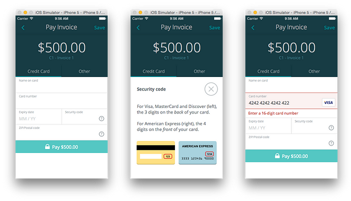
From the start, we knew that we wanted to build one form that could be used on different screen sizes (i.e. responsive), and different screens (i.e. inside the Wave iPhone app). By using a singular form object, we only have to make changes to the form in one place. We don’t have to maintain multiple code bases.
Inside the Invoice by Wave iPhone app, we initially implemented a native credit card form, that was based on the single line input design pattern. The input was functional, but slightly buggy. More importantly, we perceived a poor experience with the way this input display labels, and the way a user has to navigate between inputs if there are errors present.
Now, using an HTML iFrame, we inject the new credit card form inside the app. Users have a near identical payment experience when entering their credit card details on a desktop browser, or inside the app. In the future, inside our iPhone app, we will style the form elements using CSS to match the design of other forms inside the app.
And there you have it, the anatomy of a credit card form! We’ve reviewed everything from copy, form input design, error handling, and mobile. Our credit card form will definitely evolve over time, so stay tuned for news. The payments space is not exactly sexy, but learning and understanding the user interactions behind accepting a credit card payment was really fun.
Now, time for a demo!
Huge thanks to Nick Presta, who engineered the entire form in React (woot!), and the rest of the awesome Payments crew at Wave.
This post was originally posted on my personal website. Thanks for reading.

