The art of the usability audit
We like usability audits a lot. They’re a great way to dive into a new project, understand previous design efforts, identify areas for improvement, and prioritize usability efforts. Here’s how to make the most of an audit and present the results in a way that leads to productive conversations.

A quick introduction to audits
An audit is not synonymous with “tell me everything I did wrong” — that’s a good way to alienate everyone in the room. It’s an opportunity to collaboratively decide how to implement best practices in a way that works best for your product. This article focuses specifically on usability audits with UX professionals, also referred to as heuristic evaluations, and not user research. Usability audits are evaluated against usability heuristics (which are agreed upon industry best practices or company specific usability standards) whereas user research includes testing with actual people to evaluate the product.
Audits are a good way to evaluate the general usability and overall consistency of a system which is why we use them at the beginning of design efforts — audits should not take the place of user research.

Our Process
At Purpose UX, we work with complex web applications and therefore spend a lot of time evaluating UI consistency, visual hierarchy, and complicated workflows. For us, audits are a product “meet and greet” of sorts. We walk through the product with stakeholders and ask specific questions about context of use, target audience, and implementation constraints. After the walkthrough, we grab our adapted version of Nielsen and Norman’s Ten Usability Heuristics (our adapted version) the stakeholder’s product goals, and dive head first into the application.
An audit is not synonymous with “tell me everything I did wrong”. It’s an opportunity to collaboratively decide how to implement best practices in a way that works best for your product.
We tweak the deliverable depending on our client and their goals, but here’s the basic formula we always follow.
Share the Process and Set the Stage
Since an audit is a design critique of existing work, it’s important to build trust and create a collaborative environment. We always schedule at least an hour with our stakeholders to present the findings so we have enough time to engage in productive conversations with the team and allow for any and all questions.
At the beginning of the audit presentation, we give a one slide overview of our process. We use this opportunity to let everyone know the recommendations are based directly on the team’s business goals and standard wide usability metrics. This lets stakeholders know we’ve kept their goals in mind and adds authority to the recommendations. To prevent people from skipping over process and audit goals we wait until after the meeting is over to share the presentation deck.
Focus on Larger Usability Patterns
When we perform an audit, we go through the product one screen at a time annotating areas where the workflow breaks down, is confusing or inefficient. We typically end up with 100 or so annotated screens from the application which can get overwhelming fast. It’s at this point that we go back through the screen annotations and begin grouping similar issues together. This allows us to spot larger patterns.

This exercise offers a picture of overall system usability. It also makes prioritizing recommendations easier. During the presentation we don’t highlight single screen usability problems (unless there’s a critical issue). Instead, we include each annotated screen in chronological order at the end of the presentation deck for those who want a screen by screen play.
Focusing on patterns keeps people from feeling bogged down by mistakes and instead allows people to question why these patterns exist in the first place. Have the product goals changed? Do we need a new design system? Are we allocating money to the right area for development?
Show and Tell
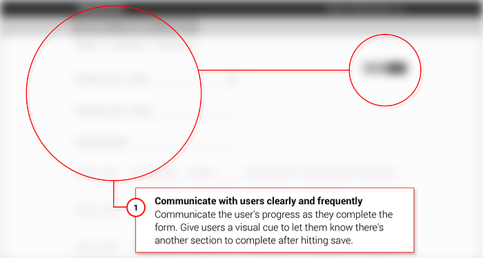
When we present the findings, we show a screenshot(s) with:
- the issue we are discussing circled in red
- its relevant usability heuristic in bold
- an application specific recommendation
This keeps everyone on the same page and cuts down on the “it’s- the-button-on-the-top-right-of-each-form-when-you’re-filling-out-insurance-document-A — it-says-save-you-know-the-one-I’m-talking-about?” kind of talk. To keep it simple, we created a version of Nielsen Norman’s Ten Usability Heuristics sans design jargon so they’re more accessible to everyone.
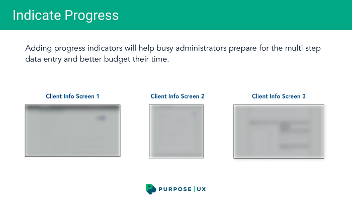
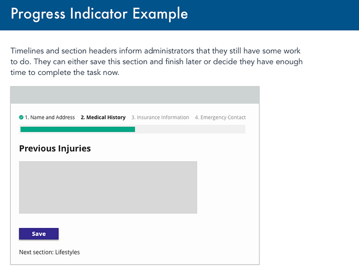
For concepts that are more difficult to visualize, such as ‘visual cue’, we include a low fidelity example of the recommendation along with a brief summary.
Start with Verbs
An easy way to strike the right tone and make the audit actionable is to start every recommendation with a verb. Verbs make the deliverable read like a helpful usability companion rather than a know it all designer screaming “thou shalt not”. Here’s an example:
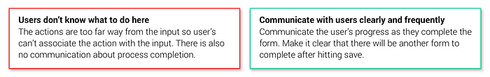
Using verbs switches the focus on moving forward rather than on what was done incorrectly. In general, people want to follow best practices but may not know what they are — that’s why they’ve come to you.
On this note, don’t forget to call out positive impressions of the product as well. Anyone that’s ever sat in a design critique (or any critique) knows how difficult it is to watch their work examined with a fine toothed comb. Highlighting positive existing features acknowledges the work put into the product and maintains a collaborative tone.
End with a Clear Direction
As with any presentation the conclusion should summarize the audit’s main findings and recommendations for how to move forward. We typically restate the goal of the audit and then order our recommendations by priority. Our conclusion slide ends with something like this:
To increase efficiency for office administrators, we recommend:
- Simplifying screen headers into one comprehensive menu bar based on workflows
- Using type ahead search to replace complex filters on patient and account lists
- Communicating administrator’s progress during data entry and form completion
Conclusion
Audits only work their magic when the results are communicated clearly and productively. It can be easy to get bogged down by mistakes and miss the forest for the trees but implementing a few key principles should improve the overall effectiveness of the audit deliverable.
In this article, we focused on presenting your results, but there are a lot of great articles about performing usability audits (here’s a beginners guide, and this one is about who needs an audit, and this one about heuristic evaluations) which we highly recommend checking out.
In the meantime, happy auditing!