Member-only story
The beautiful game of football team crest redesigns
What can you learn from these redesigns?
Football (hey 🌍) or soccer (sup 🇺🇸) — is the worlds’ most played sport. All you need is a ball, 4 shirts to mark the goal posts and you’re good to go. Maybe because football is so popular, many teams opt to redesign their teams crest into a more global logo.
With mixed results.
1 | The army of crests that are just initials or capital letters
For a personal brand, a freelance, a small agency, logo’s with just a word mark or their initials can work fine. The main selling point of these businesses is their name and the people, so it makes sense.
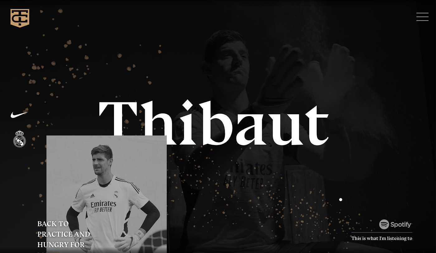
In football, CR7 is widely known to be Cristiano Ronaldo 7 (his favo kit number) personal brand. Another example is Belgian Goalie Thibaut Courtois, who has an immaculate website and equally rad looking logo.
However, this typed of branding for an entire team doesn’t really work the same way. The logo mark and the word mark should be able to be used separately. In practice however, alot of teams still use this Initials concept;
Initial from Italy
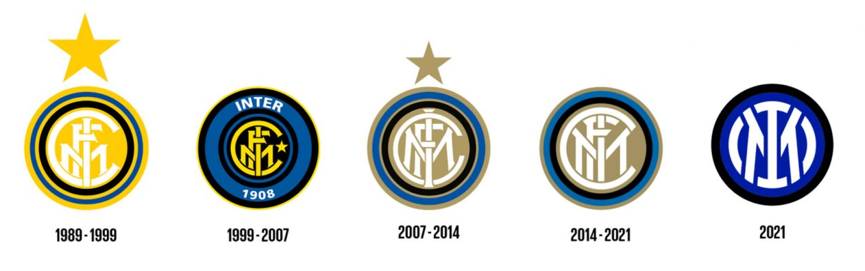
Inter Milan 🇮🇹 has used the initials since a fairly long time, and they did a slick redesign to simplify the logo in 2021. The new icon has less colours and dropped the FC as letters. It’s balanced, incremental and bold.
You can take it too far however. IMFC’s rivals from Turin, Juventus, took the idea and ran with it.
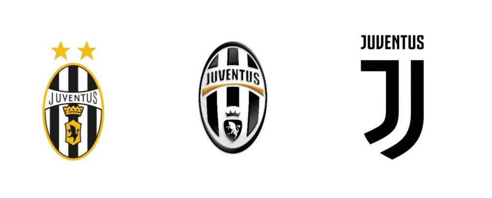
Their logo was changed into an extremely simple letter J, going against the clubs’ history of over 100 years of using a bull, black and white stripes and an oval shaped crest. Fans were not amused.
A couple of things make this logo difficult to work:
- Lack of historical value (football clubs have a rich…