The biggest UX flaw in PlayStation 5
Sometimes it is so easy to get ahead of ourselves and ignore the obvious details of a product. One such example is that of the newly released PlayStation 5. Since the release, many users have reported the problem of their disc drive not working. Guess why? They have been inserting the disc in the wrong direction! Giving them a mini heart attack, thinking that they have a bad unit or disc.
And I am not making these up; there are legit Reddit threads to this.
Of course, we can blame the user for not going reading the manual thoroughly, but according to the first rule of UX design, “it’s never the user’s fault.” So being a designer, let’s break down this problem —
The New Design
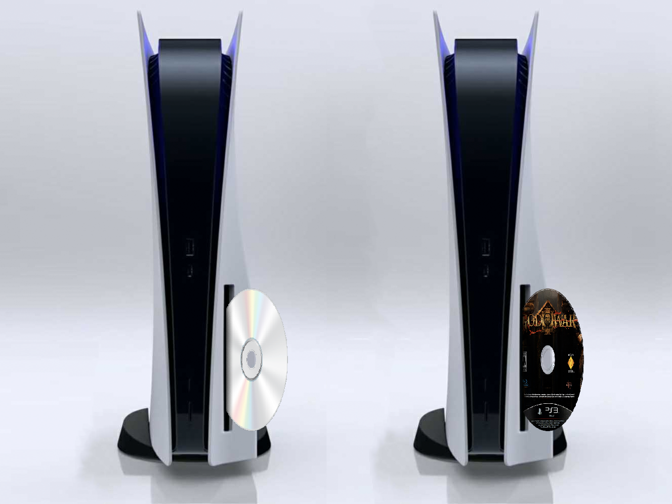
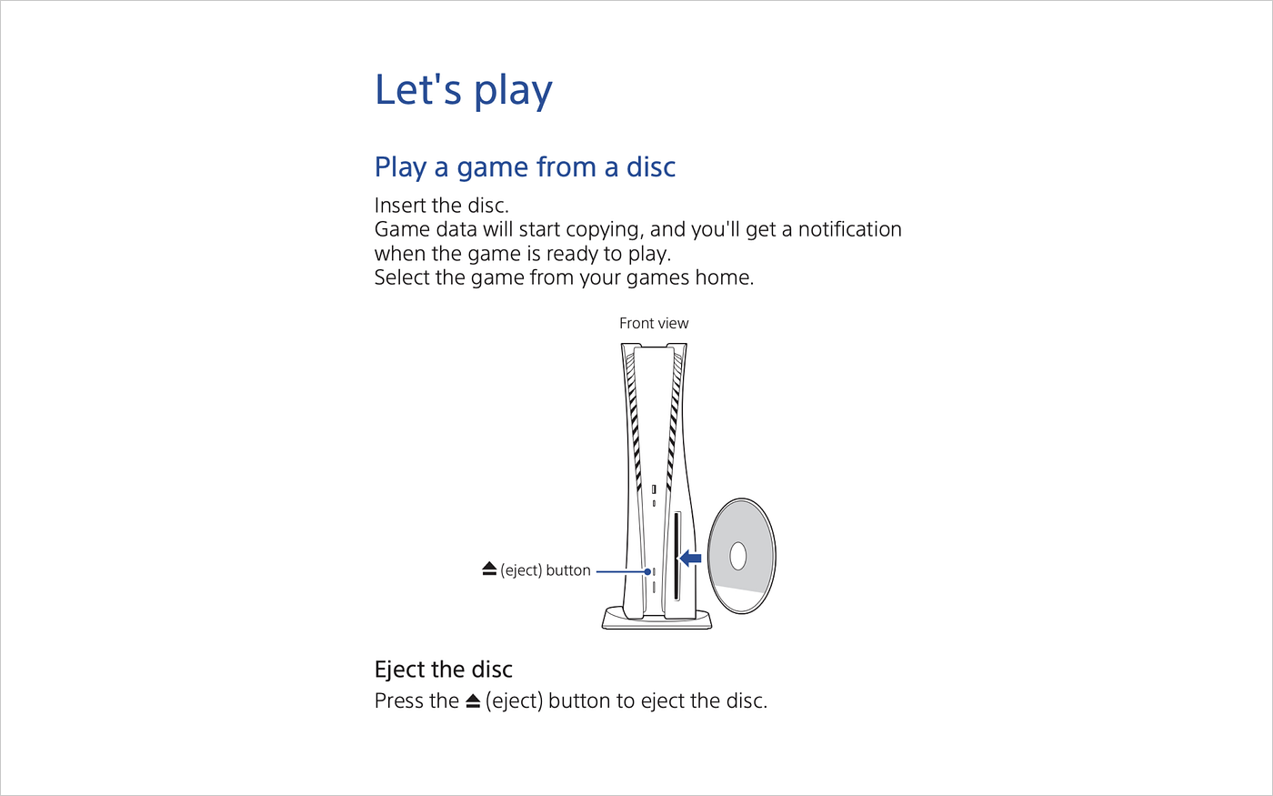
The new vertical orientation looks damn nice, but it changes everything. The disc driver used to be at the top of the device until now (PlayStation 1, 2, 3 & 4), making it clear that the disc has to be inserted with the shiny side towards the system. But with PS5, the horizontal orientation (which is also not clear) is:

Bringing the disc driver at the bottom of the device. This is a shift from the design language which was used previously. It is different from what the users were doing until now, and they will have to relearn the process. Moreover, it feels sort of unnatural that the shiny side is facing away from the system.
If you have read Design of Everyday Things by Don Norman, there are a few fundamental things wrong here:
Affordance
The design of PS 1, 2 & 3 had visual affordance with the tray coming out or the tray components being visible. This is entirely hidden in PS5 in the name of aesthetics.


Consistency
The PS4 mostly stayed horizontal with the disc drive at the top (just like previous consoles) and the disc being inserted with the shiny part towards the system. PS5 broke this consistency with the new vertical design.
All of this combined leads the user to a major “Uh Oh” moment instead of the “Aha” moment.
Yes, they have mentioned the right way to insert disc in their user manual (which is shiny side away from the system); we can give points for that. But honestly, who would read a manual if your device is meant to be plug-and-play?
Solution
Here is how I think it could be improved —
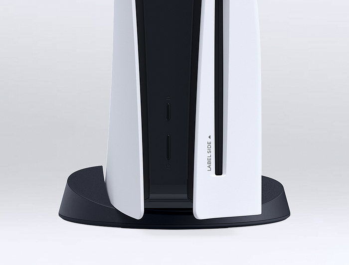
A simple label next to the disc drive just like the ones on USB and HDMI to indicate which way it is meant to be inserted. It doesn’t have to be in black, it could be some grey shade or just embossed on to the plastic to maintain the look. What do you think? What could be another solution? Let me know in the comments below.
The aesthetics of PlayStation 5 look stunning 🔥 , but yet again, it all boils down to form over functionality… So remember, each and every detail is important. What may be obvious to you as a designer could be something entirely new to your audience.
PS. I don’t actually own a PS5 device; all this is from my research over the internet.

