Minimalism in UX: the blessing of no choices
How minimum choices enhance users’ peace of mind.
One day, just like a thousand other ordinary days, I was at home, overwhelmed by the countless external (mostly digital) distractions and, equally my internal distractions (thoughts about my pending tasks, long-term and short-term goals, open/unfinished projects, activities that I want to do, books I want to read, things that I [think I] need to buy, skills that I want to learn and so on). A lot can be said and has already been said about the paralyzing effect of this situation (the work of existentialist philosophers of the 20th century being probably the most important and The Paradox of choice a more popular read). The choices are so many that the decision to pick one (the optimal), becomes unmanageably hard. And even when a choice is made, second thoughts and doubts about whether it was the best, linger in the background, slowly consuming brain energy and peace of mind.
But at some point that day, something magical happened. A blackout… The electricity went away, and along with it, the internet.
I suddenly felt my head clearing out, like a Shaolin after meditation. With lucidity and bold certainty, I laid on my couch, grabbed my book and started reading in peace. And I thought to myself: What a blessing it is, not to have choices…
Part 1: Imaginary friend
In the solitude of the offline world and since I brought that Shaolin up, I’ll take the opportunity and keep him a little longer, just to ask him the question that I’m sure was just born in everyone’s mind:
“Why did I get that curious feeling, my Shaolin friend?”, I imagine asking.
“Because, my dear UX friend, mindful awareness of whatever you might be doing, which needs skillful concentration, leads to happiness.”
“I see. But how much concentration can we really keep in this modern flurry of distractions?”
“Well, for me, life in the monastery is calm and simple. Maybe you should find a way to change your environment, change your mind or both”, he says slowly and peacefully.
“How can I change any of these?”, I ask hesitantly.
“I’m afraid I can’t help you with that. But if there is one piece of advice to start with, it would be to find the root of the problem. Now, if you’ll excuse me, I think I’ll be on my way back to the monastery. You are welcome to join me if you want.”
“I… What if I’m not ready for that?”, I whisper. But my imaginary friend is already gone.
Part 2: Epiphany
So, for all of you who are not ready either, I’ll attempt to provide some answers. First, let me clarify a little bit of my rhetorical question. This “modern flurry of distractions” involves of course the obvious external technological distractions that I mentioned in the beginning. But interestingly it goes deeper than that. In a very indirect and sneaky way, technology has an impact on our internal distractions (i.e. thoughts), as well. Not through bionic neurons or implanted microchips (at least that’s not what I had in mind), but simply through the ever-present accessible choices that it lavishly offers. It’s not that after the blackout, all my pending tasks and loose ends suddenly ceased to exist, or that similar distractions didn’t exist 50 years ago. They just weren’t within immediate reach. And that’s enough for our mind to let them go in the present moment.
The internet has brought all these choices 24/7 at the tip of our fingers, and the price that we have to pay for the amazing convenience and flexibility that this entails is some of our tranquility and maybe in the end some part of our happiness; through higher levels of stress (1, 2, 3), lower productivity (4, 5) and lower sense of achievement. Because while being surrounded by devices connected to the internet, we subconsciously know that we have countless choices every single moment, and while having this knowledge, our mind cannot totally stop from processing and evaluating these options.
These changes in our daily lives have been rapid and 300,000 years of homo sapiens evolution cannot be overridden that easily. In the book “The Organized Mind”, McGill University neuroscientist Daniel J. Levitin says that “our brains evolved to focus on one thing at a time.” One reason is that, like all animals, we evolved to switch attention instantly when we sense danger, so that we can immediately defend ourselves. My point here is that unless our brains significantly evolve from their current state, we cannot be fulfilled and happy in such overdistractive environments.
Ok, I hope the Shaolin would be proud of me now.
Part 3: Slowly getting to the point
So even if we don’t realize it, we desperately need some hedge against this overstimulation. Our mind has a desperate need to free up some of its computational resources by reducing the things that it has to process. Our eyes have a desperate need to rest on plain and clean visuals, whether they are aesthetic, functional, or both.
This principle of simplicity can (and often should) be applied to every product of human civilization. But since “human civilization” sounds like a slightly broad term, and since roughly half of our waking hours are being spent in front of some digital media (and the numbers are ever growing), let me reposition the above statement into a more UX-specific frame: Our digital consumer eyes have a desperate need to find comfort on plain and straightforward User Interfaces, which obviously still maintain their functional role. Unfortunately, there is no formula to achieve this crucial balance. It takes intuition/experience and a lot of user testing to identify the amount of options that are not as many as to create confusion, and not as few as to seriously limit the tool’s capabilities; and the graphical elements that are not as busy as to distract, and not as poor as to be visually displeasing.
With the inevitable lack of formula in mind, below I attempt to put together some practices that can hopefully bring the above abstract principle of simplicity, down to a more applied level:
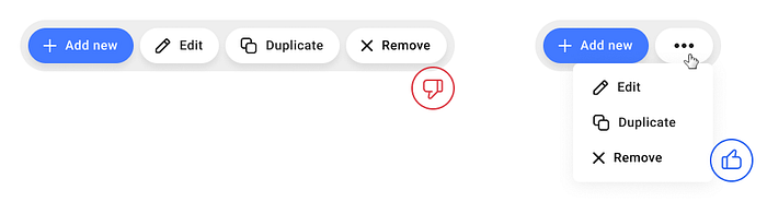
- Offer few choices, at least on the first level of the UI hierarchy. Try to expose only the primary and more frequently used functionality on the main screen of the digital product. Further options can still be available but placed in submenus and secondary screens. This way you reduce the cognitive load for the user, as they wouldn’t have to process UI elements which in most cases they do not intend to use.
- Keep a fair amount of empty spaces. Don’t be afraid of rich paddings. Absence gives value to presence, so empty space gives prominence to the elements that it surrounds. This will improve legibility and make elements with lots of info, less overwhelming.
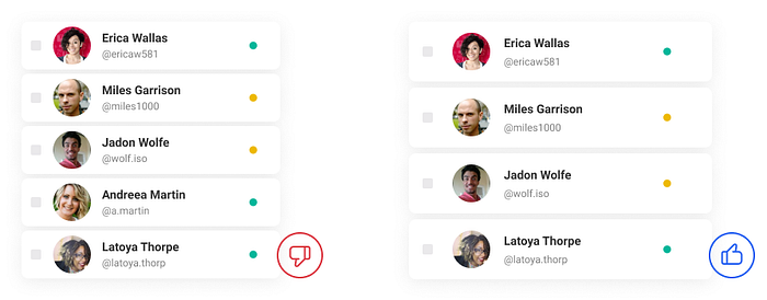
- Avoid having many borderlines (whether they are strokes or edges between shapes of different fill colors). This will make your design look cleaner and the separation between groups of elements more obvious.
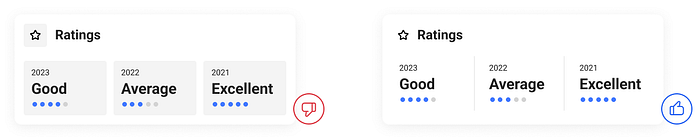
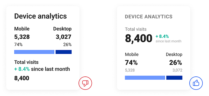
- Invest time in information architecture. Evaluate the significance of each piece of info you design. Make good use of the elements’ positions, opacities and font sizes/weights so that they suggest these hierarchies. The goal is that the user’s eye is directed to the important things first.
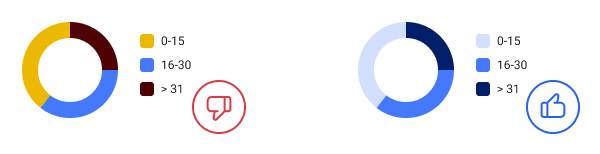
- Keep your color palettes poor. If you need an extra color, prefer to introduce a new shade/tint of an existing color over a completely new hue. This way you will achieve a more unified GUI which is less distractive, while maintaining a better visual consistency and elegance.
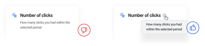
- Try to reduce text. Use tooltips for extra info instead of exposing it by default. Also consider avoiding text when it’s obvious or implicit by a web/UI convention (e.g. the magnifying glass icon).

- And finally, avoid providing alternative paths/flows for the same action. Different paths imply different actions. By eliminating this, you save the user from the uncertainty of whether the path they are choosing is the correct one.
Of course, minimal Design is not the answer to everything. There is always going to be room for maximalist eye pleasures and rich visuals/UIs too, and that is absolutely fine. Before applying any minimalist practices, you should consider the use context of the specific digital product. Is its primary purpose efficiency rather than amusement? Is it more professional rather than personal? Is it going to be used mostly in an already busy environment? If the answers to the above questions are no, then you most probably shouldn’t go with minimalism. But if it’s yes, then my UX Designer friend, this is your chance to contribute to your fellow humans’ serenity.
Epilogue
Eventually, electricity returned that day, bringing back all of its overwhelming consequences. And as the internet starts flowing back into my brain neurons, I take a moment to appreciate the absence of choices. As it fades away I can clearly see minimalism lifting a heavy mental burden from the user, letting them focus on the few choices that they have. And if those few ones can cover their needs satisfactorily, then they need no more. I can clearly see it making every decision easier, giving users the confidence and certainty that they are doing things right, giving them back their peace of mind, as if they had followed that Shaolin.
References
- Barry Schwartz — The paradox of choice | TED talk
- Daniel Levitin — Thinking Straight in an Age of Information Overload | Talks at Google
- Deborah Monroe — This Is Your Brain on Technology: The Distraction Epidemic
- Team Codesign — Understanding Minimalism: Why less is more in UX Design?
- Inês Bernardino — A guide to minimalist design
- Nick Babich — Best Practices for Minimalist Design
- Quickmark — Minimal UI for maximum impact

