DESIGN
The blurry-eye test
This little tip will help you to communicate more clearly in your designs

The visual clarity of structure or intent of the screen you’re designing, is a very easy thing to overlook. This has become particularly relevant recently, given the popularity of subtlety in design.
I have a quick test I recommend when giving advice to designers. It’s quite simple. Blur your eyes so that you can’t see what’s written on the screen.
Is it still possible to understand what the screen is trying to demonstrate?
What does the screen need to demonstrate?
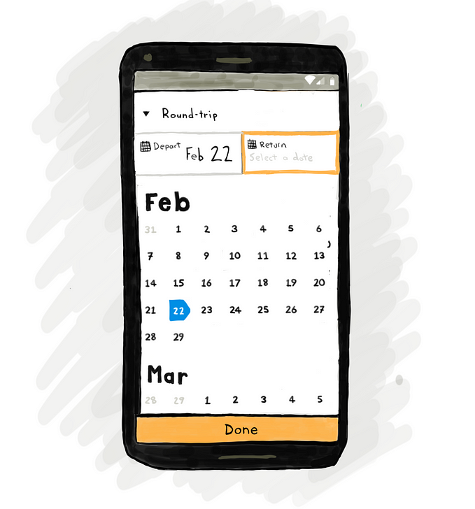
Structure
Is the structure of information clear when you blur your eyes? Do parent and child elements appear as such when you’re not focusing on the text?

You can see above that even when you can’t read any of the text, the structure of the information is still evident
Importance
Is it clear what the most important thing on the screen is? Or is that competing visually with secondary and tertiary elements?
Some screens need to support a single task over any other. When this is the case, it should be possible to begin that task without needing to even read. When you blur your eyes and look at a design you can quickly see if this is possible.

Choice
If the primary purpose of the screen is to present a number of choices, is it clear there is choice? Is it clear how many choices there are?
You can be confident the choices a screen is trying to communicate are clear when they are obvious when the screen is blurred.

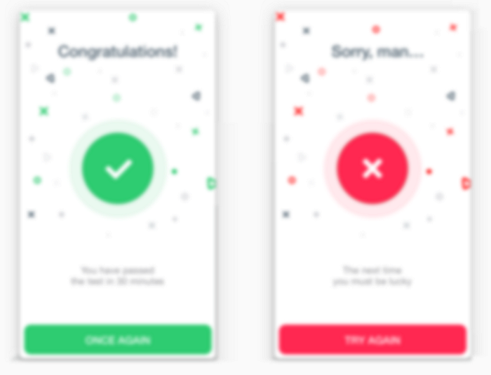
Success and failure
Did the thing the user was trying to do work or not? Communicating the answer is often not a moment for subtlety.
If your screen’s main purpose is to provide the answer to that question then someone with red/green colour-blindness should be able to tell without reading any words.
Don’t make me think!
If users need to read the actual content in order to understand the design then that design is often making the user work too hard.
Read some other stuff I wrote
If you liked this post then read some more…
Design
- The UX of stamping loyalty cards
- When Share really means Send
- Design guidelines for mobile date-pickers
- Getting real about delightful design
User research
- Cognitive interviews for user research
- Moderating user research with Zoom
- Communicating UX issues with comics
- Understanding sampling bias
- Usability test tasks to avoid
Product management