The bulk experience: exploring multi-select and bulk actions
Designing for enterprise often involves ideating solutions for data-heavy content, and in an industry where expediency and ease-of-use are a driving force behind success, our users are often intent on accessing, manipulating, and taking action on multiple items at once, or, bulk action.
During a recent design sprint for a consultancy client, our design exploration led us to examine 3 distinct takes on multi-select and bulk action. The following is a brief look at some of the key differences and take aways from each of these examples.
1. Checkboxes with Sticky Toolbar (Gmail)
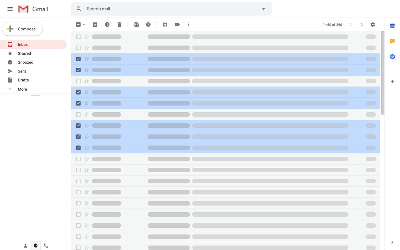
The most direct and accessible option of them all. The Gmail model employs distinct checkboxes and action buttons readily available to the user.
Pros:
- Extremely obvious and readily accessible
- Works well on desktop and mobile when hover is not available
- Includes “Select All” and other options upfront (although this works best and is most apparent when the content is displayed in list format)
Cons:
- From a visual perspective, the repetitive icons can look a bit cluttered
- If space is a concern (and it often is), the extra icons can take up some valuable screen real estate
2. Shift/Alt + click; right-click (G Drive)
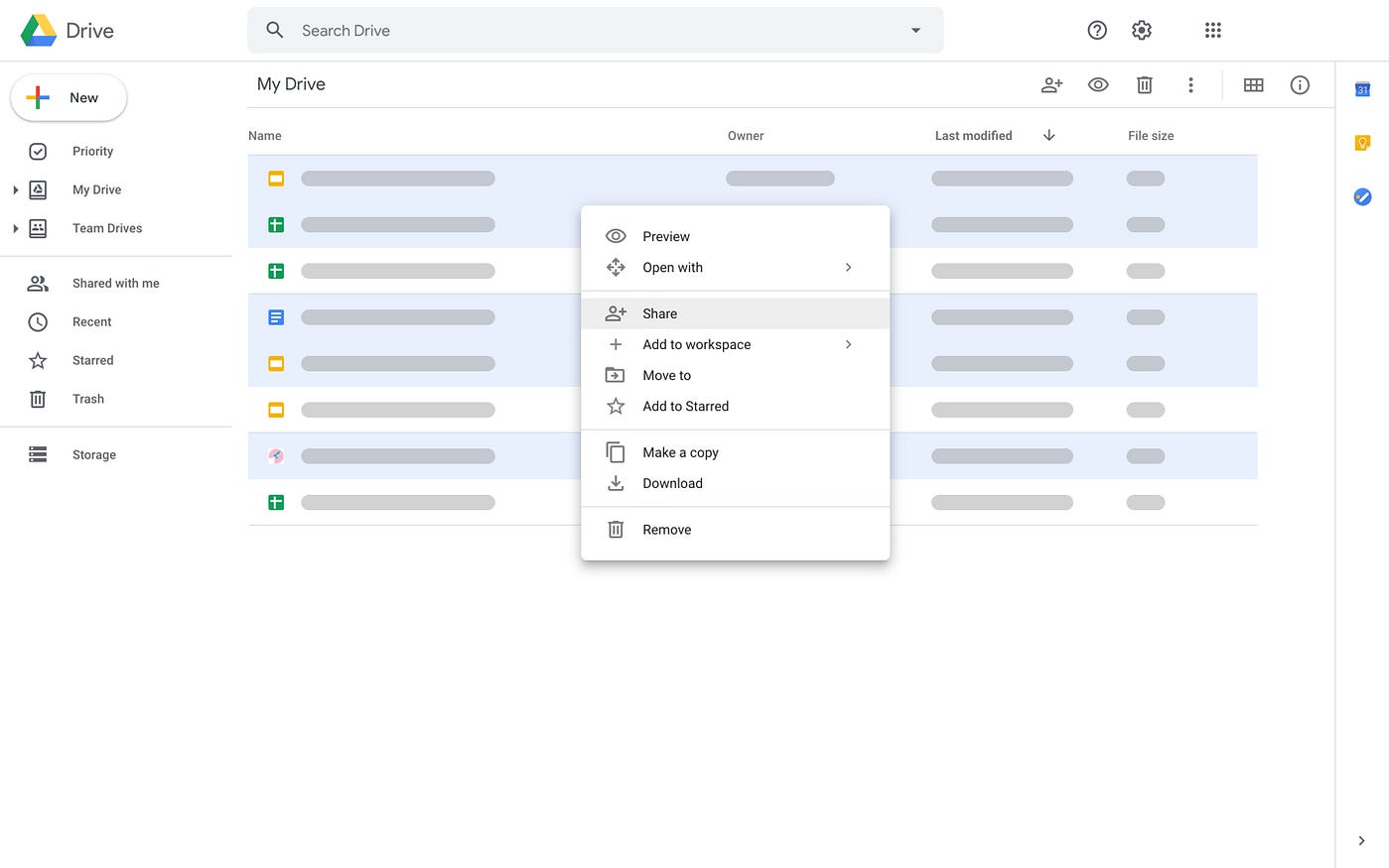
Google Drive goes to the other extreme in comparison to its email companion. Arguably the least accessible of the three, bulk action in G Drive relies heavily on interaction conventions (albeit well adopted conventions) in that the user is required to shift-click to select, and then right-click to take action on the selected items.
In this model both the select function and the action functions are completely hidden. The onus is on the user to know that these functions exist, and how to access these functions. Many software interfaces also rely heavily on this pattern (e.g. layers in sketch or adobe software). While this model does look cleaner and will inevitable save space, it lacks clear affordances. One major drawback in this model is that without clear checkboxes, the shift-click/right-click action is impossible to complete on mobile or tablet unless substituted with a different gesture (e.g. double-tap or 3D touch in iOS).
Pros:
- Minimal design
- Space saving
- Utilizes well-adopted interaction conventions
- Works well for both list or grid items
Cons:
- Select and action functionality is always hidden
- Requires inherent knowledge of action steps
- Does not work on mobile unless executed with a different gesture like double tap or 3D Touch on iOS
3. Hover: The 2-Step Solution (Invision)


In an effort to make the best of both worlds, the InVision example relies on a hover function to save space and signify “selectibility”, and a separate “select mode” once one item has been selected. Both select and action functions are initially hidden thus saving space and creating minimal design, but become readily available once the user enters “select mode” creating clear affordances and accessibility. However, the drawback of a feature based on hover is the limitations on mobile or tablet devices.
Pros:
- A 2 step solution offers clean design and intuitive functionality.
Cons:
- “Select All” and other select options are only available once user selects at least one item.
- Limited to devices where hover is an option.
What do use when
There is no one correct way. We cannot apply blanket rules across all design, but we can learn as much as possible about what has been done in the past, and what conventions already exist.
As designers, it is our duty to examine each instance, understand the business constraints, understand our users, their workflows, and the environments they work in, and create intuitive experiences appropriate for each individual scenario.

