The Daily UX Writing Challenge — fun facts, less friction.

I was already midway through a UX writing course when I came across The Daily UX Writing Challenge, and so, naturally, I couldn’t pass up the opportunity to put some theory into practice.
What I experienced soon became more than just a learning exercise. Every morning was filled with the excitement of opening up a new writing challenge, the chance to create something, and to dive into a new topic.
I love what is involved as a UX writer — the art of finding the exact words to complete the design of an interface and to create a frictionless experience for the user. You could say that the DUXW Challenge creates a similar experience — helping you become more proficient as you move through each task with increasing knowledge and confidence.
Put it this way — there was more friction involved creating multiple versions on day one than there was confidently compiling an onboarding process for the big content challenge at the end!
So, I thought I would document my journey and provide some of the fun facts I learned, a few of the struggles I encountered, and several links to articles in the UX writing rabbit holes I fell down.
What is the DUXW Challenge?
It’s a newsletter containing a writing prompt sent to your inbox every day for two weeks, which culminates in a larger content challenge on day 15.
The Challenge helps budding UX writers get to grips with writing concise and clear microcopy. It also assists those in the interview process for a UX writing role — the daily tasks mimicking many of the practical challenges presented by companies during interviews.
Each task focuses on a different scenario and way of writing to a user — and always with a limited character count.
My approach
I am visually-inspired when I write, so creating some sort of ‘mock-up’ really helped me — it was also a great way to get introduced to the basics of Whimsical and Figma.
The amazingly helpful community in the Daily UX Writing Facebook Group was also there to provide feedback, which helped fine-tune or, indeed, validate aspects of my work.
Day 1. Flight cancellation

What I learned: how to write for failures and cancellations.
When I read the words abruptly and cancelled, it is evident that the user needs reassurance with concise, purpose-driven information. I considered offering airport lounge access, a refund option, or viewing other flights, but I feel that confirming a seat on the next flight is the priority (and, conveniently, the next flight isn’t too long a wait).
I could have perhaps softened the blow of the cancellation with a ‘regrettably,’ but I couldn’t make it work within the character count. I feel an apology is redundant in this scenario as the weather is out of the airline’s control.
Day 2. Sports app promotion

What I learned: how to write a promo screen for a mobile app.
One thing to note when writing the copy for these UX challenges is that there are no persona insights to hand — unlike a real-life design situation. Not a negative when finding a solution as it buys you some creative license to interpret the brief as you need.
For this particular challenge, I didn’t have to think too hard about what would motivate the user to sign-up, as I am a huge sports fan and have experience writing promotional copy.
I used the proven formula of the headers to announce the key benefits and the body copy to list out the features. I delivered a fun and inclusive brand positioning with an enthusiastic tone of voice (and the cadence works: ‘stay in the know while you’re on the go’).
Day 3. Login error message

What I learned: how to write error state messaging.
A deceptively tricky, but insightful exercise.
As it turns out, most large corporations steer away from singling out an incorrect email or password for security reasons. And the use of the word invalid is understandably frowned upon. On that basis, both email and password make their way into the copy — eating up the character count and making it difficult to inject any brand personality.
Day 4. Pop-up ad promotion

What I learned: how to write a promotional app pop-up.
Getting the user to convert when they are already opening the app will come down to an arresting offer and design. I juxtaposed the relaxing at-home image with the chore of grocery shopping — a loss aversion technique.
On reflection, while the copy is conversational, I think it is too wordy. Another version contains the headline ‘why not treat yourself’ accompanying an image of a gift-wrapped delivery truck. Perhaps that would have been stronger.
Day 5. Phone crash app message

What I learned: how to write error state messaging after something goes unexpectedly wrong.
When an app crashes, it is a breach of trust with the user. I wanted to alleviate any concerns about lost work immediately in the headline and image. The body copy serves as a ‘gentle hug’ and gives the user clear directions on how to reopen the file.
Day 6. Google Maps push notification

What I learned: the paradox of using negativity for positive user experience.
Using scare tactics to grab the user’s attention must be deployed sparingly — and justified in this instance. The body copy explains why their route is in danger and provides a single option to steer themselves away from it.
Day 7. Sports app alert

What I learned: how to write a phone alert with limited characters
A push notification or alert was always going to be the format of choice in answering this task. As an avid soccer fan, I knew how to relay critical game information within the character count. A proper designer would undoubtedly help make the notification look less busy!
Day 8. Music app notification

What I learned: how to write an app promotion/overlay
To compel the user to book, I drove scarcity with the language and urgency with the call-to-action. The ad will target the user based on their music preferences, so the click-through/conversion rate should get a natural boost.
Day 9. Expired credit card

What I learned: how to write an error message for an expired credit card.
Making sure the user can resolve the issue fast is imperative. A simple call to action to update card details was all that is required here. An interesting thread in the Facebook group said to avoid referring to the credit card as your credit card: it is better to say the credit card as this diverts attention away from the user and puts the emphasis onto the card.
Day 10. Car website data request

What I learned: how to prompt a user to enter their personal data
Asking the user to enter their name and postcode in order to view the best cars in their area felt like a fair exchange to me. The fascinating area in this challenge was around which possessive pronoun to use — it sparked a lively discussion in the Facebook group and prompted me to uncover this insightful article.
In this instance, I felt that writing in the first person provided a sense of control for the user and a stronger call-to-action.
Day 11. Title tag and meta description

What I learned: how to write a title tag and meta description
By making the name of the fictitious contact lens business “EasyLens,” I maximised the opportunity for search engines and users to discover the company. The formula is pretty straight forward in this writing exercise — I only needed to make sure it is discoverable for users and search engines by including all of the major keywords in the title and meta description.
While I already have experience working in SEO, I love that I now know how to create mock webpages.
Day 12. Login error message

What I learned: how to write with empathy when there is no ‘answer’
I got too caught up in trying to find a solution when really this task is about showing empathy — which mine doesn’t. Perhaps I was getting challenge-weary and couldn’t resist using the name of Elon Musk’s new baby!
Day 13. Truck driver app push notification
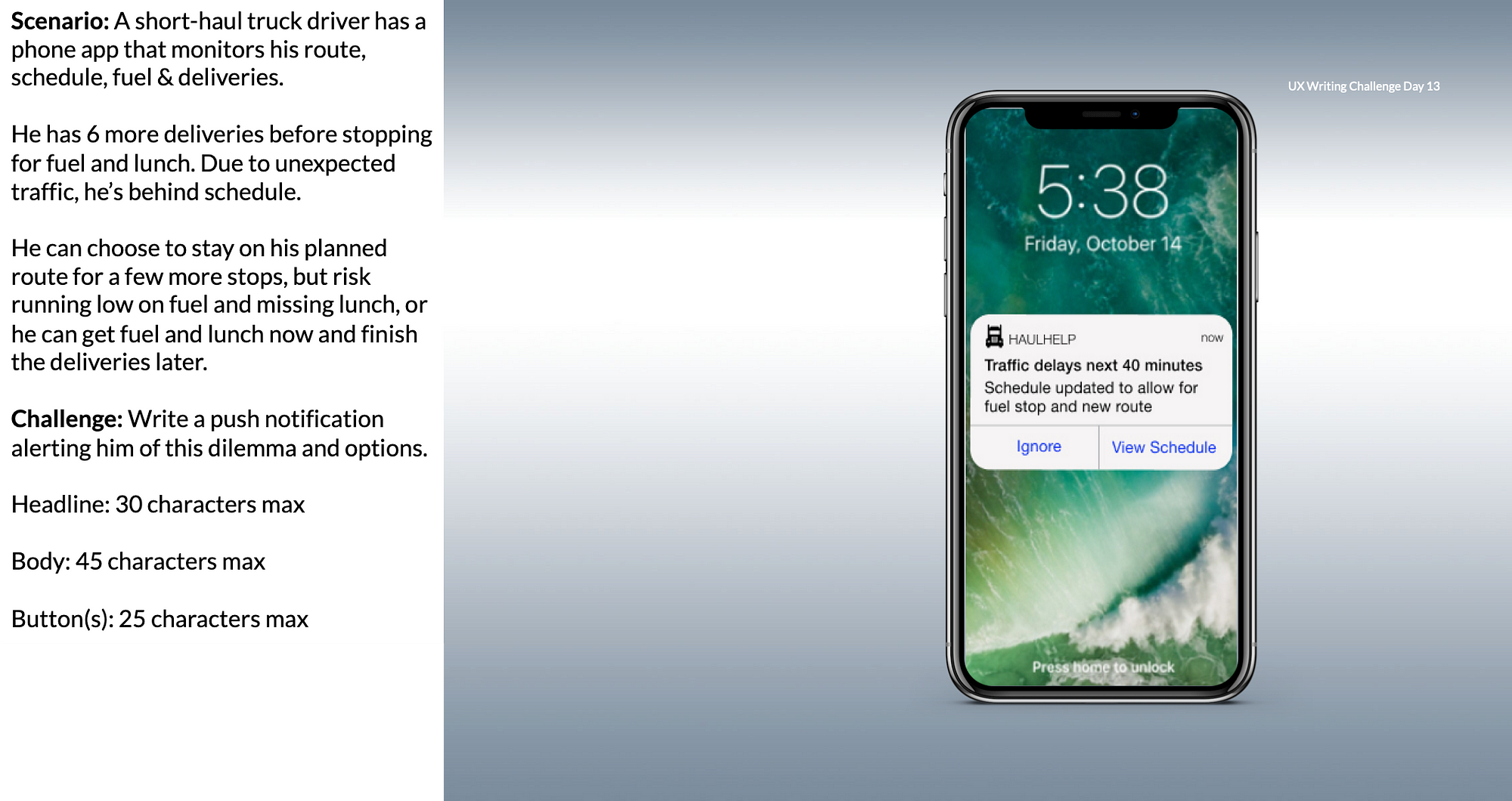
What I learned: how to write a push notification with limited characters
This was a test in filtering and prioritising the necessary information and being empathetic to the “litany of crap” a truck driver would experience every day.
I made sure the headline highlighted the severity of the traffic delays, and that the driver needed to view and accept the new schedule. The food stop was a red herring, in my opinion.
Day 14. Price comparison app error message

What I learned: how to write an error message without knowing the error
I used humour and a strong visual to distract from the failings of the app and (hopefully) appease the frustrated user. I also wanted to keep the user within the app by offering some relevant vouchers to view. It is a tenet of UX writing to empower the user with actions to help ‘fix’ the problem — the refresh button would hopefully reset the app for the user in a timely manner.
Day 15. Final challenge: Car app onboarding
Challenge: Write a multi-screen registration experience for a car-buying app that lets users view discounted prices. The app also enables dealers to call and email the user so they’ll visit the dealership to buy a car.
Character constraints per screen:
Headline: 45 characters max
Body: 100 characters max
Button(s): 25 characters max


What I learned: how to write an onboarding process
I was aware that lengthy onboarding processes are a surefire way of losing your prospects — I, therefore, wanted to ensure there was just one step to get the user onboard initially and in the database to receive the newsletter. Subsequent steps for the user to provide personal data would assist in their car search and allow dealers to make contact. Even with the subsequent steps, I felt the onboarding is still short enough to keep the user engaged.
Well, there you have it — two weeks of creative thinking, rabbit holes of additional learning, and amazing support and feedback from the Facebook community.
I hope you enjoyed reading through my tasks — I have tried to keep the commentary succinct for fear of making the post too long. If you have any feedback about the post or my UX writing I would love to hear from you.
I look forward to writing more about the wonderful world of UX writing soon.
Thank you.
Let’s connect on LinkedIn https://www.linkedin.com/in/spencedrogers/


