The “dark yellow problem” in design system color palettes
When defining a proper color palette for the design system I was working on, I came across the “Dark Yellow Problem”, where designers try to strike a balance between “yellow being yellow” and meeting accessibility requirements for color contrasts.
The goal was simple: to define the main colors so that their relative luminances, as defined by WCAG, are close to each other. This way, when designers swap out one status color for another, they are guaranteed by the design system that the color contrast ratio still passes the accessibility requirement.

Problem
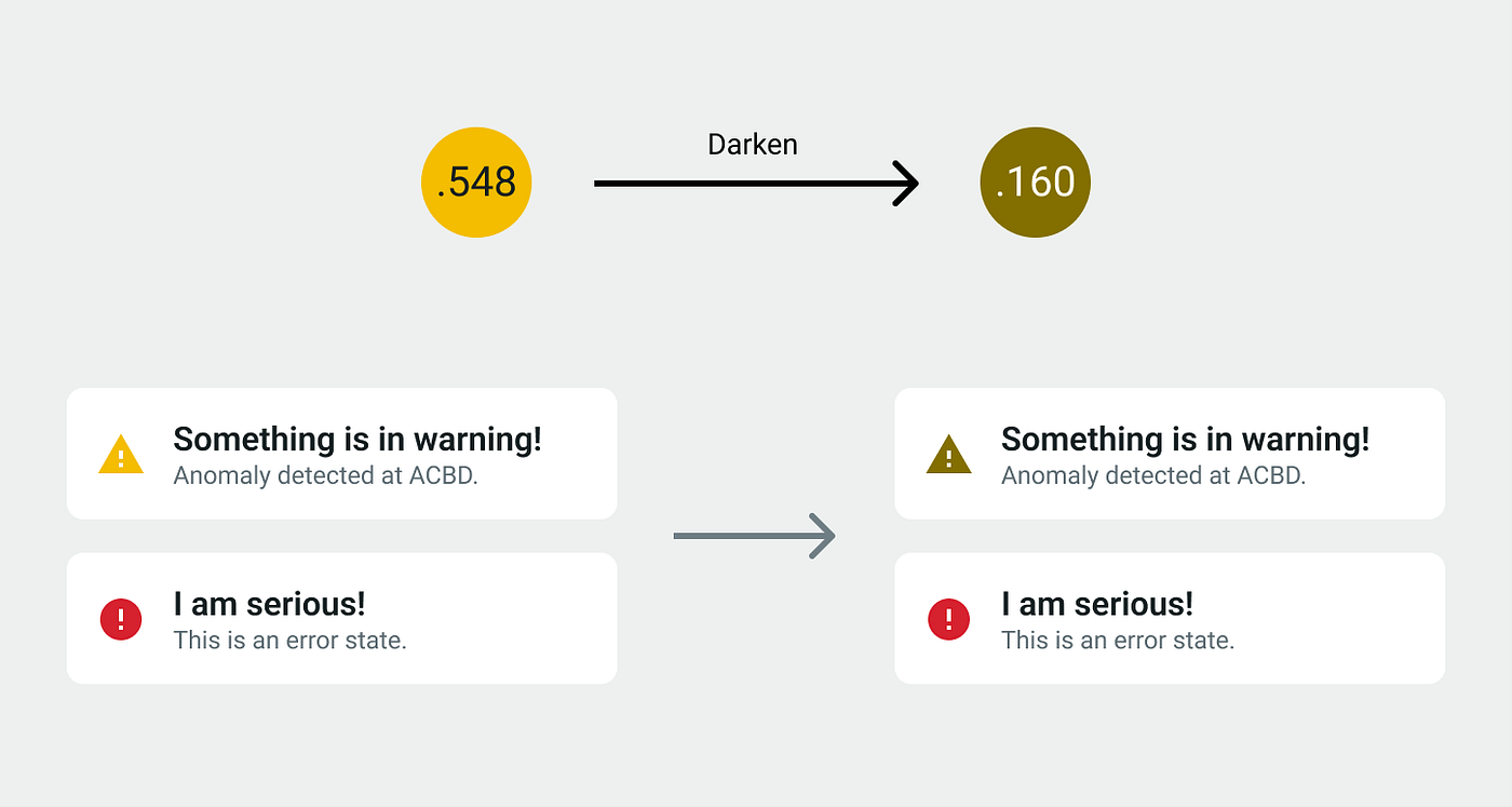
Yet trouble occurs when I try setting the yellow color to carry the same relative luminance of around 0.15 as all the other main status colors in the color palette. I just cannot make it happen.

I can simply darken the yellow, but this will make it brown. For users who are acquainted with the “traffic light” coloring scheme (red means bad, yellow means warning, green means good), this will create a lot of confusion.
Modifying the color hue by making the yellow a little more green or red does not fully address the problem either. Moreover, now the yellow color is too close to red or green, causing even more confusion.

This is what I call the dark yellow problem: trying to come up with a shade of yellow to make it accessible and align with other colors in the palette. But there’s just no such a thing as a “dark yellow”. Yellow, by definition, needs to stay light.
Solution
Since there’s no way to change yellow itself, I decided to focus on regulating how yellows can be used. UI governance is a critical aspect of a functional design system, and that includes the use of colors.
In short, while other colors may enjoy a wide range of varieties in how they can be used to stylize a component, yellow (and by extension, orange) should never be used as a foreground color, and should never be used alone without a dark UI element near it to explain its meaning.
No Foreground Yellow
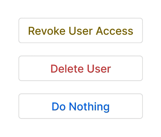
Yellow color must never be used against a white / light background. I still encourage people to use a dark yellow shade (a.k.a. brown) as text.


Accompanied Dark Element
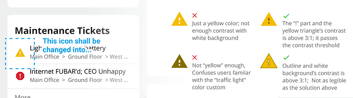
Building on the previous rule, a yellow UI element must always be accompanied by some darker-shaded UI elements such as text and icons to articulate its meaning.

In places like dashboards where the real estate is rather limited, consider using multi-colored icons, or even outline your icons.
On desktops, it might also be interesting to do this, where the yellow-ness is not as prominent, but the user gets sufficiently warned before committing to the action:
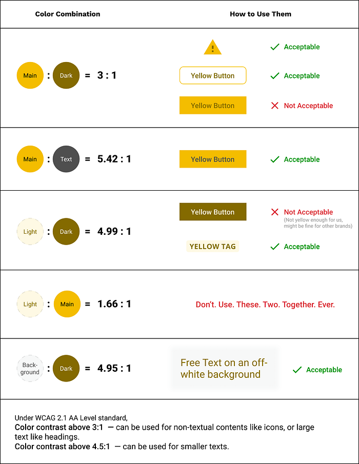
Three Shades of Yellow
When defining my main palette, I specified three shades for each color: light, main and dark, an idea borrowed from MUI’s theme structure. I picked my yellow shades in a way that can suit all the needs listed above.

A tokenized approach, as opposed to a meaningless color palette where colors range from 50 to 900, allows me to easily summarize how to use these yellow shades with other UI colors:
Related Works
- Tips to Create an Accessible and Contrasted Color Palette by Stéphanie Walter, also features specific text treatment on their yellow palette
- Designing accessible color systems by designers from Stripe, who developed a tool to determine their colors in the arguably better LAB color space

