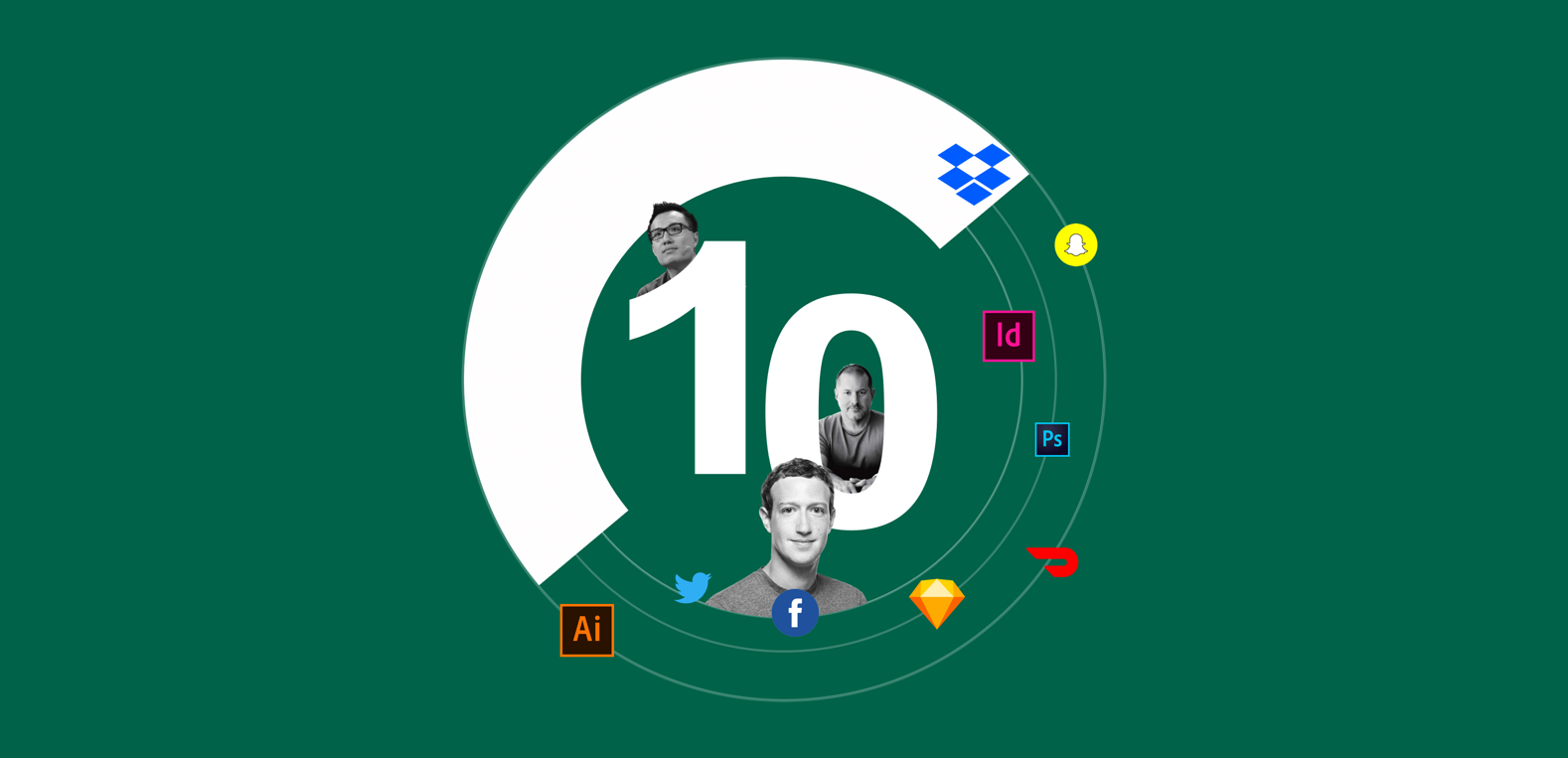
The Decade in Design
How design changed in the past ten years from 2010–2020. From Job titles to data usage, Figma vs. Sketch and everything in between. Your favs and hates.
With the turn of the decade here it’s only fitting that as the design community, we take stock of the last ten years and judge our missteps and triumphs. The craft and the industry have changed so much they have become unrecognizable. Terms like swipe right did not exist, Steve Jobs was still at the helm of Apple, the first iPad hadn’t been released and Sketch would only be released later that year. Dating apps had yet to take hold of the public consciousness, social media behemoths had yet to be weaponized by foreign powers and the newest and best hardware was the iPhone 4.
For all its wills and wonders, the industry saw rapid changes. We take things for granted in the modern age but it’s good to see how far we’ve come.
Data & Ads
It’d be remiss to walk through the whole decade and not mention data’s impact on design. Algorithms and data models are nothing new. As algorithms got more complex and efficient, the industry changed the way they designed products, recommended services, and up-sold items. In the aftermath of the 2016 election new initiatives began taking place within the design profession. We began to talk about trust and safety, every major tech company updated its terms of service and Global Data Protection Rights were implemented. Protections have been adjusted but far too late. If the “Facebook Protect Initiative” was implemented in 2015 instead of six months ago, perhaps there would have been an unbiased election. Unfortunately, the design faux pas didn’t stop there. There was plenty more to sprinkle throughout the decade.
The middle of the decade marked a turning point in the world. The 2016 election changed tech and world democracy forever. At the center of that change was consumer data. machine learning, and Facebook. The industry had a number of missteps.
Fails
Generic Startup Branding
Just as sure as you’ve seen the crypto madness on Dribble with the duplicated purple color palette, you’ve seen your new favorite startup with generic branding: white balance minimalism paired with funky illustrations and an Arial font. These illustrations and branding styles are the new fedora hat that all the hipsters want to wear. Unfortunately, if everyone is wearing the fedora it’s no longer style it’s just a fad. Some trace the origin back to Slack in early 2017, while others attribute it to Facebook. The industry collectively clowned Dropbox but truth be told they were just following suit.
These illustrations and branding style are new fedora hat that all the hipsters want to wear. Unfortunately, if everyone is wearing the fedora it’s no longer style it’s just a fad.
In an effort to cement their brands’ identity, every Saas company looks like a cucumber salad. The trend can be chalked up to a number of things, differentiation, the need to obfuscate race and gender as design becomes more inclusive, storytelling and financial incentives. The flat illustration design moved course so face a Twitter account has been dedicated to it. Dropbox was one of the first to hop on the trend some of the first some believe to see the financial gains. Dropbox has already upended the trend with its mixed-media rebrand of 2018. Although the trend went awry it begs the question, how can we make branding even more modular, accessible and inclusive in the years to come?
Shortchanging the Service industry
Unfortunately, some trends span farther than aesthetic faux pas and actually have long-lasting negative effects for consumers and customers. In June of 2019 Door Dash CEO was forced to apologize for dark UX patterns that not only obfuscated the tipping function for users but also lowered the amount of the tip, if they got any at all. This was 4 months after an official investigation began into the very policy.
The twitter thread wasn’t so much an apology as it was a bandaid over the industry’s larger wound of poor design decisions implemented to increase the company’s bottom line. Door Dash had a guaranteed minimum for drivers of $10. Example: if you as a customer tipped your driver $10, Door Dash would use that $10 to supplement their base pay so effectively instead of taking home $20 the driver would only take home $10. Door Dash was not alone in egregious design decisions. Instacart, the grocery delivery app followed suit with even more opaque practices to its tipping model that it has been tweaking since 2012.

As an industry, we have to be upfront with the information we provide who it benefits and who it hurts.
Honorable Mention: Snapchat
Snapchat suffered one of the worst received redesigns in design history. The change of the layout, primary features like stories, and over-saturation of branded content was not the only the tip of the iceberg but was enough to breach the hull of the sinking ship. It surely didn’t start with this tweet but it definitely ended here. The tweet alone wiped out about 1.3 billion of the company's market value with a 6% plunge by the end of the business day. Over 1 million people signed a petition asking the company to remove the redesign.
Dark Patterns
As the field evolved so did the necessity to increase the bottom line, ROI, metrics, and KPIs. All the things the industry kept at bay for so long became harder and harder for them not seep into meetings and discussions. These off-hand discussions became strategies, these strategies became meetings and later morphed into design elements found within products. The one page you encounter before you checkout for the one item in your cart that offers you 15 other similar items, is no mistake. Hopefully, in the future, we balance better design that marries bottom-line initiatives with actual user needs.
Wins
Believe it or not, we still don’t have an edit button and you should be happy about it. Dantley Davis,” please don’t change this”. In today’s political climate, imagine your government officials changing their tweets to fit public perception after the fact. It has the potential to be a world stage for gaslighting.
Responsive Design
The turn of the decade would truly change design and tech forever. The mass adoption of the iPhone, tablets and other devices years prior would call on design to once again change course. The practice existed long before dating back to 2001 with the first implementation on Audi.com but was originally coined in an article in 2010. 20 years of responsive design we come from {screenshot to screenshot} The introduction of native apps has allowed for…. Statistics show back in 2008 x% of healthcare.gov signups came from the mobile web. This wouldn’t have been possible without responsive design. So many necessary routine services have still yet to be digitized. With x percentage of the world having a mobile device and the broadband becoming more ubiquitous hopefully all traditional services move online to increase wider global usage.
Community
Over the years the internet has become more connected than ever. We have a variety of platforms that connect us from Medium, Dribbble, Meetup, Twitter, Slack channel, Product Hunt. All of these platforms have an inherent commonality. They provide us community. Each of these has allowed us to share ideas, find inspiration, discover mentors, meet new friends and most importantly push the conversation about design forward. These communities have evolved from things to help us learn like Skillshare, to communities that help us find jobs like Design Gigs for Good. As much as the community jokes about #DesignTwitter, its the very group that has provided us with some of our strongest advocates, favorite personalities and most notable learning. Cheers to more community.
Honorable Mention: Design Thinking
Designers now had a shared language around problem-solving they could articulate to the world, package and distribute company to company. It took off like wildfire. What once was considered an ambiguous process of creativity was now given structure and form for big enterprise scaffolding to scale. This not only gave designers a seat at the table but a seat in a C suite. It allowed design voices to be heard while also having skin in the game and being on the frontlines. Some design leaders describe it as “the crowbar that opened the door to enterprise companies letting designers in to help guide business decisions in addition to product design decisions.”
Design Titles
At the start of the decade, only 3 iPhones had been released and the introduction of the third-party app store was starting to take hold. A new interface would call for a new type of designer. Where the “webmaster” catchall once reigned supreme the “Interface designer” would take hold. Don’t be fooled, there were many variations of this title from the webmaster, to the web designer, to web architect.

No matter the title, at its core, a good designer is facilitating the conversation between a business and its customers.
These titles have evolved to the all-encompassing “product designer” which we still can’t agree anyway and might not need to. This role is a combination of your UX designer, interaction, visual and UX/UI designer. A decade ago we might have agreed that a User Interface Designer, User Experience Designer, and Product Designer performed 3 separate functions. With the evolution of technology, the design title has become even more granular to where design craft is now focused on department functions rather than business functions. Departments like marketing may be comprised of a Brand designer, presentation designer, and social media designer while Product has a product designer, Voice UI designer, and animator. Roles for voice UI may not have existed ten years ago but as technology advances so will its requirement on our skillset. The industry has even gotten as granular to be company-specific with the likes of Netflix creating roles like “Narrative Designer” and Blockchain comparable “Trust architects”. Where we once had a catchall we now have a sea of variations. All in all, names are just names.
If coming up with definitions is just a way to gatekeep, and make the industry more exclusive than it already is, we’re farther away from progression than we think we are. If we worried less about titles and background we could actually focus on the work.
What the future holds
The future of design will need to return to the days of clarity on conciseness. An era where we ushered consumers and users can complete a flow in a limited amount of steps, where their data won’t be used against them to further corporate, government or foreign agendas. The next decade will call for a greater level of ethics where design is not at odds with our inherent morals but in agreement with our values. Our tools change, titles, business needs, and priorities but what should remain constant is our commitment to who we are designing for.