Why Adobe needs to “Figmatize” and not the other way around
The evolution of user interface in digital editing tools.

A couple of weeks ago, I watched the Briar Levit documentary titled “Graphic Means”, which talks about the history of graphic design, from linotypes to photo compositions, and finally, the Pasteup, the analog version of the current digital graphic design.

The image above helped me understand the metaphor used in the first digital editing apps. Brushes, markers and letter-set are examples of tools which are referenced in the toolbars from software like Adobe Photoshop or Illustrator.

A bit of history
First Illustrator, then Photoshop and Pagemaker (which finally became InDesign), these first apps used the Paste-up Desk as a metaphor in which pages and publications were designed before the computer age.
As time went on, computers were becoming a standard in the industry. The iterations and improvements in every single one of these Apps releases were more than amazing. For example, Photoshop 3.0 introduced the concept of Layers, which Gimp, Figma, Procreate, Affinity, and even Canva, have currently inherited.
Adobe began to see these apps as digital editing hubs with multiple purposes, which had overlaps between what you could do in Illustrator, Photoshop and InDesign.
It was clear that one was used for bitmaps, another one for vector editing, and another for layout publications, but the integration between apps allowed you, in many cases, to do similar things across all apps.
Photoshop has been used not only by photographers and digital illustrators, but even 3D artists who want to colorize their concepts in a dynamic way. Its multipurpose was such that it even had a timeline to edit layers like frames, and export them as GIFs and even video, and is still that way to this day.
In 2008, there was a boom in interface design, and after Apple changed the industry with the introduction of Apps and the iPhone, Web 2.0 started a more sophisticated web design, including skeuomorphism. At the same time, another web design movement started coming to life that responded much better to more standardized websites than websites made from scratch auteur design.
Flat Design, which started with Microsoft’s Metro and continued with Google and its Material Design, triggered a clean visual style, and by 2013, became a standard after iOS7 introduced its own version of flat design. Tools focused on the development and design of flat UI were needed, which didn’t require features for digital illustrators. Sketch App was launched in 2010, and by 2016, Figma released its public version. At the time, they were Adobe’s minor competitors, but they had been getting more traction since their approach centered on UI designers.
Sketch seemed like an interesting mix between Adobe Illustrator and Photoshop. It prioritized achieving the most effective way to export assets, which was a nightmare in Adobe Apps. Once Sketch removed all image editing features that you didn’t need, you were left with a tool which was centered on interface design.
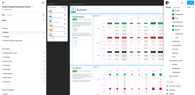
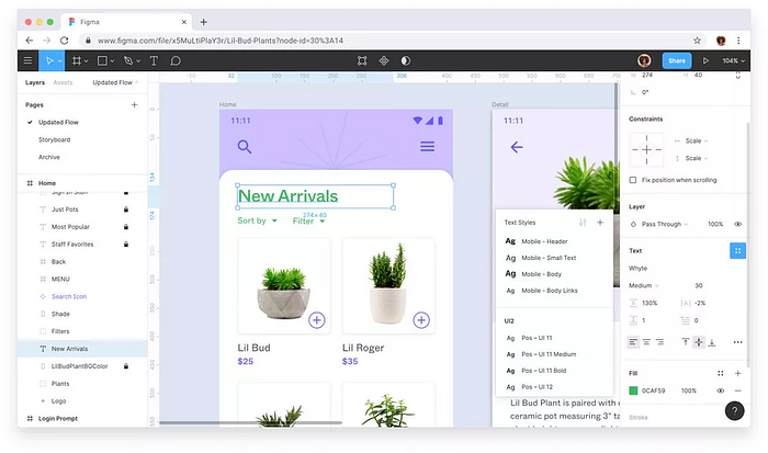
If Photoshop contributed with the concept of Layers, Sketch brought Symbols back to life from the mythic Flash libraries, which Figma refined and aligned more to what developers actually used, called Components. As a result, Design Systems became part of the core of the development of digital products and services.
Adobe was late to realize that users needed something lighter and more scoped to their needs, so it was until 2015 that Adobe XD was introduced, as a response to the market loss that Sketch and Figma had presented. They made a simpler App, rather than the heavy, “all-in-one” Photoshop, which binged on your RAM.
Niche Apps: the new paradigm
In complex Design Apps, we tend to have a more complex interface, for this reason, Adobe created Workspaces in their Apps. It was a way to customize the UI to more specific uses; for instance, workspaces for digital artists, for video producers or photographers, amongst others. An interface that is used for different audiences will require a higher level of customization.
On the other hand, when a Design App has a more narrow approach, it solves more precise problems and frees us from features we don’t need. Our Interface is simpler and our learning curve is minor.
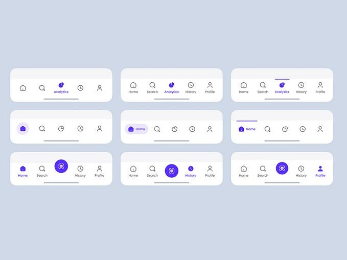
Nowadays, we can see this last approach. Sketch, Figma, and even Framer share this same principle: Apps with specific uses. Nobody in their right mind would use these apps to edit pictures. We wouldn’t expect a digital illustrator to use them, even though they are vector based.
Procreate could be another example. In addition to focusing exclusively on tablets, it is a solution for professional digital illustrators, but at the same time, it is an App for amateur Digital illustrators.
Social Media post design was another niche taken by alternative Apps like Canva, Desygner, Crello, Snappa, Stencyl or Visme; in which users need Apps to design posts for Social Media platforms or digital flyers, but rarely for print. Even Adobe introduced Spark as a mix between Photoshop and illustrator, with a simplified interface that uses templates like Canva.
This new paradigm has democratized the design and the entry-level, which created a more diverse segment where the users are not only professionals, don’t always need professional tools, and/or don’t want to pay for them.
However, Figma and Sketch Enterprise are far from cheap, but they have versions that start at $12 dollars and even offer a free version for casual users, something that Adobe has never been willing to do.
For this reason, I believe that the worst thing for Figma would be to become a more complex App. For instance, the last update which supports video split opinions, between some who celebrate the feature and others who don’t find a real use for that.
Advanced integration will respond to wider audiences, and will involve different niches. A robust and multipurpose app could target more people, but would mean less simplicity in the interface. Maybe in the future, we will see workspaces for Figma or perhaps Adobe is learning something and will start to pay attention to casual users, designing simpler products with more accessible prices.