The evolution of UX challenges
This post is based on a talk I gave at UX Alive in Istanbul and one I gave at Style&Class Ottawa.
Over the last couple years, whenever people asked me what UX designers do, I always came up with something like: we try to design things that people will love. And while it sounds like an awesome mission, our job is more complex than working in silos and coming up with revolutionary mockups to make the world a better place.
UX design is not a one-man show. We have to work closely with fellow designers, engineers, researchers, managers, business stakeholders, and clients. And while our ultimate goal is to make our users happy, in many cases the hardest part is that we have to make compromises.
I’m sure you’ve seen this diagram (or a very similar one) suggesting that whenever it comes to design decisions, you should consider user needs, business goals and technology, too.

As cliché as it may sound, it’s the truth. However, this diagram suggests that these three dimensions are equal. It shows a nicely balanced state, although the reality might be more like these:

This ‘layout’ depends on the product or project you’re working on, on your team, on your client, on your management, and so on. And needless to say, the dimensions themselves change over time, too. The ultimate UX challenge is to find balance in an ever changing environment.
User needs & expectations
What users need, want, and prefer obviously depends on the product. (It’s essentially the UX professionals’ job to learn as much about these as possible.) However, if you accept that designers should mainly focus on user needs, looking at the recent evolution of user experience design patterns might give you a sense of how user expectations have been changing.
The evolution of visual preferences
User interfaces look way different than they used to just a couple years ago. This is how Twitter’s first home page looked like — and that was completely acceptable back then:

And this is how Ryanair’s website evolved in just 8 years. (And yes, people actually booked flights in 2008 on that website.)

You could argue that it’s the designers’ responsibility that websites look better today than a few years ago. But it’s more likely that we as designers realized how distracting cluttered interfaces can be from a usability standpoint. Because at the end of the day, design trends should evolve for the users, not for the designers.
Design should make your product useful and understandable. It should support usability. Do you remember the time when all touch screen apps looked very physical?
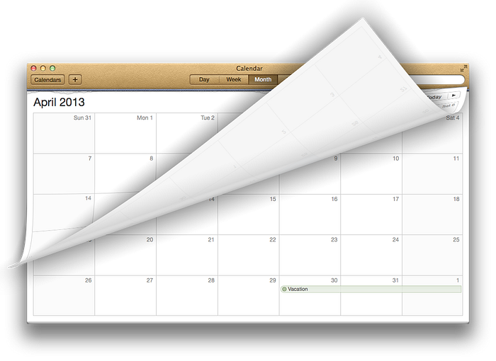
Skeuomorphism wasn’t just an arbitrary design trend, it played an important role in usability. When touch screen devices were fairly new to many users, designers had to make sure users would understand how apps worked. That’s why the iOS Calendar app used to look like a physical calendar and UI buttons used to look like physical buttons. But as soon as users got used to touch screens, such metaphors weren’t needed any more and this style went away. It was time to go flat.
The challenge of simplification
Considering that clean interfaces usually work better and that users need now less visual hints to use them, interfaces are being simplified, which, in general, is a great thing. Less is usually more in design, however, you have to make sure not to oversimplify things.
This is how the Home icon on Kindle devices has evolved recently:

Apparently, Amazon decided to simplify this icon and remove some graphical details step by step but the third version might already be hard to recognize at first sight. Taking into account that the primary purpose of an icon is to be understandable, it’s really important to validate whether removing even a tiny specific detail hurts usability. That is,
“Perfection is achieved, not when there is nothing more to add, but when there is nothing left to take away.“
– Antoine de Saint-Exupéry
The small screen challenge
A couple years ago the major design challenge was to make sure our design worked in every browser. Today the major design challenge is to make sure our design works on every screen and device.
This may be considered as a challenge of technology but at the end of the day, it’s your users’ expectation that your website or app should work on every device they use. There’s no such thing as mobile user and desktop user. There are users who may want to use your product in the same way, regardless of the device.
Although there are smart responsive techniques to provide the same (or at least similar) experience on small screens, in many cases it’s a major design challenge. A poor strategy to tackle this is considering navigation a secondary content and hiding it completely to save screen space.

Putting your whole navigation under a menu button might seem easy but since options are not visible by default, it will probably underperform.
Also, if you make some functionality accessible via gestures only, your users need to learn and memorize them, which is far from being user friendly.
The key in designing for small screens in prioritization. Try to understand the user’s context and make the most relevant options and content easily accessible for them.
Icons usually seem a good compromise to save some space, especially common ones like back, search, and add. These are widely known patterns and you can expect that people will understand what they mean.
However, if you have uncommon or complicated actions, it’s nearly impossible to invent icons that users will understand without a text label. Here are a few navigation icons from actual mobile apps:

Can you guess what they mean? If you can’t, neither can your users and text labels should be added to them. Saving a few pixels is a bad strategy if you have to sacrifice usability.
Business challenges
Business goals are usually very simple: the product you’re building has to make money somehow otherwise it’s not worth building it, no matter how great user experience you’ve created. And honestly, finding the right balance between business goals and user concerns can sometimes be really hard.
Distraction
One of the most fundamental business goals is to get your message to your (potential) customers. The simplest way to do this has always been email and if you recall how much spam you received a few years ago, it’s easy to see how a badly executed business plan can ruin the user experience.
In 2009, 90 trillion emails were sent globally and 81% of these emails were spam.
(source)
Luckily, we have great spam filters now so this is not an issue any more.
However, we have new communication tools where people are not yet protected against distractions. Think about push notifications. This technology was designed to send important messages to the users’ devices that they will see instantly. Since such a notification is really efficient, it’s very tempting to abuse it from the business perspective. And some apps do abuse it.
Nine of 10 people suffer from “phantom vibration syndrome” — where they mistakenly think their mobile phone is vibrating in their pocket
(source)
This means that the amount of push notification sent to mobile devices (around a trillion in 2014) causes serious frustration for the majority of users. Think about this when considering push notifications for the mobile app you’re working on. Let’s not make push notification the spam of the 2010s.
Roadblocks
Users typically want to get something done and it’s a bad experience when they can’t access the desired content as quickly as possible. Do you remember how many websites had flash intros and splash screens a couple years ago? Those were nothing but roadblocks and users had to develop a special skill to spot the “skip intro” link to get to the actual content.
Fortunately, we don’t have splash screens and flash intros any more, however, we do have other kind of roadblocks. Does the following screen seem familiar?
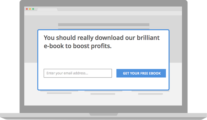
Such overlays are extremely popular right now. They’re often animated (so they causes distraction) and they might cover the very content the user is reading (so they’re roadblocks, too).
Growth hackers might argue that such tools perform exceptionally well, according to metrics. However, metrics don’t always tell you if and how much it annoys some people and you need to do your own research do discover that. Because if you lose more annoyed users than what you gain with such a widget, it’s a pattern you shouldn’t keep using.
Dark patterns
Distracting or roadblocking users might cause a bad user experience but intentionally misleading or tricking users implies ethical (or even legal) questions.

Such solutions are usually designed when business concerns are overrepresented in a project and stakeholders only focus on short term results.
Designers need to be aware that unethical solutions can be extremely harmful in the long run and that there’s a thin line between persuasive design and dark patterns. Here’s a possible rule of thumb: if a dark pattern is the most efficient way to improve your business metrics then you’re working on the wrong product.
Technology
Of all the dimensions, technology changes the most rapidly. Although its improvement promises the possibility to design awesome things, in many cases it‘s really easy to sacrifice user experience for a fancy feature.
Tech roadblocks
A couple years ago users were asked to update Flash or Java from time to time. Web technology improved a lot since and such plugins are not needed any more, however, native mobile apps do need regular updating. And if an update is required to perform a specific task, that can be a roadblock for the user:
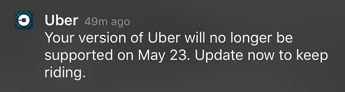
Consider how many extra steps is required in this case: open App Store, tap on Update, enter your App Store password, wait for downloading, wait for installing, etc. It can be way more painful than a pop-up overlay, especially if the user is in a hurry. And how about your car refusing to start because of a required update? That’s almost a physical roadblock.
Technology should solve people’s problems, not create new ones
Smart devices are hot right now. And while connected gadgets seem to promise endless possibilities, sometimes they’re designed in such a complicated way that it takes a ridiculous amount of extra steps just to make them work. This is what Golden Krishna points out in The Best Interface is No Interface when describing how inefficiently a specific car door could be unlocked with a poorly designed app:
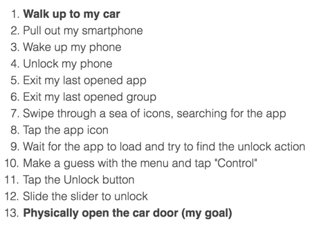
When it takes more effort to use a smart device than to solve the original problem without the smart device, you shouldn’t call that device smart at all. Then it’s people serving technology instead of leveraging it.
Designing for technology vs designing for people
It’s really easy for designers to fall in love with a specific feature or technology and stop focusing on our users. The key question that you should ask yourself to avoid it sounds like this:
Are you designing a specific feature because it will make your users’ experience better or because it seems cool to you?
In general, you should not design something just because it’s technically possible. You should design something because you believe that it’s going to solve a real problem for your users.
The best solution is not always the smartest technology
Great product designers focus on the problems their users have and try to find the best and most efficient way to solve it. Sometimes, however, the most efficient solution might not be smart at all. Here’s the selfie stick, for example, that was named one of the best inventions in 2014, and has been a best selling gadget since. It was never meant to be super smart, it just solves an apparently painful problem: selfies with bad quality.
Find that balance
User experience design is a team effort. In that team, you represent users (or more importantly: people) and while doing so, you often have to make compromises. Sometimes you have to speak up, argue, and question ideas. The designer is not always the nice guy in that room.
What’s even more difficult is that we have to do this in a permanently evolving environment where we not only have to find a balance, we also have to keep it. But it’s necessary because without that balance you can’t confidently say that you really try to design things that people love.
I’d love to know your thoughts, feel free to ping me on Twitter or LinkedIn. By the way, we’re hiring to our Budapest office. And we’re also hosting an amazing UX conference in Budapest.

