The framing effect in UX
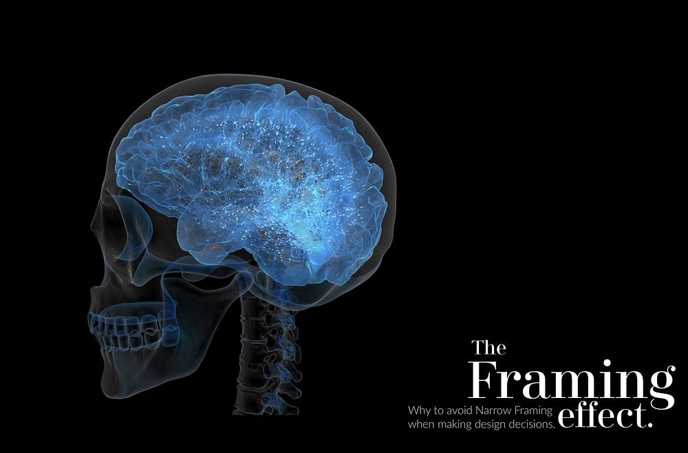
Why to avoid Narrow Framing when making design decisions.

Framing biases occurs when people make a decision based on the way the information is presented, as opposed to just on the facts themselves. To rephrase this point, the same facts presented in two different ways could lead to different outcomes or decisions from people.
Framing biases have been an important part of Behavioral Economics and the Nobel Prize winning author Daniel Kahneman in his book ‘Thinking Fast and Slow’ provides us with this example.
The flagship example of behavioral policy, called Save More Tomorrow, was sponsored in Congress by an unusual coalition that included extreme conservatives as well as liberals. Save More Tomorrow is a financial plan that firms can offer their employees. Those who sign on allow the employer to increase their contribution to their saving plan by a fixed proportion whenever they receive a raise. The increased saving rate is implemented automatically until the employee gives notice that she wants Co opt out of it. This brilliant innovation, proposed by Richard Thaler and Shlomo Benartzi in 2003, has now improved the savings rote and brightened the future prospects of millions of workers.
Thinking Fast and Slow — Daniel Kahneman
So making simple changes in the way policies are implemented makes immense changes in the way people react to it. Similarly users can be impacted by similar small changes in the way we frame our user experience. This has been explained by a number of people.
Here are a couple of excellent article that explains cognitive biases and how they can be reframed to avoid these mistakes:
Keep it simple, silly. Designing and the Framing Effect.
Importance of Framing in User Experience
Narrow Framing
Now, framing does not just effect our users. Even designers can fall victim to framing problems and one of the most important problem that we all succumb to- Narrow Framing.
In finance, investors are said to suffer from narrow framing if they seems to make investment decisions without considering the context of their total portfolio. However, this bias is not just limited to finance. Even as designers, we can fall prey to this bias.
This article covers the effects of framing when conducting user research:
Decision Frames: How Cognitive Biases Affect UX Practitioners
However, even when make design decisions, we could fall prey to narrow framing. In face we could make use of cognitive biases like Relative Pricing, Anchoring, etc and still fall prey to Narrow Framing which can result in lost users.
For example, one of the my favorite cognitive bias is ‘loss aversion’. And one of the ways we use it is by providing free trials on our products. This allows users to easily sign up and invest time in working towards something users would not want to loose at the end of the free trial. This is great. However there is a large amount of churn in the free user population and, surprisingly, this is also due to loss aversion. The same cognitive bias you used in the first place.
How does this work?
When users get a free trial, in their mind, they are already owners of the account and should not be asked to shell out money for it after they have used it, say for a month. However, they need to move to a paid plan and at this point their loss aversion mindset will evaluate the artefact they have created with the amount we are asking them to pay for it.
Unless we have a damn compelling product, a user will most likely churn. Most people try and overcome this by adding a freemium option.
However Ash Maurya, as shown below, found that it may not be the best option:
Pricing Experiments You Might Not Know, But Can Learn From
Ash Maurya, a startup entrepreneur, published an article on VentureHacks describing his pricing experiments with a photo sharing service. He tested a single, straightforward $49/yr offer vs 2 plans ($49/yr and $24/yr) vs 3 plans (added a freemium plan). The result? Surprisingly the single price offer won. Why?
His own guess: “It does pay to align pricing with your overall positioning. Our unique value proposition is built around being “hassle-free and simple” and people seemed to expect that in the pricing model as well.”
It might also be that in these complex and fast times we live in, people yearn for simplicity.
Note: His freemium plan actually converted 12% more, but had the lowest retention. Be careful when offering free plans. You might just end up with a ton of free users to support and pay for.
So instead of narrow framing for converting users, if we think about what are the decisions we can take to retain users, this would be better for us as designers. We should not ourselves succumb to the biases.
So as you can see, using Cognitive Biases is important for both designing for users and improving as design practitioners. We will benefit a lot if we can learn more about this fascinating field.
Originally published at www.navneetnair.com


