The Glengarry Bob Ross UX effect
Microcopy’s role in UX upsells.
Imagine that you’re hanging out with Bob Ross.

And Bob Ross tells you, “Hey friend, mind fetching a new tube of my favorite hue of blue? It’s behind the door with the ‘Blue Paint’ sign.”
So you stride toward the “Blue Paint” room, eager to learn what you might create with with Bob’s favorite hue. But as soon as you swing that door open, you’re confronted with an all-too-familiar reality. How did you not see this coming?

Behind all that empathy and engineered ease, there’s a machine. That machine’s purpose is to generate revenue. Hence, the upsell. More often than not, this drive to upsell (or just sell) results in clumsy nudges that vaporize any hard-won goodwill or rapport.
Don’t cloak the paywall
The pursuit of revenue, for better or worse, is often indispensable to the development of products. So why do we hide this dependence behind devices like misleading microcopy or disorienting task flows? Perhaps it’s shame. Or maybe it’s a bad habit inherited from outdated sales strategies. Regardless of the impetus, attempting to hide a request for payment until the last minute makes for a poor user experience.
If you can’t get what you’ve offered without paying, just say it up front.

At this point, a SoundCloud user’s expectations for the “let’s go” flow will reasonably consist of configuring some new features, selecting an SD for storage, and maybe learning about managing offline tracks. For a service that boasts its goal of helping users to “never stop listening,” the good vibes are strong.

The Glengarry Bob Ross effect. Remember when we were balancing stereos on our heads and dreaming about offline listening?
Turns out that not only is SoundCloud Go an upsell, but it’s also a tiered subscription. So rather than downloading some offline tracks and getting on with life, users now have to evaluate and compare feature lists before moving forward with a decision.
Don’t force users into boxes
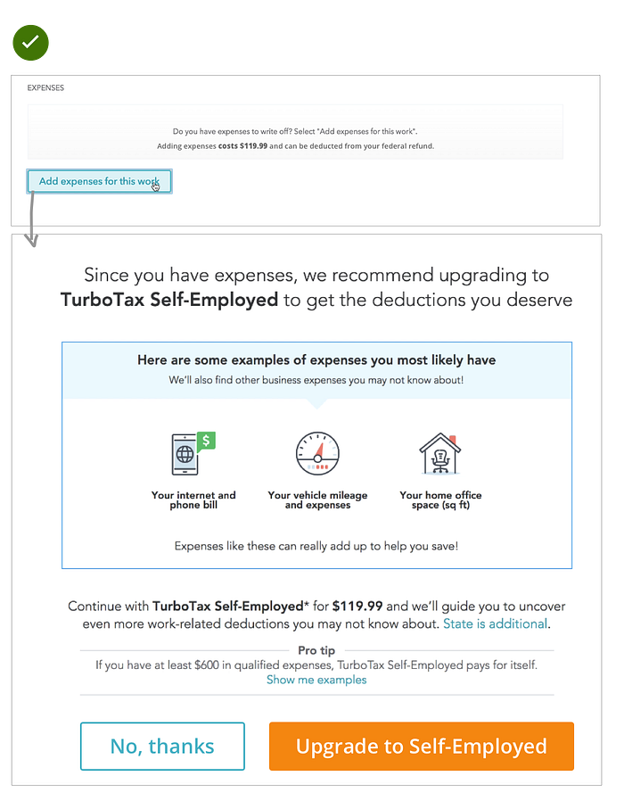
Users filing their taxes at TurboTax are presented with the option to write off self-employment expenses. This is a logical offering considering that one reason users aren’t filing taxes by themselves is that they want to reduce their taxable income by as much as possible.


A product should never place the burden of an upsell on its users. Forcing users to choose between not having any expenses and upgrading their membership is a devious usability tactic. But who knows, it might be a tactic that works like a charm when the tax deadline is looming 😈.
Evaluate, act, and move on
Microcopy that’s focused on an upsell should allow users to evaluate the offer and accept or decline without having to decipher any deceptive messaging.
Behold:
Upsell microcopy done well
If you’re tasked with writing microcopy for an upsell, remember to:
- Keep it contextual: What comes next? Explain how the user’s immediate experience will be impacted by the offer.
- Don’t force users into boxes with CTAs: Upsell CTAs should allow users to accept or decline the upsell, not pass self-judgement on their use case (remember that we like to label buttons with what they do).
- Stay linear: If the user declines the upsell, move on to the next logical step. Don’t follow up with a secondary screen where CTAs attempt to lure the user back into your upsell trap.
- Present the upsell as an extension of user action: Rather than blasting users with upsell messaging as soon as they start exploring your product, consider inserting your upsell messages wherever users hit the limits of their current plan.
Webflow: Clear and contextual


At Webflow, the upsell for an upgraded hosting plan is presented as a moment of contextual onboarding (aka, the best kind of onboarding). In addition to being contextual, it outlines the impact of the offer and provides two clear actions.
Komoot: Balancing usability and profitability


Komoot demonstrates how to balance upsell transparency with revenue goals. Stating that the feature is available for “one low price” clearly communicates the fact that we’ve encountered an upsell. This technique might be especially helpful for UXers who need to align stakeholders who value immediate conversion and profit over the long-term benefits of clear messaging.
Slack: Action-based upsell messages


Based on their freemium model, Slack suggests that users upgrade to the paid version with appropriately-timed upsell messaging. This approach works well because:
- Users will already understand the product’s value when they get the upsell.
- Relevant actions result in relevant upsell messaging. For instance, search results are complemented by an upsell that highlights a larger searchable database.
- Users can continue to use the product with clear copy and visualizations explaining the current limitations.
I feel compelled to say that I love both TurboTax (and I did pay the $119.99 fee to write off my expenses) and SoundCloud. My general feelings about their products and content design (see TurboTax’s fabulous voice and tone guide) are that of admiration. So I’m sorry to stomp on you, TurboTax and SoundCloud, but it was kinda fun. Plus, you’re probably used to it.
As for the rest of you: go forth and upsell!