The good, the bad and the toggle
A dissection of the toggle, checkbox, radio button, and related components.
The variety of components with similar functionalities is large and somehow confusing, if you also facing this problem, follow me on this journey.
For this purpose I’ll take the form of Virgil, guiding you (Dante) across the 9 circles of hell until we reach the tenth: “Understanding when to use each of these components”.
Mutually exclusive vs. mutually inclusive
Let’s start with the definition of two mathematical concepts that have a lot to do with the behavior of these components, look a these Venn diagrams:
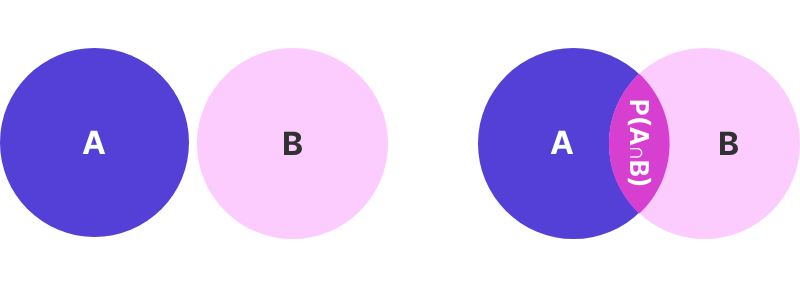
When 2 events A and B cannot occur at the same time are mutually exclusive events, this is basically how a radio group works, we have ℕ options, clicking one will unselect the other (But one of them should be always checked, unless there was no interaction yet).
On the contrary, when they can happen at the same time are mutually inclusive, if we have a checkbox group, all the checkboxes can be checked or unchecked at the same time.
Easy right? A checkbox group also have mutually exclusive or mutually inclusive states; first, a single one can be checked or unchecked, but not both, when we have them grouped, with a parent checkbox, we can have some checked, and some unchecked, so the parent can be:
- Checked: if all the children are checked
- Unchecked: if all the children are unchecked
- Mixed (or indeterminate) state: where the checkbox has children in both states
Accessibility tip: You can use an
aria-checked="mixed"when hierarchy grouping checkboxes.
Being done with the maths, let’s see case by case.
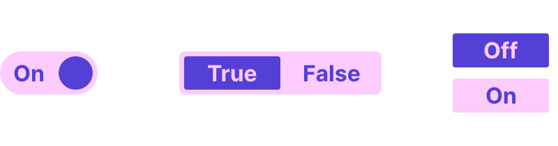
Toggle, switch, and checkbox
Naming is hard, especially when talking about components. Other names used for this component are toggle switch, checkbox toggle, toggle button… All of them behave basically in the same way: a control used to switch between two states (often on or off).
First, we need to make a distinction between a toggle button and a toggle switch since they both manage states, but not exactly in the same way:
- Toggle button: Represents an action that changes a state.
- Toggle switch: Represents two (or more) mutually exclusive states or options that can be switched.
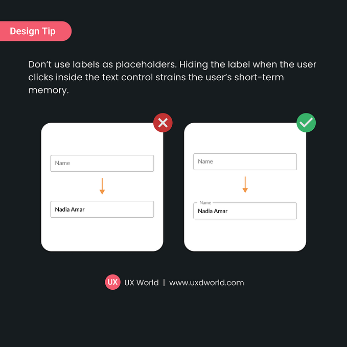
Usability tip: If the toggle is an action (Play/Pause) the
label/titleshould show what will happen. If the toggle is an option (On/Off) then it should show the current state.
Now, if we only focus on the behavior, this is exactly how a single checkbox works, two states: checked or unchecked, so, how do I know when to use each? It depends on the context:
- Toggle: use it for actions or options that have an immediate effect on the UI. They usually do not need to be confirmed or reviewed.
- Checkbox: use it when there are additional changes, they are inside a form or they need to be reviewed before continuing.
Okay, and what happens if I want to have more than two states in a toggle switch? Well, you could build a tri-state switch…but be careful, we don’t want to end building what I just named the sliggle, a mix between a toggle and a slider.

Having multiple options (2+), either the user needs to select one or multiple is another use case where we should consider the use of checkboxes or radio buttons (or a segmented control) over toggle switches.
As additional content of the section, the Human-Computer Interaction Lab did a research in 1991 with six different touchscreen-based toggle switches allowing the control of two-state devices.
Accesibility tip: The
aria-role=switchremoves themixedstate that the<checkbox>orrole="checkbox"has.
Radio group and segmented control
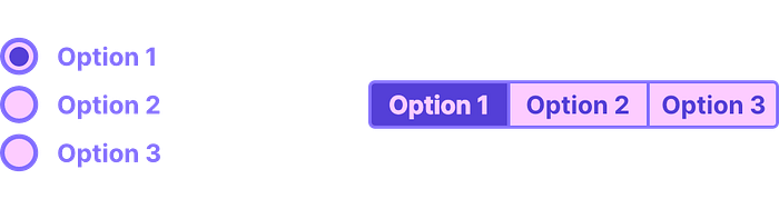
According to Apple’s Human interface guidelines, a segmented control is a “linear set of two or more segments, each of which functions as a mutually exclusive button”. You have used a segmented control quite often, since the selection of text alignment in Microsoft’s Word application is one (A paragraph can be left-aligned, centered, or right-aligned, but not the three at the same time).
These components are both mutually exclusive, so when to use them? Again we should make a difference in the context:
- Radio group: Same as checkboxes, use them if there are additional changes, they are inside a form or they need to be reviewed before continue
- Segmented control: The change has an immediate effect on the UI (since it is nothing more than a multiple option toggle, the successful mutation of our beloved sliggle).
Usability tip: To improve legibility, is recommended to stack radio buttons vertically since it’s easier for users to scan the different options, when stacking horizontally, make sure you’re providing enough space between them.
Toggle button group

The last addition to our cabinet of curiosities is the toggle button group, a group of toggle buttons, that can be checked or unchecked individually, so, as a group, they work as mutually inclusive.
This represents a visual challenge when trying to distinguish, visually, a segmented control and a toggle button group (even with a button group). Most of the WYSIWYG content editors present both of them living at the same time, and how they work is intrinsically embedded in the mental model of their users (Since the beginning of the web as we know it today).
It is not recommended to have both components at the same time unless we are sure that the user will understand in what context the same component (visually speaking) will behave as one or another.
Usage recommendations
We’re close to the end of our journey and here is a summary of the most important topics we covered:
- Do not use toggles in forms. Use checkboxes or radio buttons instead.
- Do not use toggles in filters or multiple selections of elements.
- Inhale.
- Use toggles for settings and changes that have an immediate effect on the UI (same applies for the segmented control).
- Avoid mixing toggle button groups and segmented controls.
- Exhale.
- Avoid using switches with multiple options.
Thank you for reading, below you can find a map with our current position:

Have a nice 2022!
PD: @UniofOxford please, decide if a comma before “and” should be used in lists of three items or more. I need this solved at the end of the year. Thaaaanks…


