10 tips towards creating a user-oriented space

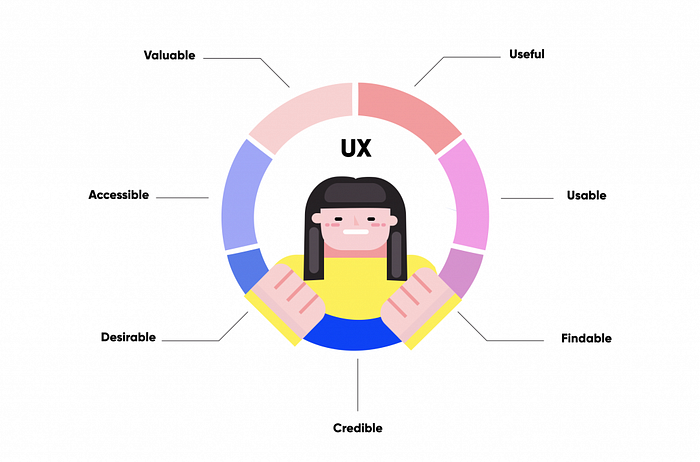
UX design is the building of user-friendly environment and the creation of a product that takes into account how the user will interact with said product.
Good designers account for the users’ thought processes to determine what they would want out of each button click or each form submission. This includes clue-ing in the user on what is currently happening, what will happen, and what has happened. A good design takes the guesswork away from the user and helps generate proper website flow that users will use to satisfy consumer needs while considering the business needs/decisions of the company (what is necessary to be rendered, how visually impactful/informatic the product must be, how much resources required to run the site, target users, cost of engineering).
Good design is actually a lot harder to notice than poor design, in part because good designs fit our needs so well that the design is invisible, serving us without drawing attention to itself — Don Norman, The Design of Everyday Things
We have all had a run in with bad design, be it through technology or in our day to day life. Here are some examples:
- Have you purchased a product that had 101 super cool functions to then get frustrated with trying to get all (or any!) of them to work and finally, defeated, only ever use 1–2 options?
- Have you been on a webpage where it took you more than a few redirects in order to get where you were going? Or been trapped on a website with no exit button or back button?
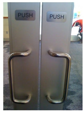
- Ever pulled a door that was meant to be pushed? These are called Norman Doors. Something as simple as a door could be made difficult to use because the signifiers on the door do not match with our intuition on how to use the door.

Good UX design: Medium’s Editing Page
A big reason why I am using Medium was because I was unable to successfully navigate Dev.to. When I had written my first blog I had 18 photos that had to be posted within it. On Dev.to I selected 18 pictures from my computer and the site responded ‘18 files selected’, when I clicked ‘Done,’ nothing happened. No pictures were on my blog and no error message to tell me where I went wrong. I did the same on Medium and all the pictures rendered, albeit haphazardly, but it still allowed me to move the pictures around and format them correctly. I also adore that Medium’s toolbars upon highlighting words and the toolbar that appears on the side for format have easy to understand icons and if you hover over them they have a small description of what they do. There is no extra fluff on the edit page and it allows me to perform all the actions to publish a new story through a few clicks on one page and one modal-like window.


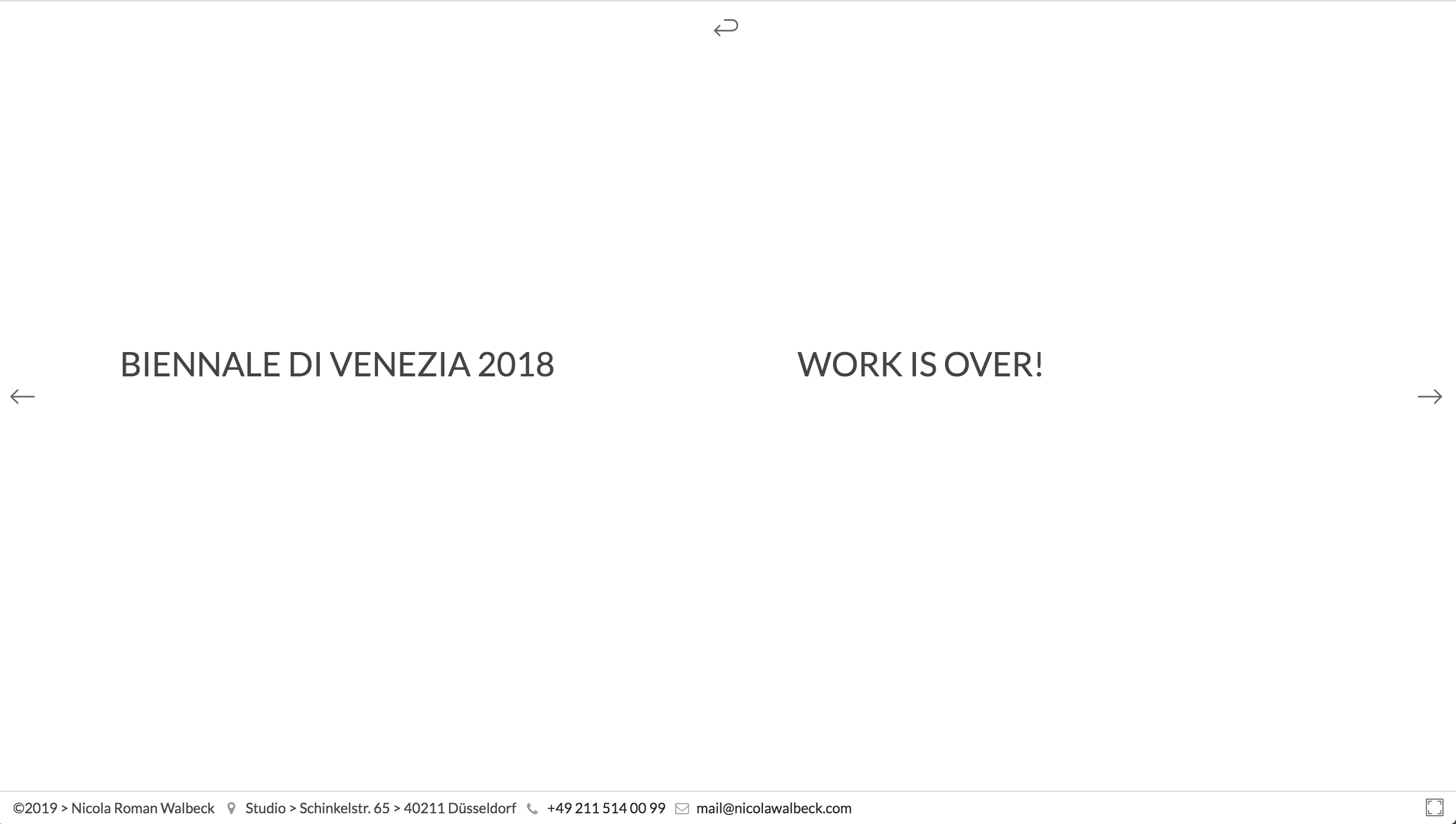
Poor UX design: Nicola Roman Walbeck Photography
This website is gorgeous! It appears to be a fashionable site for selling clothes..? Wait, it’s a photographer’s portfolio. Already we have a few other problems: First, the website takes a long time to load, this leaves the user bored and can spur disinterest. Second, it isn’t intuitive what to do next, clicking the worded boxes leads to a big white screen with the same words printed. Third, while the arrow keys do take you to the next picture/slide, it takes 3 seconds to load each picture without much indication, which leads to a bit of anxiety for the user as they are left staring at a blurred image.


10 Tips to Create Better UX:
- Simplifying the design. There are many beautiful websites that are not user-friendly, they will have too many moving parts or too much function to the point where the user is left confused what to click, or what to do.
- Create a responsive product with quick loading times. In an era where we are starved for time, waiting 3 seconds for a page to load can be excruciating. Consumers want things QUICK! This means that any long introduction at the beginning of your website can cause users to become disinterested. Google also penalizes websites with slow load times causing a lower ranking in a Google Search.
- Identify the target user. By being able to identify your target audience you can omit having over-functionality. An example of this, if you are creating a health tracker for primarily elderly patients, you wouldn’t add a menstruation tracker.
- Understand their needs and their pain points. This can be through use of usability studies (to see how users are interacting with your website), surveys/reviews about what the user wants to see and get from your app, and user metrics. Accessibility can be a common pain point for users too!
- Having buttons and items in logical places. Keep back/undo/redo buttons and navbar elements towards the top of the page. When coding forms, having them before the content ensures that they’ll be able to be seen even if content steadily grows.
- Decrease the amount of “last-resort UIs”. These are hamburger tabs or dropdown selector boxes. These require the user to click through multiple tabs to determine the location of the button they’ll need to click to see what they want to see. Having core app components as friendly symbols on the main interface will increase the user’s experience, leave the lesser used items in the hamburger tabs.
- Cultural significance. Twitter has a quill to signify creation of a new tweet, but this will unlikely have the same impact with users outside of European/American countries where the quill was known for written text. Cultural context can play a big part in how a user uses your website, make sure the language and descriptions on your website is consistent and understandable to your user.
- Give user feedback (loading bars, visible back buttons, small notes on hover, identifiable clickable objects). Ensure that every object on the page will give the user a clear and accurate hint about how to utilize it.
- Decrease the amount of memory that your user will use. This means having small prompts towards where a button is located or what past dialogue has occurred. This can be presented as FAQs on your website for the user to refer to!
- Involvement of the user in the design. Tailor your product to the user to make the experience more personal by using their usage metrics to suggest events for them or in the case of Facebook, groups or friends to add.
Really good UX is about more than a well-designed interface — it’s about optimizing every single interaction your user has with your brand. — AppCues Blog
After all, it is like what Don Norman said: There is no such thing as user error, just bad design.
Sources and Extended Reading Materials:
- Jakob Nielsen — 10 Usability Heuristics for User Interface Design
- AppcuesBlog — Bad UX Mistakes
- UX Magazine — Psychological Usability Heuristics
(An awesome resource that talks about human psychology) - AskTog — First Principles of Interaction Design
- Guy Kawasaki — DICEE
- Jason Clauß — 5 Examples of brilliant UX Design

