The importance of visual meaning in user interface design
According to Norman’s three levels of cognitive processing, the first judgement we make on something is visceral, based on how it looks, sounds or smells. It’s something we inherited from our primal ancestors. Nature has always used colour and scent to signal meaning. Once we make this gut-feel judgement, we decide how (and if) to interact.
So the first judgement a user makes on an interface is based on its aesthetic properties. The aesthetics render meaning for the user before they interact with it. Does it look like it will be easy to use? Does it look premium, or cheap? Will they want to use it?
Understanding how to create visual meaning is fundamental to controlling how users interact with an interface. An interface will fail (regardless of how visually pleasing it is to the designer) if the resulting meaning differs from the intent.
Style
Adopting an aesthetic style is at the essence of interface design. The choice of style needs to be measured against the audience’s culture, how they make sense of colour, type, imagery, and layout. It includes consideration for accessibility requirements, such as colour blindness and screen readers.
Understanding how users respond and read visual meaning provides a tactic for setting their mindset. Audience meaning is more than a designer’s assumption or interpretation. An interface that uses poorly lit and composed photography, childish handwritten type and a fluorescent colour palette would traditionally represent a series of hideous design decisions for an educated designer. However, in the example below, these aspects of the interface work well and the style is simply intended for a distinct type of user and form of communication.

In the next example, the thin lines, clear typography, and use of a single colour has a very serious feel while not distracting from the content behind it. Quite a contrast to the previous example but in this case, entirely appropriate for an interface in a motorcycle helmet.

Icons and symbols
Icons attempt to resemble or imitate their proposed meaning. There is still room for interpretation, but generally, some sort of meaning can be obtained.
The American Institute of Graphic Arts created this set of standardised icons in the 1970s for use in airports and highway signage:

However, in the example below the meaning differed from the intent:

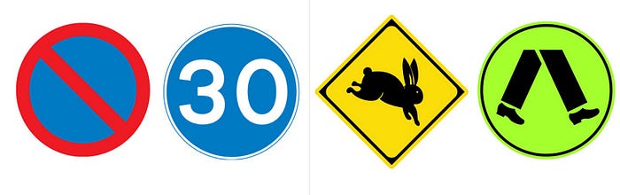
Symbols, on the other hand, use shapes that do not resemble their meaning, such as the no entry and speed sign below. The relationship must be learnt before meaning can be derived. They often rely on meaning tied to particular cultures or societies.
Icons or symbols can be used on their own in an interface, but as the designer recognising what knowledge you’re expecting from the user is critical. You can help teach meaning through an interface by using labels next to the icons and especially symbols.
Mediums
The channel (or medium) used to house the interface carries meaning too. An audience has associations with specific mediums and set expectations of how they should function, interact with, and read. Interacting in a 3D space has very different expectations versus a mobile screen.

Evaluating visual meaning
Visual meaning needs to address functional, cultural, contextual, channel, and social requirements. When it’s right, it speaks to the audience and addresses their expectations.

Designers need an intimate knowledge of their craft so they are empowered to use elements and styles with purpose but they also need to be aware of their own biases on the interpretation of meaning.
Regular user testing provides valuable insights into meaning and should be part of the design process. Once a designer has a deep understanding of their user’s interpretation of meaning, relative to cultural environments they need to communicate in, their work can become far more effective and powerful.

