The light and the dark side: creating a UI colour system in 3 steps
Choosing a colour palette is easy … but add accessibility standards, various button states, and a couple of themes to the mix, and it soon gets tricky. To make it less tricky instead of thinking colour palette — think colour system.
A colour system in 3 steps
Step 1 — Split in half
Step 2 —Include enough colours
Step 3 — Make accessibility easier
Step 1: Split in half
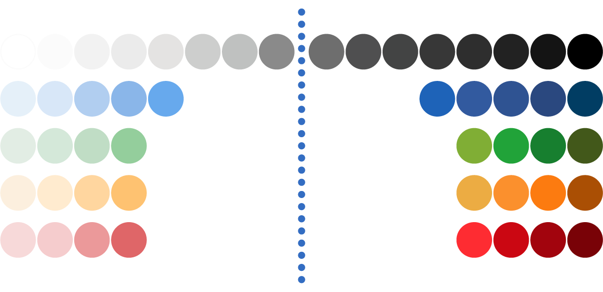
Split the entire colour palette in half and ensure each half has an equal quantity of tints/shades. Creating a light and dark theme then becomes a matter of swapping the equivalent colour from the opposite half of the colour palette.

Number the different shades starting with the lightest and the darkest. This makes swapping the equivalent colour from each half of the palette even easier, simply swap like-for-like numbers. Light-grey-3 with dark-grey-3, dark-blue-5 with light-blue-5, and so on.
Step 2: Include enough colours

Include enough colours for all status / notifications. Typically these include:
Information = blue
Success = green
Caution = yellow / orange
Danger = red

Include enough shades and tints for the various button types and states. These usually include:
Types = Primary | Secondary | Subtle
States = Default | Hover | Active | Disabled | Focused
Step 3: Make accessibility easier
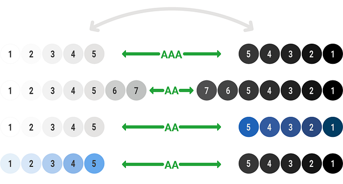
Swapping equivalent colours from each half of the colour palette has the advantage of giving both themes the same amount of contrast. Therefore if the light theme passes accessibility contrast standards — the dark theme will automatically pass.
Examples: The system in action

Like-for-like colour swapping is easy. The example above shows how the dark theme was created by using equivalent colours from the opposite half of the colour palette.

Adding a subtle hue to the neutral shades helps create a less utilitarian feel, above a hint of blue has been added to the neutrals.

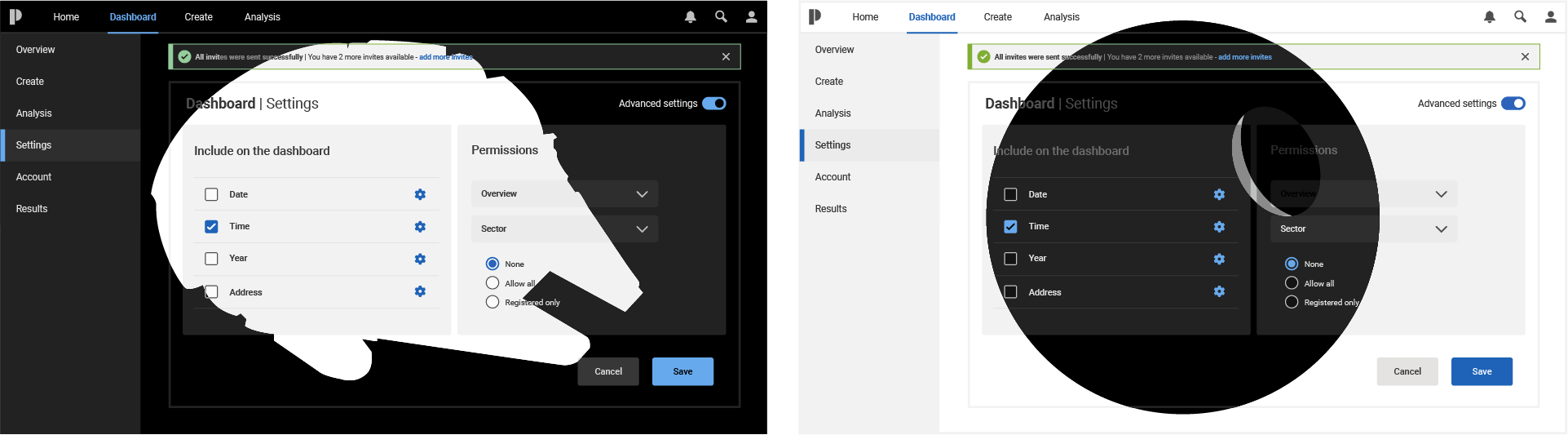
A brand identity can take advantage of a colour system and include a light and dark theme. Replacing the neutrals and primary action colours with colours from a brand identity can create a more recognisable UI.

Hybrid themes, a theme containing both light and dark areas, can also make use of this system. The above example shows how the light hybrid theme has used the dark theme for its navigation.
Conclusion
Thinking colour systems instead of colour palettes can benefit everyone involved in choosing and using colour as part of a UI.
It allows designers to focus on the more complex problems — no more procrastinating on colour choices. Enables developers to create a simpler more logical codebase. And helps users avoid eye strain.
Design system teams may benefit the most. A colour palette is usually the first element tackled when creating a design system, therefore creating a colour system at an early stage of a design systems development will give a great foundation of system thinking.
— Pete Woodhouse, designer at Redgate

