The 🍔 menu
A step by step guide to creating a Hamburger Menu in SVG & CSS

 The Hamburger Menu widget is on every other site nowadays. It has become synonymous with the web and, perhaps even more so, with web development. Have, for instance, a look at Dribbble or Codepen. There you’ll find a fair share of examples. They come in all shapes and sizes where one is more elaborative than the other. Developers and designers can’t seem to get enough of the widget.
The Hamburger Menu is not without controversy. Some hate it, and some love it. Numerous articles are debating it and its alternatives. Some argue that its proper place is in the history books. Regardless of its fate, it continues to have widespread use. Over and over, it keeps showing up in new sites. It’s especially popular for mobile views where menus typically are hidden.
There are quite a few variants out there exploring different kinds of animations. I’ve created a couple myself. Here are a few of my creations:
The anatomy of the Hamburger Menu
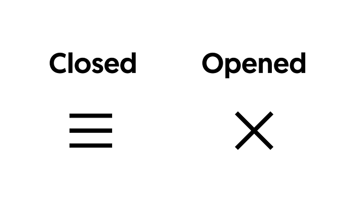
In its most simple incarnation, the Hamburger Menu comes as straight, parallel lines. Usually, they’re three. These lines stay in some form of a clickable container. Shapes and sizes of menus may vary, but their use is the same. Clicking them toggles the hamburger’s state. This interaction makes the menu go back and forth between its opened and closed state. The conventional way to portray the opened state is by showing an X. It signals to the user that tapping/clicking the button again closes the menu.
Ever so often, there’s an animation going between these two states. Buttons like these are excellent opportunities for web developers to delight their users. Generally speaking, it’s the perfect place to add an animation. Animating the button’s state transition is not just pleasing to the eye; it also serves a purpose. It’s a good UX to give users feedback on touch and click interactions.
What is SVG line animation?

SVG line animation is, as the name implies, a technique to animate lines. Or, more specifically, SVG paths. It creates an appearance of drawing a line on the screen. The method emerged mid-last decade, and it has remained popular since. This article from 2014 explains the technique in detail: https://css-tricks.com/svg-line-animation-works/.
The effect is ideally suited for the Hamburger Menu as the widget is, most often, created with lines. This article discusses how to use the technique to animate between the two different states of the Hamburger Menu.
The three horizontally parallel lines
First of all, let’s start by drawing the three lines. Drawing vectors requires a vector editor. I.e., if you’re not a hard-core SVG coder and like to do it by hand. I use Inkscape to draw my vectors.
The first thing to do is to find a suitable size for the SVG drawing. Using a 100 x 100 pixel SVG document is a good idea. Working with even numbers makes it easier to relate and work with sizes and proportions. It’s, in theory, possible to go with whatever size when drawing these vectors. Remember, the S in SVG stands for scalable.
When drawing the lines, let’s also reserve some wiggle room for the animation on the sides of the menu. This space is reserved for later on when animating the lines. In the editor, the pen tool creates new strokes.
Was it too quick for you? If so, here’s the recipe
- Draw a straight line on the upper part of the screen
- Move the end-points of the line to make it 60-pixel wide. Vertically center the line around y=29.
- Set the stroke width to 6px
- Duplicate the line and move the copy to the center of the SVG document. At y=47px, the center of the copied line lands at 50px. Half the stroke width is 3px. I.e., 47 + 3 = 50.
- Create another copy and place the third line at y=68px. Placing the third line at this position makes the hamburger symmetrically correct.
The numbers above, e.g., the stroke width, need not be the exact numbers, used here, should you recreate this example. The important thing is choosing values that create something visually appealing. It is possible to tweak these numbers and fine-tune them. They should be such as the hamburger matches the style of the other content on the web page. It’s the web developer’s job to create a consistent look and feel building web pages.
A look at the produced code should look something like follows. These essential parts below should be found somewhere in the SVG code.
<svg width=”100” height=”100” viewBox=”0 0 100 100”>…
  <path d="M 20,29 H 80" /> // top line
  <path d="M 20,50 H 80" /> // middle line
  <path d="M 20,71 H 80" /> // bottom line…
</svg>
The X close icon
Next up is creating the X close icon. The way to build it is by extending the top and bottom lines. The idea here is to make the SVG document include both shapes at the same time. Combing the opened/closed states goes perfectly together with the SVG line animation technique. It makes it possible to animate between the different shapes of the menu. The creation, at this point, might look like a bird’s nest. Don’t worry. It’ll make sense later on discussing the animation. The following three parts should be part of the model:
- The straight lines (the hamburger)
- The connecting lines, joining the two shapes
- The X close icon
The way to extend the line is to break up the process in three steps.
1. Extend the line
The first step is to extend the top line with an edgy line that includes part of the X icon. The drawing, at this point, doesn’t need to be perfect. It just needs to be good enough, so you spot half the X.
2. Adjust the coordinates
After extending the path, the next step is to move the connecting nodes to their appropriate coordinates. The connecting line can be arbitrary. However, the X icon should be proportional to the hamburger. In this example it’s a line going from (25px, 25px) to (75px, 75px).
3. Make the lines smooth
Last but not least, converting the line to a Bezier curve makes it smooth. First, let’s look at what it looks like doing the above procedure for the top path. Here again, the pen tool once again comes in handy.
Once the top line is in place, it’s time to do the same procedure for the bottom line. Since everything needed is already on the screen, it then makes sense to reuse the work above. Duplicate, flip, and position the copy does the trick to replace the previous bottom line. Bringing objects forward & back is one way to access the right path at the right moment.
Move to HTML
When the model is complete, it’s time to move it over to HTML. Luckily, HTML is interoperable with SVG. That means that anything SVG directly works inside any HTML document. Copying the SVG code into the markup makes it appear on the screen when loading the page in a browser.
Placing references, HTML selectors, on the SVG DOM nodes, is what to do next. Doing so opens up the markup to the wonderful world of CSS. Or, more specifically, it enables manipulation of the SVG paths. With CSS, these SVG elements can have styles, be animated, and inspected. Below is what the structure of the CSS rules looks like after adding classes:
<style>
  .line { ... }
  .line1 { ... }
  .line2 { ... }
  .line3 { ... }
</style>...<svg width=”100” height=”100” viewBox=”0 0 100 100”>
  <path class="line line1" … /> // top line
  <path class="line line2" … /> // middle line
  <path class="line line3" … /> // bottom line
</svg>
Another thing to do is to center the menu and to remove the default margin. This is not a must, but it makes it more pleasant to work with the menu. A flexbox container, conveniently places the widget in the center of the browser window.
body {
  align-items: center;
  display: flex;
  justify-content: center;
  height: 100vh;
  margin: 0
}
How long are these lines?
An essential part of the SVG line animation technique is knowing the length of the paths. Here is where the Dev Tools shines. The inspector’s console window can, in numerous ways, access DOM elements. One of the more convenient ways is the nifty focused element shorthand $0. It gives direct access to the currently focused node in the inspector. The function call getTotalLength, callable on any SVG path, measures the lines.
Measuring the lines gives the lengths 207px and 60px. It should come a no surprise to see the number 60 again. It is the original length of the hamburger lines. Another thing to note is that the first and the last lines are equally long except for minor rounding errors. This outcome is what to expect as they are duplicates. Both of them are 207px long when rounded upwards. These two numbers, 207 & 60, are the values needed to get started with the SVG line animation effect.
Diving into the SVG line animation technique
A great way to get accustomed to the line animation technique is by using the inspector. The style editor lets you change the CSS rules with immediate feedback. Visualizing the change makes it easier to get a feel for how the CSS affects the SVG paths. The instant feedback loop quickly helps to hon in on desired values. The goal here is to use the model, created above, to find the following two sets of values:
- The values that make the hamburger appear again.
- The values that make the X icon appear again.
These two sets of values, in turn, represent the end-points in the animation. Interpolation between these two extremes is what creates the actual animation.
The first thing to do, working with the animation, is to set the stroke-dasharray rule for one of the long lines. The stroke-dasharray rule takes a range of values that describe dashes and gaps. The animation effect in this article needs only two values. They are one dash and one gap. One way to find the dash/gap value pair is to set both values to the full length of 207px and work backward. The keyboard’s up and down arrows stepwise alter the value in the editor. Stepping through the first value in the set of values reveals the hamburger.
The same procedure, as above, goes for the X icon. This time the second rule, stroke-dashoffset, comes into play. The offset pushes the line forward to reposition it. The diagonal line in the X is slightly longer than the lines in the hamburger. For this reason, the line needs an extension. Adding a handful of pixels adjusts its length.
Now, let’s have a look at the results. Below are the different sets of values found:
<style>
  /* Hamburger */
  .line1 {
    stroke-dasharray 60 207;
    stroke-dashoffset 0;
  }
  .line2 {
    stroke-dasharray 60 60;
    stroke-dashoffset 0;
  }
  .line3 {
    stroke-dasharray 60 207;
    stroke-dashoffset 0;
  }  /* X icon */
  .opened .line1 {
    stroke-dasharray 90 207;
    stroke-dashoffset -134;
  }
  .opened .line2 {
    stroke-dasharray 1 60;
    stroke-dashoffset -30;
  }
  .opened .line3 {
    stroke-dasharray 90 207;
    stroke-dashoffset -134;
  }
</style>
Animation
The Dev Tools is a powerful ally when it comes to animation. With the inspector, it’s possible to test, fine-tune, and record animations. The style editor allows modifying CSS to re-run animations immediately. All inside the browser. The Dev Tools provides the perfect playground for exploring and crafting animations.
The simplest way to get objects moving on the screen is by using CSS transitions. They’re easy to use. One specifies what other CSS rules to animate. Setting the target rule, together with duration and easing, immediately enables animations. It is very convenient. Once in place, the only thing needed to start an animation is to change the value of the target rule. Here’s what the transition rule looks like for the Hamburger Menu:
transition: stroke-dasharray 600ms cubic-bezier(0.4, 0, 0.2, 1), stroke-dashoffset 600ms cubic-bezier(0.4, 0, 0.2, 1);Notice the specific easing used. The cubic Bezier easing above comes from the Material UI guidelines. It’s a bit more punchy compared to the regular ease easing.
Here’s what fine-tuning in the Dev Tools might look like
Putting it all together
The event handler is the last step in creating the animation. It’s what makes the menu interactive. Toggling the “opened” class triggers the animation automatically. The only thing needed is a place to trigger the state transition. The SVG element itself serves as a perfect place to insert the handler.
<svg … onclick="this.classList.toggle('opened')">Accessibility, updated version
After publishing the first version of this article, Dennis Lembrée pointed out, that the above version is not accessible. Accessibility is important, so let’s fix the fundamental parts. The right thing to do is to wrap the menu inside a button and move the event handler to the button. With buttons, some of what’s needed for the menu to be accessible comes for free. The menu becomes focusable and it automatically enables keyboard tab navigation.
Adding an additional aria-label is also very helpful. It gives contextual information to users relying on screen readers.
<button onclick="..." aria-label="Main Menu">
  <svg>
    ...
  </svg>
</button>
The source code
And here’s the complete menu on Codepen
That’s it! If you reached this far, you can hopefully now know a bit more about Hamburger Menus. Thanks for reading, and the best of luck with your animations!
Cheers,
Mikael
