The microcopyist: cancellation, confirmation, conflagration
Writing microcopy for destructive actions.

One of the marvelous things about UX writing is that you’ll inevitably write yourself into some torturous and impossible-to-fathom linguistic corners.
One day, your mind boggles over whether to hyphenate or not hyphenate a lesser-known phrase. The next, you forget what sanity feels like when someone asks you to write microcopy for unknown errors.

All the while, you’ll have to justify your decisions to the voice, tone, and data deities. But never forget, young writer: You did this to yourself.
In this quick story, I’ll walk you through one of my recent microcopy conundrums.
A new wrinkle: cancellation confirmation microcopy
Typically, I can cure most microcopy hiccups through a combination of brainstorming with my collaborators and remembering that people don’t read interfaces.
But the other day I bumped into an unfamiliar puzzle. I was writing about order cancellation usability issues and needed to sketch out a few interface examples. That’s when I realized I had wandered into a trap:

My experience as a UX writer told me that the primary button should be the action that the button initiates. In this case, Cancel Order. So what’s the secondary button, and how might it influence the primary?
How do you write button copy for a destructive task?
I cobbled together some meager copy options while my brain began to fizzle.
CancelandSubmit RequestNo, don't cancel orderandYes, cancel orderCancelandConfirmBackandCancel OrderCloseandCancel Order
The nuance here is that the primary action the user will take is destructive in nature. Because the order will be canceled, there should be absolutely no ambiguity between the primary and secondary actions. And it’s this ambiguity that really matters (to me, anyways).
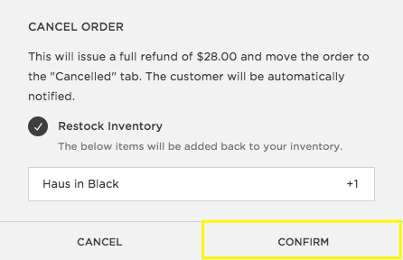
From my perspective, the choice between Cancel and Confirm in a Cancel Order dialog is unmistakable. But I am not my users, and for a large percentage of folks who use e-commerce sites, the difference won’t be so clear.
I took this question to one of my favorite discussion groups and and received two very helpful answers.
1. Nevermind
Andrew Schmidt, who writes at Slack, had been there before:
Oh yeah. I backed myself into that exact same corner recently — having to write a confirmation dialog for an action called
Cancel Invitation. That’s no fun.I settled keeping
Cancel invitationas the confirmation button, in red (because it’s destructive), and usingNever mindas the “close this dialog and go back” button.

One consideration you might want to ponder with this particular direction is tone. Never Mind might work for a product like Slack, where the audience is one that’s accustomed to clever, well-executed copy. Some writers, however, might argue that this type of casual language is inappropriate for a more traditional audience. They might be right. But my gut tells me this is more likely a matter of fearing your stakeholders than it is accommodating for your product voice and tone.
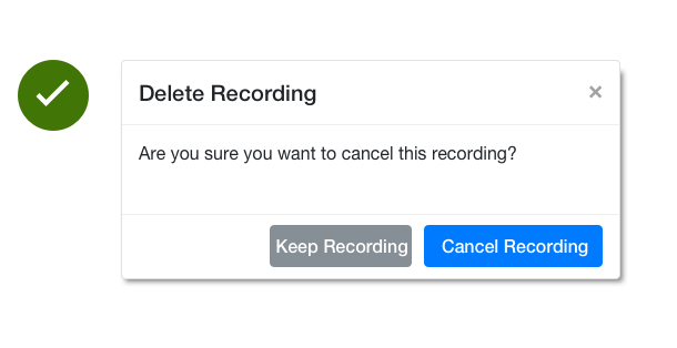
2. Keep the thing
Michael Strickland, Director of Content Design/Strategy at Charter Communications, referred to a different but still relevant scenario. Rather than an order cancellation dialog, he outlined his team’s simple approach to deleting recordings.
We use
cancel the thingandkeep the thing.
Presumably, it looks something like this:
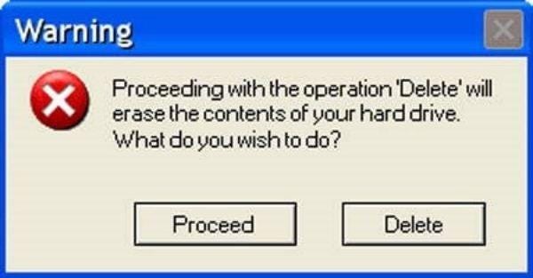
Mike also called our attention to the following example, for which I am infinitely grateful:
Thanks to Andrew and Mike for their feedback!