Member-only story
Redesigning the New York Times app — a UX case study
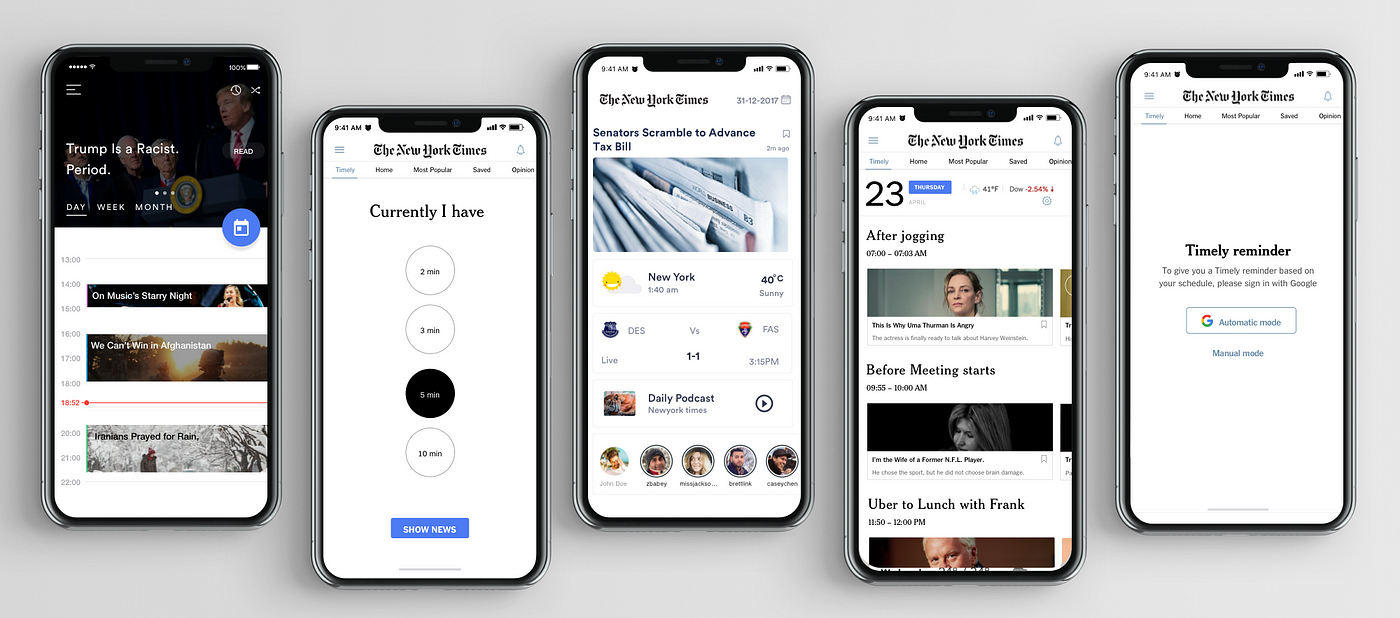
Brief: Timely provide to quick read articles from 2–5 mins. News catered to specific users based on their schedule and habits..
Note: Official The New York Times team does not do this, This is just a concept our team (Addi Hou, Ke Hu, and Myself) made up with a help fo our professor Renda Morton.
Problem
The New York Times app loses the love of users, due to a myriad of reasons. Along with the competition and cost, the following factors are the reasons for the difficulties.
1. Coverage (Users are unhappy about something they read)
2. Life-changing event (moving).
3. Lack of usage.
4. Irrelevant content.
Goal
- To build incentives amongst the sea of news apps, many of which are free.
- To lead to lasting habits for readers of The New York Times app.
- To help them retain their long-term loyalty.
Our Proposal
Instead of overhauling the existing NYT app, we will add a subtle and useful feature to that landing page called Timely.
That will enable the user to receive notifications at opportune moments throughout a busy day: at breakfast, commute, before a meeting, during a coffee break or right before bed.
These notifications will assist the user to open Timely and access articles. It will take only a short time to read. Most importantly, the articles are catered to each user based on their interests and habits.
Design process

My role and team:
I primarily worked on Interaction/Visual Design teaming with Keh and Addi Hou who are expert in UX thinking
Topic research
We researched the habits of young people. Hence we can fit into their life instead of just urging our app.

