Member-only story
The origin story of the Wingdings font
The funny font from vintage Microsoft Word has an unbelievable past and great influence on today’s culture

Wingdings, the iconic font composed by… well, icons; became widely popular for being included in many Microsoft Word versions in the ’90s is quite intriguing. It has even been the subject of some conspiracy theories.
Why do we need a font exclusively composed of symbols, such as the Celtic cross, the Zodiac signs, and the star of David? Who came up with that idea? Do people really use it?
A little bit of History
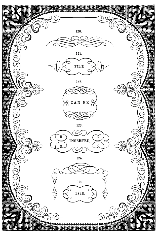
Wingdings history ties back to the very beginning of printing. Printing was originally a manual process, that existed before typing. It involved setting every letter, word, line on every page manually and individually. It was a long and tedious process.

Therefore, setting a fancy text was a complex process. Creating detailed templates for fonts was time-consuming and expensive, so printers invented a shortcut: dingbats. Dingbats were reusable sets of symbols and special characters arranged in ornamental pieces to frame and/or embellish printed pages. The trick was slotting plain text in a dingbat instead of hand-carving and laying out every ornament.
The use of digital dingbats was motivated by the same reason why they were originally created — to save time. Just as printers wanted to save time using dingbats, a new generation of computer typographers saved time with dingbat fonts.
It was in the ’70s that the main inspiration for Wingdings fonts was created: Zapf Dingbats, a digital dingbat font designed by the acclaimed calligrapher Hermann Zapf.


