The other dimension of design
Extending design principles beyond the dimensional space into the temporal
Let’s explore together a couple of techniques and ideas that designers can use when creating delightful user experiences. If you haven’t caught the hint from the image above, these ideas are taking advantage of the temporal dimension.⏱
Don’t worry, I will not be getting into time theory or space-time continuum, or other sciency things, I’ll be sticking with what I know and that’s about design.
The perception of time
If you ever ordered something at a restaurant that takes a long time to prepare, you probably found it easier to wait if the waiter offered you the drinks first and kept the small talk going. Good restaurants really have this nailed down. The drinks are acting like small distractions and the small talk makes the whole waiting experience smooth.
In UI design, one of the first examples of this technique was the introduction of the progress bar. It is a great way to tell users how much they have to wait while the process they initiated executes. The users can estimate how long it the process will take and even play a game by placing the cursor at the end of the blue progress indicator.

Later, research studies showed that the appearance of the bar going faster was a helpful illusion, making users perceive time as going faster as well. Don Norman even mentions this concept in one of his books:
…something that takes longer but that is perceived to be efficient is superior to something that is shorter but perceived differently.
(because others already wrote about this I won’t bore you with the details, but if you are interested in that study from 2010 you can find it here)
Getting back to modern times, we have a variety of awesome ways to facilitate a good experience when we want to affect the perception of time. Pre-loaders, loading animations and progress bars are good tools, just to name a few.

Takeaway: you shouldn’t let your users waiting without them knowing what’s happening, and when you have to do speed optimisation compromises use the perception of time to your advantage.
Temporary UI lifetime manipulation
Banking on the progress bar idea, it really helps to know how much long something will last on the screen. Having control on the lifetime of temporary UI elements is even better!
If you’re a driver and if you ever had to pay attention to Waze while driving, you might’ve noticed the self closing pop-up that tells you the route is changing. It has a good lifetime indicator on the top right corner, very well tied together with the dismiss action so the users can have full control.

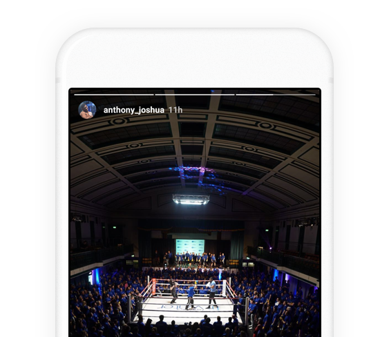
On the other end of the spectrum we have the Instagram Story. Designers at Instagram did a great job showing the story’s lifetime at the top, but the twist here is that they give you the ability to stop time. By keeping a long press, users can prolong the story’s lifetime on the screen so they can have a longer interaction with it.
Takeaway: facilitate the user to have more control of the product by providing the appropriate time-based mechanisms.
Conscious actions
Permanent user actions should be treated with careful attention, there is no doubt about it. As designers we might use patterns like confirmation alerts with secondary actions, undo menus, or even a “slide to unlock” metaphors, but what if we can use time to our advantage?
Here is an example on how to do so.
Imagine a destructive action on a particular UI element. Hovering over an X icon for a short amount of time enables the action to delete or dismiss the UI element. This requires the user’s conscious action to position the cursor over the area we’ve indicated and for him to wait an expected amount of time in order for the action to take effect.
Expected time constraints
A great use of time constrains are the temporary restrictions of actions. Disabling an action for a short amount of time before enabling it again eliminates the room for spamming that action.
Here is an example I’ve created with Principle to illustrate this idea:
Another usage of time constraints is to regulate addiction. In the mobile game MarioRun, if you want to binge through levels you’ll encounter a time barrier. You’ll have to wait for a short amount of time between play sessions. From this perspective, this makes you put the phone down for a while and maybe find something productive to do. Of course the timer in MarioRun is placed there for other reasons as well.
Time and productivity
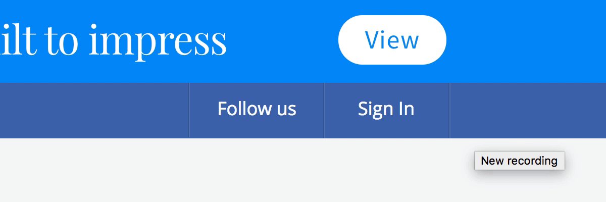
One of the great aspects of Medium is that they estimate how much time (on average) it will take you to read an article. For example my first article takes just 8 minutes to read as seen below.

On top of estimating once at the beginning of the article, another great usage of this concept is to indicate the remaining time as the user is making progress.
On the same topic of productivity, I just want to mention that autosave makes a huge difference in the user’s workflow. This is one of the invisible aspect of using time in design. Medium offers this while writing drafts by nicely combining the loading bar with a small message next to the logo.
Another invisible aspect of time in design
More than a year ago, I’ve done a small presentation for a local design community in which I’ve mentioned optimistic design as a really useful technique for designers.
The idea behind it is simple: do an action and consider its outcome as success based on the fact that in the high majority of time the outcome is a succcess. Examples of it are liking or bookmarking something on your favourite social media.

This allows you to create a seamless experiences for your users creating the impression they can achieve more in a short amount of time. It’s an interesting topic to read more about.
One of my favourite usage of the temporal dimension in design
Because I just moved into a new city and I’m not familiar with the surroundings yet, I tend to use Google Maps a lot to navigate around. One of the things that I really appreciate bout Maps is the changing of theme based on local time.
A light theme during the day for a good contrast and a dark theme at night for it not being distracted.

Using local time to dictate aspects of a particular user experience can prove to be a clever way of using the temporal dimension in design. There are loads of other applications of this idea that you can come up with for your next project, especially when you have to deal with long user sessions.
Takeaway: delight can be easily obtained by introducing time into you designs.
As we designers strive to innovate and improve services and products, we should remember that we are not limited by two or three spatial dimensions and we should use the temporal dimension to our advantage.
In the end I’ll leave you with this great quote by Tennessee Williams:
“Time is the longest distance between two places.”
Thank you for reading, I hope you’ve learned something new! If you have more examples on the topic, leave a comment below!