The Peloton experience: a usability heuristics analysis
An in-depth analysis on six human factor principles and laws of UX and how they helped shape the existing Peloton interface into what it is today
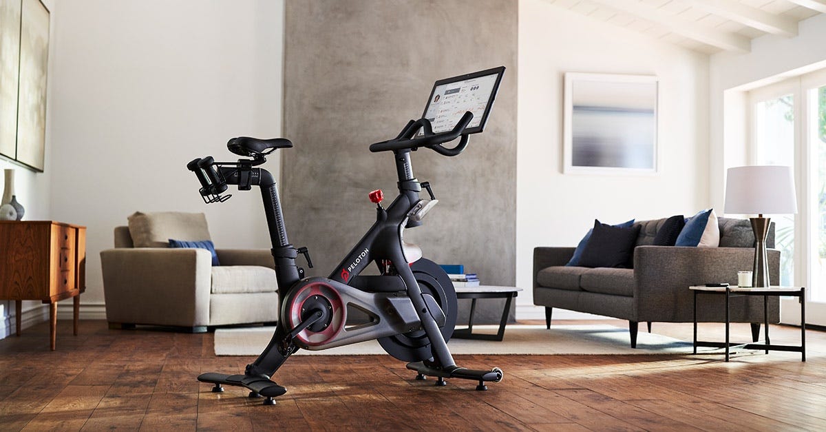
Peloton Interactive is an exercise equipment and media company that enables members to stream on-demand workouts from their home. They offer thousands of classes across categories including cycling, yoga, meditation, and running. Peloton’s mission is to use “technology and design to connect the world through fitness, empowering people to be the best version of themselves anywhere, anytime”. Peloton is the culmination of fitness, technology and media and seemed to single handedly reinvent the way people work out. They deliver a fully engaging experience while offering a social connection, allowing users to become a part of a community while working out.
“People are pretty obsessed with Peloton — myself included,” Robin Arzon, Peloton’s vice president of fitness programming, told CNBC Make It.
To understand more about the success of Peloton, I explored the interface on the Bike+ and identified human factor principles and laws of UX that appear to have influenced the existing interface. We will go in-depth on six specific principles and uncover how they helped shape the existing Peloton interface into what it is today. These principles include:
- Aesthetic-Usability Effect
- Visibility of System Status heuristic
- Tesler’s Law
- Hick’s Law
- Peak-End Rule
- Goal-Gradient Effect
Understanding how these factors influence a large brand’s UX/UI design choices, can help provide insight for other designers and how they can incorporate these principles into their work.
The first principle we look at is the Aesthetic-Usability Effect. Users tend to perceive an aesthetically pleasing design as more usable than its less attractive competitors. A positive response is triggered in people’s brains, causing them to think the design actually works better than it does. The Peloton app is no different. Using technology and design to “connect the world through fitness” is right in their mission statement, and they successfully do just that. Minor usability issues with the platform become more tolerable to users when the design is great to look at, and therefore harder to discover issues in usability testing. For example, something introduced only recently to the app is the pause button. People need the ability to pause and be able to pick back up right where they left off. To me, this is something that I believe would be quite obvious but they missed it in their first versions of the application. I believe the Aesthetic-Usability Effect plays a role in why this was missed.
The Visibility of System Status heuristic states that the design should always keep users informed about what is going on. Appropriate feedback within a reasonable amount of time is important here, and Peloton does this throughout the user journey. During a workout class there is a bar at the top of the screen that shows where you are in the class at all times, but can be hidden if desired. Every button clicked shows appropriate, instant feedback. Throughout your class you can also high five people doing the ride with you, and receive high fives back. This allows the user to always be informed about what’s going on as well as providing a reliable sense of community.
Peloton offers thousands of on-demand classes for users, and this plethora of choices can easily become overwhelming with poor design. Tesler’s Law states that there is a certain amount of complexity for any system that can’t be reduced. For example, there will forever be a growing list of available Peloton classes that cannot be reduced in Peloton’s database of class offerings. Filters, sorting elements, and predetermined categories ensure as much as possible of the burden is lifted from users by dealing with this inherent complexity during design and development. You can see in the image below how Peloton separated classes first by category, and then provides a secondary level of sorting the classes based on things like instructor, class length, and music genre.
With this plethora of choices comes other challenges. Hick’s Law states that the time it takes to make a decision increases with the number and complexity of choices. Peloton recognizes this and uses a few techniques to counter this. When response times are most critical, they minimize choices. After a workout is complete, Peloton suggests a few cool down/post-workout class options for users to click quickly and efficiently after a workout without spending the time trying to select one of the many options for a post-workout. In the classes tab, live class sessions are highlighted at the top, and the classes are pre-sorted into categories to help decrease the cognitive load. Progressive onboarding also helps minimize load for new users, recommending specific beginners’ programs. These programs take you through a new user journey that tailors the classes you are first introduced to and familiarizes you with a variety of instructors to find what works best for you. This helps ensure that once the new user dives into the elaborate catalog of classes, they have an idea of what they’re looking for and already know some of their likes and dislikes when filtering for a class.
Another principle Peloton seems to be aware of is the Peak-End Rule. This states that people judge an experience based largely on how they felt at its peak and at its end, rather than an average of how they felt throughout the entire experience. Peloton has placed most emphasis on the peak and end of the user’s journey. At the most intense point of the user journey, you are partaking in a class which is the most enjoyable part of the journey. At its end, you receive a reward for doing your personal best or making any achievements. All of the instructors are incredibly motivating throughout the ride, and the most complimentary at the end of the ride with the goal of delighting the end user at the moments they’ll remember the most.
The Goal-Gradient effect states that the closer you get to a goal, the higher the tendency to approach that goal. Peloton employs two features to encourage users to complete more workouts in relation to this principle. The display of artificial progress helps ensure users will have more motivation to complete tasks. The progress bar at the top of the screen during a workout is broken down into segments, showing you when you’ve hit certain milestones. The closer you get to the end, and with each milestone completed, the more motivated you are to get to the end. The same is true for the programs in Peloton. The image above shows a program titled ‘Crush your Core with Emma’, a four week program with 22 classes. They break it down into a recommended schedule for completion, and displays your progression within the program with an artificial progress bar.
Peloton is an innovative fitness company, with a cult following for a reason. The brand’s online and at-home experience engages, inspires, and motivates people to be the best version of themselves. They do this through incredibly well-thought-out UX design and interactive classes. Understanding the ‘why’ and the ‘how’ of a company like Peloton can encourage other designers to employ these practices in their own work, and influence the UX of tomorrow.
Gross, J. (2012, Feb 23). Redefining Hick’s Law. Smashing Magazine. https://www.smashingmagazine.com/2012/02/redefining-hicks-law/
Batterbee, I. (2020, May 17). Designing for motivation with the goal-gradient effect. UX Collective. https://uxdesign.cc/designing-for-motivation-with-the-goal-gradient-effect-c873cdf58beb
Kivetz, R., Urminsky, O., & Zheng, Y. (2006). The Goal-Gradient Hypothesis Resurrected: Purchase Acceleration, Illusionary Goal Progress, and Customer Retention. Journal of Marketing Research. http://home.uchicago.edu/ourminsky/Goal-Gradient_Illusionary_Goal_Progress.pdf
Clinehens, J. (2019, May 15). The Choice Overload Effect: Why simplicity is the key to perfecting your experience. Medium. https://medium.com/choice-hacking/choice-overload-why-simplicity-is-the-key-to-winning-customers-2f8e239eaba6
Arsenault, B. (2020, Sep 27). Travelling To The Gym Feels Like A Distant Memory. Forbes. https://www.forbes.com/sites/bridgetarsenault/2020/09/27/travelling-to-the-gym-feels-like-a-distant-memory/?sh=6fabe6542cd5
Harley, A. (2018, June 3). Visibility of System Status (Usability Heuristic #1). Nielsen Norman Group. https://www.nngroup.com/articles/visibility-system-status/