Concept validation: The perfect UX Research midway method

You’ve done exploratory research in the form of generative interviews. You’ve connected with your users and synthesized their feedback into themes, insights, and challenges that could be solved through product and service design. So now your cross-functional team wants to make some stuff and get it usability tested. But, you still have a slew of remaining questions…
I think there’s a lot of pressure on UX researchers by cross-functional partners and stakeholders to either be practicing at the beginning or the end stage of a traditional UX research cycle. You’re either doing exploratory surveys and interviews or you’re conducting usability tests with embedded prompts or success metrics. But what about that fuzzy middle stage, where there’s a ripe opportunity to build your learnings as a team without over-designing to get to a stage of testing that is too mature for a set of insights from a survey or interviews?
Enter, concept validation. It is exactly how it sounds. You are validating, and by that I mean equally invalidating, concepts. Not end-to-end workflows, not discrete and measurable tasks. But concepts. And the great thing about a concept is that it can serve as a design vignette, an isolated point in space and time where you orient the user in a mid-fidelity scenario and get feedback that straddles interview questions and full-on prototype testing. When I’ve described this method to stakeholders and team members I often say:
Concept validation is testing the pieces of the puzzle before you go off and build the wrong final thing.
In this article, I will move through the traditional stages of gathering inputs and conducting effective rounds of concept validation, summarizing how the findings and insights from concept validation research can inform a final, evaluative method such as usability testing.
Hearing our users versus interpreting their intent
When we hear a user explain a challenge or a nuance, we certainly hear their words as they say them. We often record, with permission, and transcribe what we’ve heard. But our brains are creative and wildly independent entities. We all interpret what we’ve just heard very differently. Concept validation is critical, not only in gaining alignment with our users, but within our own team. Let’s make up a quick example below.
If a user discusses the challenges of task management in an interview, we may be able to determine that they are looking for more guidance or more structure with regard to project-specific tasks. They might express that they don’t know what they need to do when, and find themselves hunting through emails or pinging colleagues to ensure they’ve completed the right tasks at the correct points in time. It’s a time-consuming and frustrating experience.
But if we go ahead and create a task management system, including a test-ready UI, we may gloss over some critical nuance that would hinder the product’s success. We may also over-index on one purely generative feedback, embedding bias into our designs very early in the process.
If we include a round of concept validation, we give ourselves more runway to understand without keeping ourselves from the making process. Do our users want to see all tasks across projects in one place or per project tasks embedded in a specific project? Do users want a separate surface or view for organizational needs versus input needs, or should the two live side by side? Are there already task management systems in the wild, albeit for different industries and domains, that could be abstracted and tested at the architectural level? Without needing to think through every end-to-end connection point, we can drop users into variations and vignettes of task management showing sketches, screen recordings, and diagrams that help us tease out insights (interview-style) but in the form of visual artifacts.
In terms of how to do this, I usually leverage a slide deck, keeping one concept per slide (diagram, sketch, verbal prompt, or video). I ground the users verbally in where they are in the process and drop them into the vignette, task management in this case, and then ask them to rate the concept on some sort of 5-point scale. This brings a sense of comparison between concepts within and across user sessions.

Concepts as co-created artifacts that are intentionally presented as incomplete
One of the less obvious, but equally powerful benefits of keeping concepts lower fidelity is that it encourages co-creation, both with our cross-functional stakeholder teams and with our users. I’ve had stakeholders help create concepts in the form of workflow diagrams and screen recordings of stitched together behaviors that don’t require the skill, expertise, or refinement of UX led prototypes. Additionally, when users see concepts that are not fully baked end-to-end product flows, they feel more empowered and more able to poke holes, offer ideas, and further explain their needs in the form of artifact critique.
I’ve had users inadvertently propose a better way of solving a core need just through their verbal walkthrough sharing how they believed a concept either did or should work. In one real-world case, after hearing the same assumption and critique from several users about how a concept worked, we used that feedback to inform a subsequent round of higher fidelity concepts instead of worrying that the user “didn’t understand the concept correctly.” The concept is not a means in and of itself. It is a method of information mining and refinement in the form of artifacts rather than just questions.
Let your users run wild. Let them misinterpret your concept and leverage the artifact to understand their thinking. Allow them to add to your concept, propose an idea, and become an extended member of the team. Equally, allow your non-design team members to use the skills and tools available to them to create something that helps them get at the questions they need answered to proceed in the project. And be open to things that do not look like traditional mid-fidelity wireframes.
Concepts can have many ranges and rounds of fidelity
Concepts are flexible in format as well as in fidelity. You can throw a lot at the wall and see what sticks; going broad essentially, and then continue to refine and distill a few concepts before you move into true productization. You can take the learnings, questions, and alternate interpretations of concepts to help generate a fresh round for testing. Users and stakeholders love to watch the evolution of an idea mature with their feedback in mind. It is collaboration with evidence. This also gives the design team the chance to ensure the intent and purpose behind what we are making is solid and sound prior to grid and pixel level details.
Concept validation is great when launching a new or novel product, say a minimum viable product in a space, but it can also be used to abstract new features or capabilities from an existing product to their core purpose rather than focusing too much on how a new feature will fit into a drop-down menu. The design team should be trusted to make the right calls on granular-level details and to utilize more evaluative methods, like unmoderated task-oriented tests and A/B tests for asessment at the end of a research cycle. But in the middle phase, the working team should stay fuzzy enough to give breathing room to the questions: Why? For what purpose? To what benefit? And by who, when?
Leveraging concept validation can be especially helpful when you have power users of a longtime product that find it hard to give feedback without immediately referencing the context of the user interface itself. By pulling both the working team and the users out of the day-to-day of a specific interface, we allow for exploratory thinking within a pro-maker method. We can think while we make and make while we think without feeling that one is a dependency for the other. When we move too quickly from asking questions to high fidelity designs do we tend to over-imbed bias into products and services.
How concept validation results can inform usability testing design
After completing one or several rounds of concept validation, you will want to exit with strong signals and inputs that can inform a more final design proposal and ultimately be evaluated using a method like usability testing. As I mentioned above, I like to anchor the entire concept validation test around a slide deck (but you could use a collaborative surface like Mural instead) and ask a ranking question after each concept or set of concepts. This produces low-volume quantitative data that gives a sense of comparison, both between concepts within a single user test and across the results of several user tests (I usually aim for 8 to 15 unique users, case dependent).
Typically, I’ll exit concept validation with a set of themes and insights, much like exploratory interviews, as well as specific callouts of where users struggled or excelled in certain concepts, a summary of the ratings per concept type (and if there were any patterns depending on user profile), as well as, suggestions for how concepts could be evolved, merged, or edited. This provides a more optimal solution for users. Depending on the project and the fidelity of the results, you can generate a list of design criteria for wireframes as well as business criteria to evaluate success.
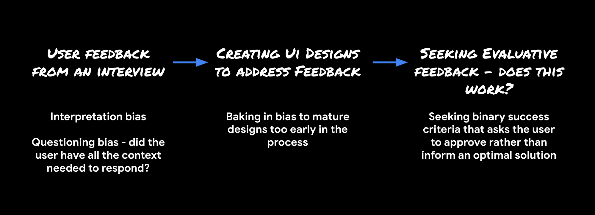
Your results might look something like this (fictionalized for privacy but based on real outcomes):

From there, I can create a usability testing plan that takes into account UX and Engineering scope based on what we’ve determined we need to build, as well as the best assessment criteria to hold ourselves accountable to the insights and nuanced needs we’ve heard from users throughout the process.
I hope this article will help those of you struggling to advocate for more time in between a round of interviews and the request to produce testable wireframes. I’ve found that asking to build in time for concept validation is often a more favorable request than simply asking for more time for interviews. It gets the maker momentum going and visualizes progress more clearly, while still giving breathing room to truly understand user needs before designing in too much bias. Let me know in the comments if you’ve used a similar method recently or if you end up trying this one! I would love to hear about your experiences.

