The power of colour in UX
How to leverage colour psychology, cultural associations, and strategic colour combinations to create impactful user experiences.
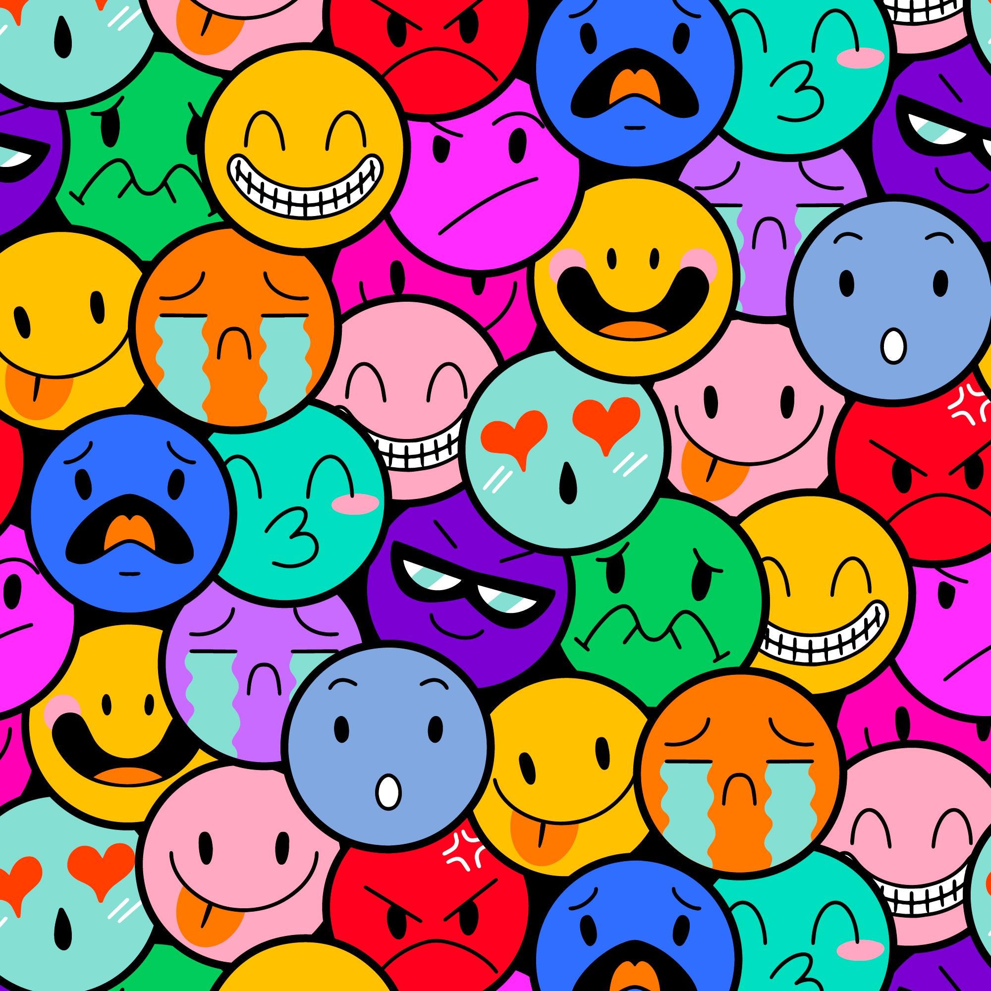
Colour is the secret sauce in design. It reaches out and grabs us, influencing our feelings and actions in subtle and often unnoticed ways. Each shade whispers its own story, stirring up distinct emotions and sparking particular associations depending on our cultural, psychological, and contextual backgrounds. As a designer, I’ve seen time and again how the right hue can breathe life into a design, turning it into an experience that really resonates with users.
Emotional design, to me, is designing with heart. It’s about fashioning a bond, a sense of connection between the user and the product or service that goes far beyond just how things look or work. It’s about creating designs that make users feel good, that stir their hearts and speak to their souls. And the elements we use to weave this kind of magic into our designs? They range from colour to typography, from imagery to the way things interact and flow.
In a recent piece I shared, I discussed how I tackled designing dashboards that aren’t just handy information hubs, but also spaces that stir positive emotions and boost engagement. It was like painting with a palette of emotional design principles, and, let me tell you, colour was one of the most powerful brushes I had at my disposal.
Now, in this piece, we’re going to dive headlong into the fascinating world of colour in emotional design. We’re going to explore how it paints user perceptions, how it subtly influences behaviour. We’re going to see just how much of an impact the colours we choose can have. So buckle up, and let’s get ready to splash some colour onto the canvas of our design journey together.
The psychology of colour
Colours, they’re more than just a splash on a canvas or a swatch on a design. They’re a language of their own, affecting our emotions and decisions in ways we often overlook. Welcome to the world of colour psychology — a fascinating field that digs into how colours sway our behaviour, mood, and perceptions. As a design manager, I can’t stress enough how vital this understanding is to our work. It’s a toolbox we use to guide customer behaviour and foster meaningful bonds with our users.
You might think colour psychology would be a fully mapped-out territory by now, but surprisingly, it’s still a bit like uncharted waters. Researchers Andrew Elliot and Markus Maier hit the nail on the head when they said that while colour is everywhere, its psychological influences have been mostly overlooked, and past studies have often prioritized practical considerations over scientific rigor.
“Given the prevalence of color, one would expect color psychology to be a well-developed area, surprisingly, little theoretical or empirical work has been conducted to date on color’s influence on psychological functioning, and the work that has been done has been driven mostly by practical concerns, not scientific rigor.” — researchers Andrew Elliot and Markus Maier
But hey, that doesn’t mean we’re left completely in the dark! Let’s leverage what we do know and dive into the rainbow. Typically, we split colours into two camps: the warm and the cool. Picture warm hues like red, orange, and yellow. They’re like a crackling fire or a brilliant sunset, sparking feelings of warmth, energy, and excitement. Then we’ve got the cool crew — think blue, green, purple — like a peaceful lagoon or a quiet forest. These are the colours that bring us a sense of calm, relaxation, and tranquillity.
Building on the ideas introduced earlier about the psychology of colour, it’s essential to consider the application of these principles in a real-world setting.
Research and testing are the guiding stars of effective design. But here’s the kicker: while the fundamental principles of colour psychology hold true, interpretation and preference can be deeply personal and vary across cultures, age groups, and personal histories. A common pitfall I’ve observed is designers falling prey to their own biases and preferences when choosing colours. It’s a natural inclination; we’re all human, after all. But as designers, it’s crucial to remember that our role is to communicate and evoke emotions, not merely to create something we personally find aesthetically pleasing.
The designer is indeed not the customer. This mantra needs to be seared into the mind of every design professional. To design for the right person means to design with empathy, clarity, and purpose. It means to put aside our own inclinations and truly understand the needs, desires, and perceptions of our target audience.
But here’s another layer of complexity: our stakeholders, ranging from product managers to CEOs, also bring their own palette of biases. And sometimes, these biases can be as innocent yet misleading as preferring a particular colour because it’s a family member’s favorite. I’ve been in meetings where decisions were almost swayed by such sentiments. This is where user testing becomes our saving grace. Empirical evidence can help us showcase that while the CEO’s granddaughter might love neon pink, it might not be the most effective choice for a critical call-to-action button on a banking app.
Additionally, while the allure of using a wide spectrum of colours can be tempting, moderation is key. Some of the most striking designs I’ve encountered use a limited palette to ensure clarity, focus, and intention. Overloading a design with colours can confuse the user, dilute the primary message, and lead to cognitive fatigue. Think of it as seasoning in a dish; while a sprinkle of salt can enhance the flavor, too much can overpower and ruin the taste. The same applies to colour in design: it should be used selectively, with a clear understanding of its role and impact.
Diving into the world of colours is a bit like exploring an emotional atlas. As designers and marketers, understanding the emotional geography of warm and cool colours can guide us to create experiences that elicit specific emotional responses from our customers.
Let’s embark on a quick tour of the major colours, shall we?
Warm Colours:

First up, we have red. It’s a colour with some serious power, a real show-stopper. Red speaks the language of love and passion, pulsating with energy. But it can also stir up feelings of anger and aggression, often used as a flare to signal danger or warnings. Design-wise, it’s like your trusty highlighter, spotlighting urgency or accentuating key elements on a page.

Then we move onto orange. This one’s like the life of the party. It’s energetic, it’s warm, it’s got that creative spark and zest for life. The kind of comfort and enthusiasm it evokes make it a go-to for food and beverage branding. Use it in your design to infuse a sense of playfulness and to crank up the excitement levels.

And last but definitely not least, we have yellow, the embodiment of a sunny disposition. It’s bright and brimming with cheer, a symbol of happiness and positivity. Yet, it also dons the safety hat, as its use in road signs and other safety signals can bring feelings of caution. Incorporate it into your design to create a feeling of optimism or to spotlight vital information.
Next on our colourful journey, we’re stepping into the cool shades territory.
Cool Colours:

First stop, blue. Imagine the serene vastness of the sky or the calm rhythm of the ocean. Blue is all about tranquillity and calm, often linked to trust, loyalty, and stability. But, like a cloudy day, it can sometimes stir feelings of sadness or melancholy. In the world of branding, you’ll often find it in the healthcare and wellness sectors. From a design perspective, we love using blue to craft a serene ambience and encourage relaxation.

Moving on to green, the embodiment of Mother Nature herself. It’s refreshing and calming, symbolising growth, harmony, and balance. But remember, it’s not all sunny meadows — green can also bring up feelings of envy and jealousy. Green features prominently in financial and environmental branding, capturing a sense of growth and sustainability. Design-wise, it’s a wonderful tool to create a refreshing vibe and deepen the user’s connection with nature.

Last on our cool colour palette is purple, the shade of royal robes and lavender fields. Purple speaks in whispers of luxury and regality, associated with creativity, spirituality, and wisdom. Yet, it also has a hint of mystery and ambiguity. You’ll often spot it adorning beauty and fashion brands, adding that touch of sophistication. As designers, we use purple to bring a dash of elegance and a sense of exclusivity to our work.
Cultural and Contextual Considerations
Let’s shift gears for a moment and talk about the fascinating interplay between colours, culture, and context. When it comes to emotional design, these aspects significantly shape how our designs resonate with different audiences. So, let’s don our explorer’s hat and dive into these associations.
“Share our similarities, celebrate our differences.” — M. Scott Peck
Colours
When we talk about colours, we’re not just talking about visual elements. Colours are like a silent language, carrying the weight of cultural symbolism. They’re tied to our values, traditions, even our beliefs. The way different cultures perceive and interpret colours can drastically influence users’ emotions and perceptions. That’s why, as designers, we make it a point to align our colour choices with cultural nuances, ensuring we don’t accidentally stumble into a cultural faux pas.
Culture
Take red, for instance. If you’re in China, red is a symbol of luck, celebration, and joy, splashed all over festivals and major events. On the flip side, in the Western world, red paints a picture of passion, love, but also danger or warning. So, understanding these cultural swings in colour perception is absolutely essential to hit the right emotional chords with our audience.
Context
But we don’t stop at cultural associations. The context, or where and how a colour is used, plays an equally vital role. For example, blue is a star player in both the corporate and healthcare worlds, but it wears different hats in each context. In the corporate world, it’s all about trust, reliability, and professionalism, helping companies project a stable, competent image.
Colour, culture, and context — the three C’s that are a crucial part of our design toolkit. As we navigate these elements, we’re not just creating designs; we’re crafting experiences that respect cultural identities, industry nuances, and resonate deeply with our users. It’s all part of the joy and challenge of design!
Colour Combinations and Effects
Let’s take a moment and delve into the fascinating world of colour combinations, specifically, their magic and how they can shape the emotions and experiences we create as designers. It’s not just about one-off colours, but rather, it’s about how they interact and harmonise together, creating a compelling visual symphony.
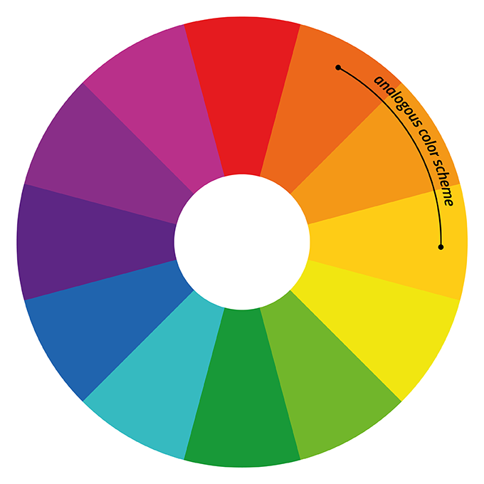
Analogous colour schemes:
We’re kicking things off with a favourite design strategy: analogous colour schemes. Picture this: you’re standing in front of a colour wheel, and you choose colours that are next-door neighbours. That’s an analogous colour scheme. These colour partners bring unity and harmony to designs, creating a soothing, coherent visual experience.
The charm of analogous schemes lies in their balanced and pleasing aesthetics. They allow for a gentle colour transition, maintaining an overall harmonious feel. We designers love using them to stir up specific moods or to weave a consistent visual identity for a brand or product.
Picture a website for a hiking gear brand. An analogous scheme of various greens and blues paints the vibrant, serene beauty of nature, stirring up a sense of adventure. Or imagine a fashion brand that’s all about youthful energy, employing an analogous scheme of bright and zesty colours like orange, red, and yellow. This palette creates a visually captivating brand identity that resonates with their audience’s vibrant self-expression. Or consider designing an inviting living room using an analogous scheme of warm tones like red, orange, and yellow. These colours work in harmony, creating a welcoming atmosphere brimming with warmth, comfort, and relaxation.
So, what are the effects of analogous colour schemes? They create harmonious and balanced compositions, unified and coherent designs. They bring in subtle variations for visual interest, crafting soothing and calming atmospheres. They do offer limited colour contrast, so you need to balance them well for readability and accessibility.
Analogous schemes work wonders in emotional dashboards, creating visually engaging, cohesive experiences. Here’s how you could use them:
- Mood Tracking: Each colour within the analogous scheme can represent a different mood, letting users swiftly identify and track their emotions over time.
- Health and Well-being: Use calming shades of blue and green to evoke feelings of relaxation and tranquillity in meditation or stress-management dashboards.
- Goal Progress: Gradually shift colours within the scheme to depict different stages of accomplishment in goal tracking dashboards. It’s like a visual reward for progress!
- Financial Insights: Use warm analogous colours for income-related info, and cool ones for expenses in a financial dashboard. It helps users visually differentiate and understand their financial data.
- Social Engagement: Use warmer analogous colours to signify high engagement levels, like likes or comments, and cooler ones for less active interactions in social engagement dashboards.
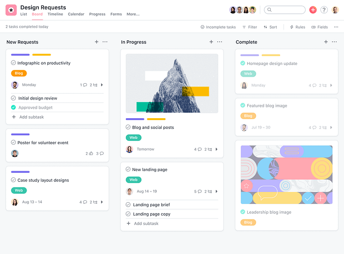
Let me share with you some wonderful examples of how real-life dashboards are harnessing the power of analogous colour schemes:
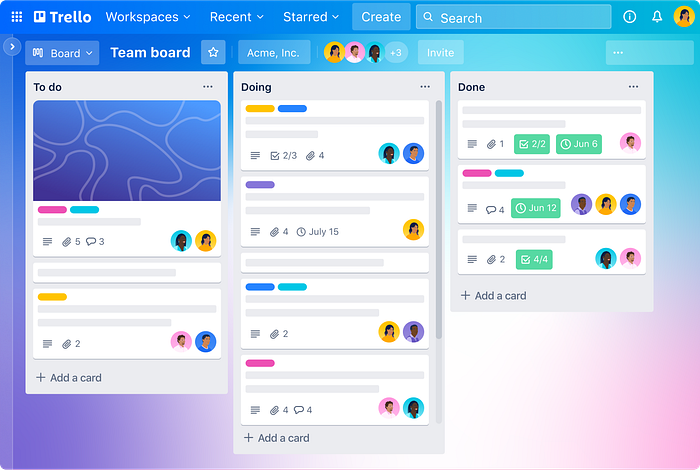
Take Trello, our favourite project management companion, beautifully uses various shades of blue in an analogous scheme. This ocean of blues creates a coherent and calming visual treat, perfectly mirroring the platform’s aim of aiding organization and boosting productivity. The analogous colours act as useful markers differentiating between lists and cards, making task management for users a breeze.
Now, let’s talk about Asana. This project management tool smartly brings into play an analogous scheme with shades of orange and yellow. These warm, lively colours create an upbeat and optimistic environment, which uplifts user engagement and motivation. The analogous colours help distinguish between different projects, tasks, and labels within the dashboard, adding clarity to the user experience.

Next up is Pinterest Analytics. Here, an analogous scheme uses the vibrant hues of red and pink. These colours stir up feelings of creativity, inspiration, and passion, perfectly aligning with the platform’s aim of visual discovery and idea-sharing. The analogous colours serve as a coding system to represent different metrics and insights, simplifying the task of tracking the performance of Pinterest content for users.
Last but not least, we have Salesforce. This leading customer relationship management (CRM) platform makes effective use of an analogous scheme featuring shades of blue and teal. This colour combination evokes feelings of trust, professionalism, and efficiency, reflecting the platform’s focus on managing customer relationships. The analogous colours play a significant role in helping users navigate through the diverse modules and sections within the CRM dashboard.
And now, let’s swing to the other side of the colour wheel and take a look at complementary colour schemes:
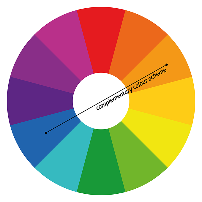
Complementary colour schemes:
When we talk about complementary colours, we’re referring to pairs that sit directly opposite each other on the colour wheel. Classic duos like red and green, blue and orange, or yellow and purple spring to mind. These pairs have a unique relationship that creates a high contrast, leading to dynamic and bold visual effects.
Now, here’s where things get exciting in the world of emotional dashboards. Complementary schemes pack a punch! They create a vibrant, energetic visual impact that commands attention, making your designs not just beautiful, but unforgettable.
But it’s not all about the wow factor. Complementary colour schemes also play a critical role in structuring the visual hierarchy of your dashboard. By using one colour for crucial elements and its complementary counterpart for the less significant ones, you can guide your users’ eyes to key information or actions.
Need to highlight a call-to-action button? Or want to draw attention to a specific data point? Turn to your complementary colour palette! The stark contrast between the colours naturally ushers the user’s gaze to those specific areas, encouraging interaction and user engagement.
However, with great power comes great responsibility. Though complementary schemes are inherently striking, balance is key. Overdoing it could lead to a sensory overload for the user. To strike the right harmony, consider using neutral colours or toning down the intensity of your dominant complementary pair. The aim is a balanced, visually pleasing composition that is as easy on the eyes as it is impactful.
And let’s not forget about emotions. Complementary colours have the power to stir specific emotional responses. For instance, the contrast of red and green might spark feelings of excitement and calmness. The combination of blue and orange can communicate trust and enthusiasm, while the pairing of yellow and purple could evoke a sense of energy and luxury.
Let’s put this theory into practice and dive into some real-world examples of how complementary colour schemes play out in emotional dashboards
Take Airbnb for instance, the globally-renowned online accommodation marketplace. It uses a delightful complementary pairing of dark teal (being the primary colour) and coral. What does this accomplish? Well, this eye-catching colour contrast exudes feelings of trust, warmth, and hospitality, reflecting the company’s mission beautifully. Plus, it maintains a harmonious balance that is visually pleasing to the user.
And how can we forget about Coca-Cola? Its iconic complementary colour scheme is a testament to the power of colour in branding. With a spirited red as its primary colour paired against a contrasting white, Coca-Cola has effectively imprinted itself in our minds. The red speaks of excitement, energy, and joy, while the white strikes a balance, making for an instantly recognisable and emotionally engaging brand identity.
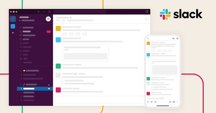
Now let’s talk about Slack, the collaboration platform that’s taken the corporate world by storm. With a bright purple primary colour contrasting against a vibrant yellow, Slack’s complementary colour scheme is truly a feast for the eyes. These contrasting colours serve to create a dynamic, visually compelling user experience, breathing life into the brand’s ethos of creativity, enthusiasm, and collaboration.
And lastly, there’s Netflix. This streaming giant employs a striking combination of red (as its primary colour) and dark grey (as its complementary colour) in its interface and branding. The high contrast between these colours lends a sense of urgency, excitement, and sophistication, painting a picture that aligns perfectly with Netflix’s commitment to quality entertainment.
Each of these examples beautifully demonstrates how complementary colour schemes can be wielded to create visually attractive, emotionally engaging dashboards that enhance user interaction. As a design maestro, learning to master this powerful tool of colour can truly revolutionise the way you shape your user experiences.
Colour Contrast and Accessibility
Now, let’s unravel the significance of colour contrast in the realm of emotional design. It’s like distinguishing different flavours in a meal — some spicy, some sweet, yet all integral to a balanced palate. Similarly, colour contrast is all about the visual difference between various colours employed in a design, a crucial factor in crafting engaging and accessible user experiences that resonate emotionally.
Ever wonder why certain colour combinations just work? That’s colour contrast doing its magic. A good contrast not only amplifies the readability and clarity of content, making it easy for users to digest and interpret the information, but it also sets up a visual hierarchy. This leads the user’s eye to key elements and smoothly guides them through the interface. Plus, let’s not forget the emotional dimension — a striking contrast between warm and cool colours can create a lively, energising experience, while softer contrasts might lend a calming, serene ambiance.

In our endeavour to design emotionally resonant dashboards, we shouldn’t overlook the importance of accessibility. This means ensuring our designs work for everyone, including those with colour vision deficiencies or colour blindness. By opting for colours with sufficient contrast, using colour-blind friendly palettes, and including other forms of information conveyance (like text labels or symbols), we can make sure our designs are accessible and inclusive, not just to some, but to a diverse array of users.
Case Studies
Let’s take a deep dive on some of the most used dashboards nowadays:

Apple Health
This comprehensive platform provides users with all the tools they need to track and monitor their health, from fitness and sleep, right through to nutrition. One of the core principles in Apple’s design philosophy is to foster an emotional connection with users. They’ve managed to achieve this beautifully in the Health Dashboard by creating an engaging experience that inspires users to take charge of their health.
One of the most striking elements of the Health Dashboard’s design is its use of colour. Apple carefully selected each hue to evoke specific emotions and encourage positive user behaviours. For example, the dashboard prominently features vibrant shades of green. Green is a colour often associated with growth, renewal, and vitality. By employing this shade as the primary colour, Apple subtly motivates users to pursue a healthier lifestyle, encouraging feelings of positivity and empowerment.
To complement the energetic green, Apple incorporated soothing shades of blue in sections related to sleep and relaxation. This balance of exciting green and calming blue creates an inviting atmosphere within the dashboard that inspires users to both strive for improvement and rest when needed.

Additionally, Apple didn’t shy away from using touches of bold red in strategic places within the dashboard. This vibrant colour, typically associated with urgency, action, and determination, signifies areas where the user could improve or highlights health goals that are within reach. These little red touches act as a call to action, inspiring users to take proactive steps towards healthier outcomes.
Users have reported feeling more connected to their health goals and inspired to make positive changes, thanks to the emotionally resonant, visually pleasing experience that the dashboard provides. The careful and strategic use of colour has undoubtedly played a significant role in creating this engaging, user-friendly interface. It’s a fantastic testament to the power of emotional design and a case study worth examining for any budding designer.

Google Analytics
Google Analytics, a platform revered by digital marketers and businesses alike, offers a wealth of information about website traffic, user behaviour, and a lot more. Google, with its design philosophy that champions simplicity and user-friendliness, has managed to transform this complex data into an accessible and insightful experience through the Google Analytics Dashboard.
One of the key aspects that make the dashboard so effective is its strategic use of colour. Google has mastered the art of leveraging colours to guide users through the interface and to represent different kinds of data intuitively.
The primary colour of the Google Analytics dashboard is a calming shade of blue. Blue, a colour commonly associated with trust, intelligence, and efficiency, sets the overall tone for the dashboard. This colour selection cultivates a sense of reliability and professionalism, reinforcing users’ confidence in the data they’re analysing.
Complementing the primary blue, Google uses varying shades of green, yellow, and red to represent data trends. Green, often linked with growth and positivity, highlights positive trends or successful metrics. Yellow, which stands for caution or slow progress, is used to indicate stagnation or little change. Meanwhile, red, a colour tied to urgency or negative situations, is used to highlight declining trends or areas needing attention. This intuitive use of colour helps users understand complex datasets at a glance, making data interpretation more straightforward and faster.

To balance out these vivid colours, Google uses generous amounts of white space. This not only creates an uncluttered, clean interface, but it also enhances the legibility of the data, allowing the colourful graphs and charts to truly stand out.
Users of Google Analytics have lauded the platform for its user-friendly interface and ease of data interpretation. The strategic use of colour contributes significantly to this success, effectively guiding users through the vast amounts of data and highlighting important trends and areas of concern.

Spotify
Spotify, a leading music streaming platform, has managed to create a user experience that is not only functional and intuitive but also emotionally engaging. A key part of this success lies in the Spotify Dashboard’s design, particularly its colour usage.
Spotify primarily uses a deep, calming shade of green as its signature brand colour. Green often symbolises freshness, creativity, and harmony — a perfect match for a platform that brings diverse musical experiences to its users. This shade is consistently used across the platform, from the logo to various user interface elements, creating a coherent and immersive visual experience.
The Dashboard design further leverages dynamic colours based on album art for individual songs or playlists. When a user plays a song, the background subtly takes on the dominant colour of the album cover. This creates a unique and emotionally resonant experience for each song, enhancing the user’s connection to the music and the artist.
In addition to this, Spotify uses a high-contrast combination of light text on dark backgrounds for its dashboard. This choice not only reduces eye strain for users during longer listening sessions but also makes key elements stand out, guiding users effortlessly through their musical journey.

Spotify also utilises colours to categorise and differentiate various sections and functionalities of the dashboard. For example, playlists curated by Spotify have a distinct green logo, while user-created playlists adopt the dominant colour of their album covers. This not only adds a personal touch to the user’s interface but also enhances the usability of the platform.
Users of Spotify have often praised the platform for its personalised and emotionally engaging user experience. The colour scheme plays an integral role in creating this experience, marrying functionality with emotional design to deliver an immersive musical journey.
Takeaways
- Understand Colour Psychology: Delve into the world of colour psychology to comprehend how colours influence emotions, perceptions, and behaviours. This insight is a designer’s secret weapon, allowing you to harness the right hues to evoke desired emotions and reinforce your brand’s persona.
- Personalise the Experience: Implement personalisation features that adapt to your user’s unique tastes, moods, and actions. Harness data-driven strategies to present content that emotionally resonates with your users.
- Narrate Through Colours: Merge the dynamism of colour with engaging visuals and interactivity. This potent mix will immerse users in your brand’s tale, fostering a deeper bond with your offering.
- Foster Exploration and Engagement: Construct your design with a user’s journey in mind. Intuitive layouts and strategic colour placement can spotlight essential actions, guiding users seamlessly through the interface.
- Cultural & Contextual Sensitivity: Remember, colours carry varied meanings across cultures. Tailor your palette to respect cultural norms and industry-specific connotations to prevent unintentional missteps.
- Holistic Colour Strategy: Beyond individual elements, view colour in its entirety across the interface. While it’s tempting to add ornamental hues, remember that they can cloud the product’s primary purpose. The overarching colour strategy should serve functionality, not just aesthetics.
- Maximise Hue Variations: Instead of an array of colours, consider manipulating the shade, lightness, or saturation of a single hue. This tactic offers a spectrum of meaning without overwhelming the user.
- Animate with Purpose: The movement of colour, when animated, can be an adept method of drawing attention. But use this with discretion; while motion in colour is engaging, it may merit its own deep dive.
- Value White & Dark Spaces: Effective colour application necessitates breathing room. Whether it’s white space or the contrasting dark mode, these “voids” amplify the impact of your colour choices, ensuring clarity and focus.
- Maintain Colour Consistency: Whether within one product or across a suite of products, consistent colour usage establishes a coherent visual language, safeguarding against user confusion.
- Timelessness Over Trends: While it’s tempting to embrace the latest colour fad, remember that trends fade. Opt for enduring colours and combinations to ensure lasting appeal and avoid frequent changes.
- Tread Carefully with Changes: Tweaking established interface colours can be as jarring for users as relocating key features. It’s a reminder of the adage, “Who Moved My Cheese?” Consider user familiarity and comfort before making drastic shifts.
- Balance Branding with Usability: A complex but crucial task is to harmonise brand colours with usability-centric hues. If a conflict arises, always lean towards usability. Relegate brand colours to specific branding components if needed, ensuring the user’s experience remains unhindered.
Conclusion
The role of colour in emotional design is indeed monumental. It’s like a master key that unlocks compelling user experiences. Colour has this inherent ability to stir emotions, mould perceptions, and guide user behaviour. Once designers manage to navigate the intricate psychology of colour, consider the colour associations rooted in various cultures and contexts, and skilfully use colour combinations, they have a winning recipe to create dashboards that are both visually pleasing and emotionally captivating.
The colours we choose should naturally resonate with the emotions we aim to evoke and the audience we want to engage. In this journey, we should never lose sight of the cultural and contextual influences on colour meanings. Prioritising colour contrast and accessibility is another way we can be certain that our designs cater to every user and no one feels left out. And of course, let’s not forget how instrumental colour can be in branding, assisting us in carving out a unique visual identity and triggering the right associations.
Businesses and designers can strategically use the influence of colour in emotional design to heighten user engagement, curate positive brand experiences, and distinguish themselves amidst market competition. By judiciously exploiting the potential of colour, they can form emotional bonds, prompt desired actions, and ultimately gift users with experiences that they won’t forget in a hurry.
To sum it all up, colour in emotional design is like a power tool. If used thoughtfully, it can substantially enhance the efficacy and impact of dashboards and overall user experiences. Recognising and utilising the deep impact of colour paves the way for creating designs that not only draw users in but also leave a lasting, resonant impression.
Feel free to learn more about the Designing memorable dashboards from one of my previous articles.

