The problem with abundance
Since the past couple of times, whenever I have logged into Netflix to watch a show or a movie, I have ended up browsing through their endless catalogue for hours without arriving at a conclusion. After speaking to a few friends, I realised that this isn’t a dilemma faced only by me. There are so many more users that when faced with countless choices decide to do something else instead. Even after applying multiple filters, the unending list feels so overwhelming, that a user eventually gives up.
This phenomenon was termed “The Paradox of Choice” by psychologist Barry Schwartz in his book with the same title.

Humans by nature are more comfortable with following directions than taking decisions. Thus, when given with multiple options to choose from, they are highly likely to get overwhelmed by the choices.
A very pointed reason for this is ‘FOMO’ — Fear of Missing Out.
With so many options at hand, the user wants to make the best/correct choice for themselves. To make the absolute right choice, they would need to analyse each option and weigh them against each other before picking. The subconscious fear of not picking the correct option, of making the wrong choice is what overwhelms the user.
The reason why the process is overwhelming is because the user dwells over the potential outcomes and results that may could be caused if they were to make the wrong choice. Moreover, evaluating every option at hand is not only time consuming for the user, it also reduces their productivity. Adding excessive cognitive load increases the turnaround time for the user to come to a conclusion.
Hick’s Law states that “The time it takes for a person to make a decision as a result of the possible choices he or she has: increasing the number of choices will increase the decision time logarithmically”
This means that when a user is swamped with alternatives, the time and effort they need to make a choice increases drastically.

Real-world examples
An example of this in the real world can be seen at a restaurant or even while ordering food online. With the number of restaurants, cuisines and dishes to order from, most conversations of getting food start and end at “You decide”. Somewhere in the conversation lies the fear of picking a wrong dish or worse, thinking that they could’ve ordered something better.
This is the reason why many high-end restaurants are not multi-cuisine and why their menu is extremely limited. Narrowing down the options available for a user eliminates the dilemma they would have faced if they were forced to do it themselves.
Another example of this in the digital space would be e-commerce.
E-commerce websites are the most common area where a user is subject to an overwhelming number of choices.
Now the problem with e-commerce is not just the abundance of similar products available for the users to choose from, it is also the numerous websites to choose from. When purchasing a cell phone, a customer would look at multiple websites to see which one offers the best deal. Not only that, they might even decide to wait for a sale period to begin to acquire the best bargain.
What can we as Designers do to deal with the problem of abundance?
1. Categorise, Filter and Search
To help users find their way around an e-commerce portal with thousands of products at their disposal, Designers should categorise their products very well.
If categorised well, the user would be able to navigate through the system better, and start their journey at a more relevant spot.
This would help them escape lot of unnecessary cognitive load that they would otherwise need to go through.
To assist the user with further narrowing down the catalogue, they should be equipped with relevant filters and sorting methods. For users who want to browse through products of a certain type or range, filters come very handy and leads them to relevant results.
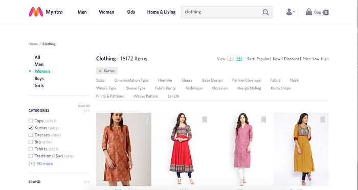
For users who know exactly what they want, search bars lead them to their destination in an instant. As designers, we can bring up items closely related to the search query for customers so that even if there is an erroneous entry, the next few results lead the user to the product they need.
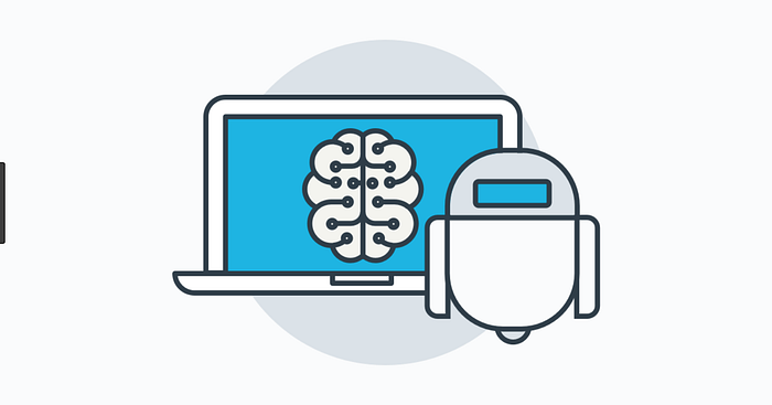
2. Choose for the user
By employing Machine Learning, systems are able to predict what the user might need. As designer, we should use this data to our advantage by auto populating all areas of the UI that we can.
When choosing for the user, accuracy is key
If accurately predicted, the user will be able to build a trust with the system. So the next time a user’s screen is pre filled with data, they would be able to skim through it quicker and make faster and easier decisions.
In systems that do not have the capability of employing Machine Learning, defaulting the choice on basis of history and relevance reduces their effort to a great extent. The advantage in defaulting is that the user expects it coming due to his past choices. Hence even if the defaulted value is not what is needed by the user, the frustration is far less than a predicted value.
3. Display limited options
Reducing the number of options available for the user is unfair, both to them and to the business. While not having enough choices causes dissatisfaction to the user, having too many disorients them. To deal with a large number of options, designers can choose to display the most relevant options for the user upfront, and hide the remaining on the UI. This way, we are reducing the cognitive load for the user without compromising on the flexibility of choice.
The problem with abundance is the reason why minimalistic design was such a hit with the masses.
Users want their UIs to be clean and clutter free. So the next time, think twice before saying “The more the better”.