The rainbow sheet: a visual method for research analysis
How the rainbow spreadsheet helped evaluate Harvard’s new visualizations-based course-selection tool.
Last November I helped moderate twelve usability tests to evaluate Curricle, a visualizations-driven course-selection platform for Harvard University. The web application was still in beta and the product team wanted to know if students understood how to use the tool and if they found the tool enjoyable. In the end, we discovered that while Curricle had a lot of potential, the platform still needed many usability improvements. But I don’t want to talk about the results. Instead, let’s talk process, specifically, let’s talk about how we analyzed the test results.
Our research team was completely separate from the Curricle design team. In fact, the majority of the researchers in my team had not heard about Curricle until we were tasked with evaluating its usability. Reporting findings to an external design team presents several challenges, but one important challenge is properly illustrating the results. Another challenge is working with an external deadline. For those two main reasons, I advocated for the use of the rainbow spreadsheet for this project.
How did we find this technique?
The sheet wasn’t something our team had used before. A few weeks into our usability tests the team’s Lead Research Adviser posted a Smashing Magazine article on Slack, where Tomer Sharon described the use of the rainbow spreadsheet. Around the same time, I had spent several long hours writing and organizing sticky notes to create a large affinity diagram containing qualitative data about the use of Harvard mobile applications. Don’t get me wrong. I still enjoy using affinity diagrams and they have their place. But I realized that for our purposes the rainbow spreadsheet provided a faster, more concise. and more visually appealing alternative.
How does this rainbow spreadsheet work?
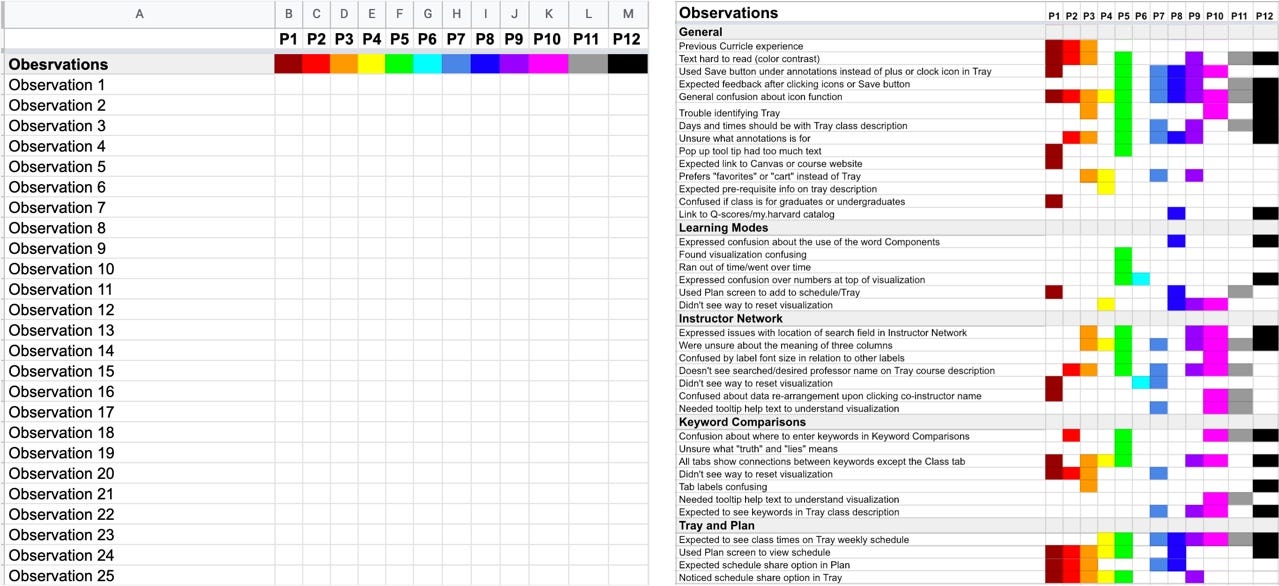
The rainbow sheet consists of a spreadsheet document where researchers can record behavioral patterns presented by research participants. Every time a participant exhibits a new note-worthy behavior the researcher writes the observation in the left-most column of the rainbow sheet. Towards the right of the observations, each participant is assigned a color, and a label (we used the suggested labels P1 to P12, which stand for participants 1 to 12). If a participant performs a recorded behavior (or observation), the participants cell is filled in with the participant’s assigned color.

There are several ways to use the sheet. Sharon suggests using the spreadsheet during usability testing. However, we opted for taking notes during usability tests, and later using the spreadsheet to find patterns in our observations. The end result is the same, a colorful visualization of behavioral patterns.
Benefits of the Rainbow Spreadsheet
You Can Work Quickly
Sharon provides a pretty comprehensive and descriptive template. The hardest part about using the sheet was getting started. Once we got comfortable with the method, we were able to analyze and summarize findings speedily.
You Have A Flexible Framework
As I mentioned, you can use the spreadsheet during usability sessions or after, depending on the needs of your team. Furthermore, you can customize the spreadsheet to better represent your results. In the original template, Sharon suggests notating all observations one after the other. However, our study focused on four very different different areas of the Curricle platform. Thus we decided to split the observations into five different sections: one General Observations section, and four different platform areas (named Learning Modes, Keyword Comparisons, Instructor Network, and Tray and Plan).
It’s Easy to Combine with Supporting Documents
Because the sheet includes forms part of a larger spreadsheet document, you can use the tabs on your document to create additional sheets with supporting data. For Curricle, we included data about participants, success completion data, and data about user platform enjoyment.

You Can Find Patterns Easily
Once you have filled out the rainbow sheet you can easily scan it to identify the most common behaviors among test participants.
While we were doing the Curricle usability tests, most test participants indicated they that did not enjoy the platform and that they found it difficult to use. Thus we decided to focus on using the rainbow sheet to notate problem areas. After we had filled out the sheet, we were able to quickly scan it to find which areas of the platform participants struggled with the most. In general, the observations with most colored cells, presented a potential priority item.
Potential Drawbacks
Like all research methods, the rainbow sheet is not great for everything. If you have few data points, another method, such as an affinity diagram, might be more useful. Furthermore, the rainbow sheet may not be able to stand on its own. For Curricle we used it as an accompanying resource to a larger written report.
Conclusion
Our team was extremely satisfied with the rainbow sheet and we plan to use it in the future. This colorful solution provides a useful way of both interpreting and communicating usability research findings. I’d definitely suggest trying it. If you’ve used it in the past or are planning to use it in the future, I’d love to hear your thoughts!