Crestfallen: the simplification of football emblems
 Modern-day design principles for logos are simple. Minimise unnecessary text, use clean lines and simple imagery, and use colour to convey meaning — think Nike, Starbucks or Apple. For a long time, major football clubs have favoured traditional crest or shield-based designs. Until now. The football emblem landscape is changing and club designs are catching up with their corporate counterparts.
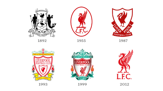
Traditionally, when a football club formed they would adopt their town or city’s crest, usually a complex design of various symbols and colours. Liverpool city’s coat of arms, adopted by Liverpool Football Club in 1892, features the Roman and Greek gods, Neptune and Triton, as well as two Liver birds and a Latin phrase.
Clubs adapted their emblems over time, adding mottos, images of footballs and icons representing events from the club’s history. The addition of flames to Liverpool’s logo in 1993 commemorated the victims of the Hillsborough disaster.

In the Post-War era, clubs made efforts to modernise their emblems in line with the growth of the International Typographic Style. This design movement standardised colour and typefaces and, most importantly for football, advocated for the “banishment of ornament”. The 80s and 90s saw a revival of traditional crest-style emblems, promoting nostalgia as well as reinforcing pride in a club’s history, and the fans’ attachment to it.
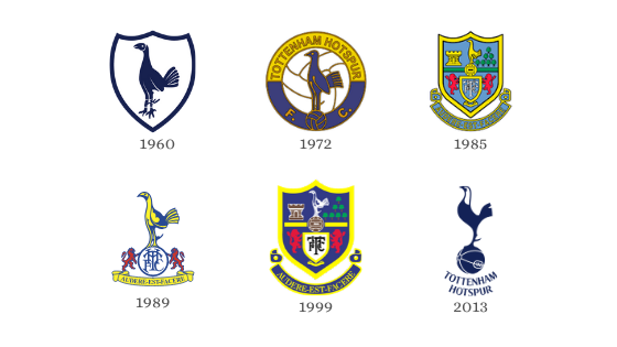
In the last decade, we have once again seen a simplification of club emblems. Consider Liverpool, Tottenham and Juventus’ most recent logos. Gone are the colourful crests with complex patterns and intricate designs. We see clean lines, minimal text and colour, as well as simplified iconography, creating a modern, stylised club identity.

This stylised identity can also boost commercial revenue. The explosion of athleisure in recent years has significantly increased the expectations of fans for the stash being produced by clubs. These sleek logos meet the increasing pressure to produce premium, stylish kit for fans who will wear their kit to the gym, out to brunch and everything in between.

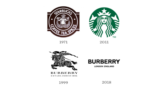
In this way, clubs are following the trend set by many international corporations. The Starbucks logo has gradually shifted from a detailed, fuzzy drawing of a mermaid to the iconographic, digitized and vividly coloured illustration we recognise today. Burberry held off until 2018 when the fashion house made the first change to its logo in more than two decades. The dramatic transition from their iconic knight to a simple, text-based logo shows that change and modernisation will follow for the company itself.
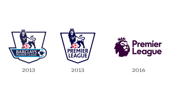
In 2016/17, the English Premier League (EPL) also redeveloped their logo. At the beginning of the season, the league moved away from having title sponsors which lifted the design constraints created by having to include another brand’s logo. The EPL took the opportunity to modernise and the result is striking, streamlined, and enhanced for digital and broadcast formats. The shape of the lion’s head alludes to the shape of a football, removing the need to integrate the extra element into the design. Modern viewers accustomed to the world of emojis may identify with the simplified lion more than the 2013 illustration. Additionally, the logo is now a unified colour; the EPL’s traditional blue has given way to a stylish purple, forging a neutral identity for the league that appeals to all, since no Premier League side plays in purple.
Not all redesigns have been well received. Juventus released a statement when they launched the new logo, stating that it “represents the very essence of Juventus: the distinctive stripes of the play[ing] jersey, the Scudetto shape and the iconic J for Juventus. The black and white stripes are the defining trait of the new visual identity and can be adapted to fit any setting”. However, the loss of the charging bull and the crown, key motifs of Juventus’ identity, was a bone of contention amongst fans who believed it was “too corporate and anonymous”. This should be a lesson for other clubs wishing to modernise their brand — don’t lose your identity.
This being said, football clubs are having to adapt their identities for an increasingly international audience. Research conducted by Nielsen Sports for the EPL highlights that during the 2018/19 season, Chinese audiences increased by 6% from the previous season, whilst viewing records were set in the US. International players also impact a team’s audience. Tottenham, who signed South Korean player Son Heung-Min in 2015, attracted high numbers of South Korean viewers and Liverpool, whose starting line up includes Dutch stars Gini Wijnaldum and Virgil van Dijk, saw a record number of viewers in the Netherlands.
An international club identity needs to appeal to a global audience, and this comes with risks. To a Chinese audience, for example, the colour yellow poses an interesting dilemma. When used in the context of media, the colour yellow (黄, huáng) conveys something pornographic. Red, on the other hand, signifies luck, joy, celebration and is believed to ward off evil. Simple, clean logos are a logical solution to counter these risks. As just over 62% of players in the Premier League are not home-grown, international fanbases are lucrative markets for EPL clubs.
The best logos are simple. You can immediately recognise and understand them. Modern football clubs are corporations and over the coming years, an increasing number of clubs will simplify and internationalise their brands in the race to secure a lucrative share of the global market.


