The smart secret hiding in your phone’s keyboard

Your phone’s keyboard is hiding a secret from you — and that is a good thing. In this article, we’ll explore how and why that is the case, and what we can learn from this story for building future adaptive and “intelligent” user interfaces.
Maybe you remember a situation like this: You borrowed a friend’s phone to quickly look up something and now you keep mistyping your search an embarrassing number of times, all while your friend is watching. “I’m not that clumsy”, you explain, “I’m just not used to that phone”. There’s a good chance that the opposite is also true: Your friend’s phone is not used to you.
We often hear about apps and services collecting data, for example, to inform which ads to display, which movies to recommend, or which news to include in our social feeds. But there is a less well-known type of data that can be utilised for the benefit of the user: Data about your input behaviour.
This data can help to tailor a UI specifically to you, for example, to improve how fast and accurately you can type on your phone. Human-computer interaction (HCI) research has explored this idea for several use cases. In my doctoral research at the intersection of HCI and Machine Learning, I created concepts and applications for such behaviour-aware user interfaces, as I called them in my thesis. The prime example in use today is found in your phone’s keyboard and this is what we’ll look at here.
Visual keyboard vs control space
Pull out your phone and look at your keyboard now. It’s very likely that what you see is not what you’re actually using every day. There are two layers to your modern “smart” keyboard, as shown in the figure:

First, the keyboard you see (left) has a regular grid of letter keys, all of the same size and shape, except for special keys. This is the visual space and thanks to it you know where to move your finger to hit “a” and “e”, and so on.
However, underneath that visual keyboard sits a different, invisible representation of the keys — the control space (right). In the old days, the control space was identical to the visual space: For example, the visible key area of the “e” was exactly the area you had to hit with your finger to type “e”.
In contrast, some modern keyboards separate visual and control space. Which keyboard pixels result in which letters is dynamically adapted, usually based on two components: Your past input behaviour, and the language context. We’ll cover the input behaviour here.
Adapting a keyboard to you
Let’s say you tend to hit the “e” key slightly too far to the right. Sometimes, say, you thus hit the “r” right next to the “e” by mistake. Your adaptive keyboard keeps track of all those touch points. After a while, it has learned that your typical “e”-touch is not aligned with the visual centre of that key but rather shifted to the right. It will accordingly interpret your future touches, which means that, for you, some of those pixels of the “r” key are interpreted as an “e”. As a result, the keys you see — the visuals of “e” and “r” — no longer directly correspond to the areas used internally to trigger these letters.
The figure visualises this keyboard personalisation process.

So in a way, your keyboard’s visuals are “lying” to you — but it helps: Research has shown that adapting the control space in this way improves typing performance by reducing mistyped letters.
Why hide adaptations?
Why the secrecy, though? Why not show adapted key areas? It turns out that this is a bad idea: If keyboards display reshaped key areas, performance can decrease, due to an unwanted feedback loop between user and system, as shown in the figure — you want to avoid the red feedback on the left.
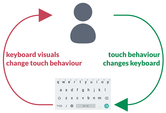
If visual key areas change, so will your touch behaviour. In turn, your changed behaviour will lead to new changes in the keyboard, which will again influence your behaviour, and so on. You and your keyboard race each other with mutual adaptations, likely towards a distorted and impractical layout.
To avoid such bad co-adaptation, the visual keyboard stays the same, despite the changing key areas underneath.
Limits of key area adaptation
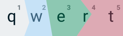
Moreover, there are healthy limits to be respected for keyboard personalisation: Adaptation of key areas must never lead to a state in which a key has no area left at all, for example, due to its neighbours having been adapted too far. The figure shows such a case: Here, the “r” cannot be entered at all, since “e” and “t” have been adapted too much.
To improve typing further, language context is often used for disambiguating keyboard touches. A lot has been written about related features such as auto-correction, word prediction, and so on. I don’t cover this part here, but it can be combined with touch adaptation (it started with Goodman et al.).
Here we’ve covered the physical component, that is, taking into account how individual users place their fingers on the keys. This “smart” keyboard feature is much less well known than language prediction since there are good reasons for hiding key adaptations, as explained above.
Takeaways
In this article, we’ve uncovered the hidden separation of your phone’s keyboard visuals from its interpretation of your typing touches. More generally, such a keyboard is an example of the concept of behaviour-aware user interfaces:
Enabling UIs to analyse and adapt to how a user executes input actions can improve the effectiveness and efficiency of said interface for that user.
If you’re a mobile keyboard user, you now know a little bit more about your phone’s hidden personalisation. Possibly, this explains why borrowing a friend’s phone can make typing feel slightly awkward. Or why your new phone or keyboard app feel a bit unusual, even with the same OS and visual style.
If you’re a UI designer, front-end developer, or HCI researcher, here are three key takeaways:
- See if you can utilise rich individual details of input behaviour to improve performance and/or user experience, even if your UI only uses simple actions, such as finger taps.
- Dare to think beyond what the UI visuals imply when implementing how your UI interprets user input. Besides generally facilitating more adaptive UIs, this separation of visuals and input model can help users with diverging motor skills.
- Carefully examine if and how UI adaptations should actually visually change the UI to avoid unwanted feedback loops and co-adaptations between user and system.
Outlook
Finally, don’t feel betrayed by your keyboard: After all, adapting the key areas and hiding those adaptations improves your typing experience.
Nevertheless, as an HCI researcher, I consider it worthwhile and important to think more about transparency and explainability in this context. These are hot topics in Machine Learning and Artificial Intelligence right now. Yet they are rarely discussed for UIs with personalised interpretation of input behaviour: Even if hiding adaptations is better for practical use, I believe that users might still be interested in knowing which behaviour information their UIs capture and process. As an example from current practice, the SwiftKey keyboard app in its settings menu offers a brief visualisation of its key adaptations, based on touch data. There is certainly more to be explored here.
I’m curious to hear your thoughts on adapting UIs based on input behaviour data, hidden or not. For more insights from research on intelligent and adaptive user interfaces, follow me here or on twitter.
In any case, happy (personalised) typing!
Want to learn more? Check out my article on utilising personal touch behaviour patterns to guide GUI design and adaptation.