How to design for people who navigate via keyboard
There are a lot of reasons why someone navigating your site or product might not use a mouse. Some people who don’t use a mouse will only use a keyboard.
When I’m testing websites or apps, the first thing I tend to run through is how easy it is to interact with via only a keyboard. I’m sorry to say I rarely come across examples where this is a good experience (or possible at all in a lot of cases).
Get an understanding of how impossible keyboard navigation can be
A great game has been designed to replicate how hard it can be to navigate the web via only a keyboard when designs haven’t considered this use case.
Visit Hocus :focus and see how well you get on.
Understanding WCAG guidance on keyboard navigation
I’d like to highlight two sections within WCAG that relate to keyboard navigation. 2.1 — Keyboard accessible, which has a number of criteria within it and 2.4.7 — Focus visible .
2.1 describes:
The intent of this Success Criterion is to ensure that, wherever possible, content can be operated through a keyboard or keyboard interface.
Adding to that 2.1.2 states:
If keyboard focus can be moved to a component of the page using a keyboard interface, then focus can be moved away from that component using only a keyboard interface.
This criteria is here to make sure people navigating via a keyboard don’t get stuck on an interactive element.
Finally, 2.4.7 includes:
Any keyboard operable user interface has a mode of operation where the keyboard focus indicator is visible.
So any interactive element should have a clear indication when it is active so it is easy to see where someone is on a page.
The main issues I have come across hindering keyboard navigation
No visible focus state
By far the most common issue I have come across is websites having multiple interactive elements (or all of them) that have no visible focus state.
This makes it almost impossible to navigate via a keyboard, leaving someone to count how many times they hit tab or try and work out from the url displayed at the bottom of the browser if they are on the right link.
For me, this is such a terrible mistake to make. With only a tiny consideration and very little impact on other users this should be very easy to get right. Most interactive elements have a focus state visible by default in the most common web browsers.
A slightly less severe but still annoying issues related to this is focus state that are really difficult to notice. If you are going to include a focus state make it obvious so people don’t have to strain to find it.

A change of context doesn’t change the tab order
I’ve lost count of the number of times I have been navigating via keyboard, opened a modal, only to completely loose where I am on a page. If an interaction causes a context change like a new modal to display the tab order needs to be updated to maintain a logical focus.
If this doesn’t happen the next item that is tabbed to is a shock as it is usually an item that has been hidden by the new modal or context. This usually means the person has to tab many many times until they eventually find the focus element inside the modal.
A related issue I’ve seen too many times is being able to focus on elements that aren’t currently visible. For example, if a website uses a drop down navigation requiring the user to open a new menu to see the next level of navigation, the hidden navigation should not be focusable. However, when created incorrectly, the focus states gets lost and what is actually happening is the hidden navigation is being focussed on. This will nearly always result in a terrible experience for the person using the keyboard.
No skip links
It’s good practice to introduce skip links, which allows people using only a keyboard to tab directly to the main section of a page. This saves the person having to tab through the entire navigation every time they go to a new page.
Sadly, this good practice is rarely evident from the sites I’ve been testing. It’s all too common to have to tab many times through the same links before getting to the content I actually want to interact with on the page.
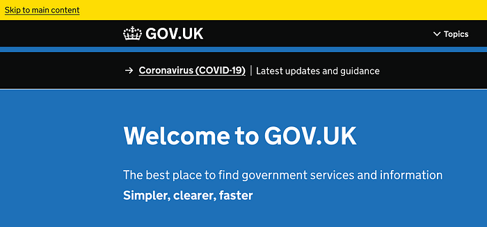
An example of better keyboard navigation
Here’s a better example of a website where keyboard navigation has been considered.
- There is a clear focus state which is easy to see and available on all interactive elements.
- Not only is there a ‘Skip to Content’ link they also allow people to skip to the menu and the footer.
- When the flyout menu is activated the focus order is updated to focus on the menu.

