The state of the hamburger menu

One insight that I’ve found on my research, and put into two of my previous case studies and work, is that most of the user are not comfortable with Hamburger icons, the rest are just willing to muddle through.
In most cases it was because it feels unnecessary to click to open the icon, and click again to get tho where we want, click the icon again to open up the menu, and click to where we went or where to next. These four steps action has now getting too long especially when we’re more familiar with better alternatives like bottom bar.
I’m sure most of us already knew this little lined icons there whether you are the user or the UX designer. It is one of the popular navigation element we find on desktop, android and iOS apps and websites. It’s three horizontal lines that represents side menu, drop down menu, and mostly used on vertical contents.
Characteristics
Hamburger menu is a space-saving menu, the most of it all. Hamburger menu helps simplify menus, group certain secondary features together and creates pleasing design overall. The icon itself also widely recognized. However, there this menu lacks discoverability, which could lead to low engagement because it will be used a lot less.It doesn’t really help user to achieve their goal within the app.
Intuitive navigation system tells you where you currently are, and where else you can go.
Usage tips
Don’t make hamburger as a primary navigation
Hamburger Menu has it’s purpose, and many apps still use it. As mentioned above, there are faster way for the user to accomplish what they want to do in your app like with bottom bar. Two main concern is that hamburger menu has low discoverability and second, it doesn’t play well with back button (to go back and forth).
However, hamburger menu does clean the screens from unnecessary secondary action away, so strong information architecture must be at play here, which action demands are less important and can be tucked away. My mindset is that I think of UX as a physical space. And hamburger menu is like one of those shelf you put random things you can’t get it out of your room yet because it’s probably needed in the future.
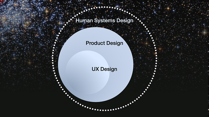
One of my principle in UX is that I think of UX as a physical space.
Put only less important features for user
Products should be of service to user, but at some points, also need to keep some informations necessary for the brand, such as “about us”, “chat customer service” and others when it’s necessary. We can’t put everything upfront, can we :) But we can solve this with affinity mapping and prioritization. If you see the diagram below, you may see the lower right segment. There’s feature less important for the user but important for the company. I don’t think this is a mean to scrap those features/service, but we may put it somewhere accessible when it’s needed

Instagram is one of the app that I notice that does this. Instagram has it’s bottom bar as primary navigation, but if you go to the profile, on the upper right corner, instagram put hamburger there for less accessible features.
Declutter
If you’re going to use hamburger navigation, the last thing you want to do is to make it visually noisy. Putting up nice spacing, using contrast accordingly, and overall great composition of design elements would make the usage better and wouldn’t feel overwhelming.
Takeaways
Icons and interaction methods are improving over time, depending on a lot of factors. Hamburger menu might be a good idea on it’s time, but today may not be the best solution for primary navigation, and today’s solution might be an obsolete in the next few years. Who knows? There is no single truth in UX, there’s only context.