The story of dark mode, light mode, and the user

 I have been working on designing a UI for an app that has individuals over the age of 60 as its main audience. At some point, I found my design more appealing in dark mode. As a UX designer, I know that my opinions and preferences don’t matter and I have to see what the real user prefers. However, because of the pandemic restrictions, I was unable to do one-on-one user research to find out what the users prefer.

Takeaways
Based on my findings in research studies, articles, blog posts and user comments, my key takeaways for deciding about using dark/light mode at designs are as follows:
- You have to design for both modes and provide the user with the option of switching between them.(accessible and inclusive design)
- For text-heavy screens, light background with dark text is preferred as default (legibility)
- For messaging interfaces, light background with dark text is preferred as default(semantic interpretation)
- For people experiencing Migraine, dark theme is preferred as default (health)
- For people with long hours of working with screens, dark UI is preferred as default (preference)
Research Approach
I looked up academic research papers, articles published on the internet, blog posts, and any other possible resource that I might find the answer through. One of the most interesting resources I found was the comments people left for some of these articles and blog posts. They were actual users of dark and light themes that expressed their opinions about their preferences and most of the time with an extensive explanation about the reason for their preferences.
None of the resources that I found compelled me toward using or not using either of these modes. Most of the old resources have only explored this subject for text reading use cases only. Many of the new resources based their arguments on those old ones (as it seems to be reasonable to do so!). However, I didn’t only rely on academic studies and tried to find more clues and synthesize my own conclusion.
I found that I can explore this subject from the following perspectives:
- Legibility (How readable is it?)
- Aesthetics (How beautiful is it?)
- Personal Preferences (Who prefers what?)
- Emotional effects (How does it affect emotions?)
- Semantic Interpretation (How does it affect understanding?)
- Visual fatigue (Which one makes the eye tired?)
- Technology benefits (Which one is technologically preferred?)
- Health conditions (Which one is better for health?)
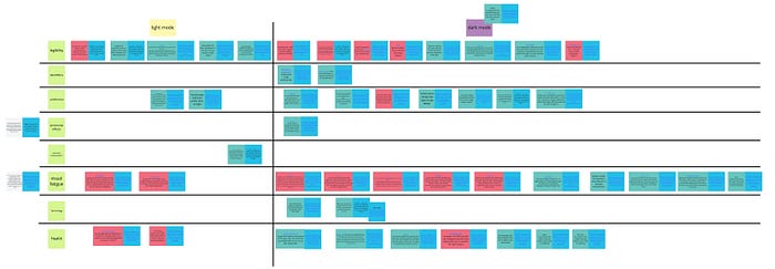
I defined a table(ish) structure, in which each of the defined aspects forms a row, and Dark and Light modes define a column each. Then I started to exploit facts out of my readings and placed them in the correct location in the table.

The left and right columns are light and dark mode respectively and each row represents one of the criteria I mentioned before. Red squares are against that mode in the specific criterion and greens are in favor of that mode. (Blue square is the reference related to each fact.)
There have been some situations where the resource discussed one mode instead of explaining the benefits of the other. So I divided up my findings into two categories, the ones favoring a mode and the ones against it.

Research Results
After categorizing all the findings (Affinity finding), I synthesized the results of my (micro)research. Though I couldn’t find so many clues for every criteria, some of them with few findings were supported with strong research papers that made me compelled to conclude based on even a single finding. Here are the results for each criteria:
1- Legibility:
- Research results support the legibility of dark text on light background more than light text on dark background [1].
- The smaller the font, the better it is for users to see the text in light mode[2].
- Higher luminance of light background leads to an improved perception of details [3].
2- Aesthetics:
I couldn’t find any structured and unbiased research on this issue. However, based on my explorations, I can say the overall number of users who left comments in favor of the beauty of the dark mode exceed from the comments supporting the light mode. (see for example comment sections at [4] and [5])
3- Personal Preferences:
Research studies show that dark themes are widely used among professions that heavily rely on working on computer screens [1].
Large companies play an important role in forming preferences of their users. For example:
- As Jon Friedman (Head of Microsoft Office design) states in his article [6], Customer choice was why Microsoft brought darker UI theme to desktop apps in office 2010, and also they brought it to more Microsoft experiences like Teams, due to its popularity.
- Apple somehow convinces their users for using dark mode by stating: “ Dark Mode makes it easier to stay focused on your work, because your content stands out while darkened controls and windows recede into the background.” [7]
- Google states that dark theme has many benefits and provides guidelines for developers to utilize it on Android devices [8].
4- Emotional Effects
Research studies approve that proficient color design increases pleasure, whereas inappropriate use of colors results in boredom, which in turn negatively affects mood and lessens the User Experience[9]. However, I couldn’t find any study or enough feedback from users to have any conclusion about emotional effects of dark/light themes.
5- Semantic Interpretation
A research study [1] shows that for chat interfaces, dark themes increase the probability of interpreting an ambiguous message negatively compared to light themes. However, I couldn’t find any similar study for other types of UIs (e.g. photo galleries).
6- Visual fatigue
A research study by Nielsen Norman Group [2] states that there is no significant difference between dark and light themes in making people more tired. Also after reading users’ comments at[2,4,5], I can confirm this finding independently. There are users who found the dark mode so disturbing and some users who found it a relief. Finding an affinity requires conducting academic research studies considering age, visual status, gender, etc.
7- Technology
OLED screens display black by deactivating pixel elements altogether. This way, true deep blacks can be achieved without the consumption of any power and this is one of the main reasons many users mentioned for their use of dark themes[1]. However, using any shades black (like dark gray) dissolves this benefit (i.e. not every dark mode design saves power!).
8- Health
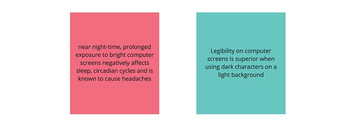
A research study [10] confirms that near night-time, prolonged exposure to bright computer screens negatively affects sleep, circadian cycles and is known to cause headaches. Another one [2] states that even though performance in light mode may be better in the short term, there may be a long-term cost associated with it. From my exploration in users’ comments on blog posts [2, 4, 5], I found that users who have experienced some sort of eye disease or visual impairment, or the ones dealing with Migraine found the dark mode more comfortable.
Reflection
This was a one-day exploration of the resources I found on the internet to find an answer to the simple question of using dark or light UI for people over the age of 60. It is clear to me that the leading reason for using dark UI by many large companies has no root in scientific research and is mostly concerned with marketing decisions and following trends. However, these decisions raise a lot of questions regarding mental and physical health of users that can be explored by researchers.
I am confident that my findings can be used for designing interfaces on mobile devices and computer screens but cannot be employed at designing for VR/AR environments. This is another area of study that we need to explore more from the users’ perspective.
References
- D. Löffler, L. Giron, and J. Hurtienne. 2017. Night Mode, Dark Thoughts: Background Color Influences the Perceived Sentiment of Chat Messages. In Proceeding of INTERACT. 184–201
- https://www.nngroup.com/articles/dark-mode/
- Piepenbrock, C., Mayr, S., & Buchner, A. (2014). Positive display polarity is particularly advantageous for small character sizes: implications for display design. Human factors, 56(5), 942–951.
- https://www.howtogeek.com/423717/dark-mode-isn%E2%80%99t-better-for-you-but-we-love-it-anyway/
- https://tidbits.com/2019/05/31/the-dark-side-of-dark-mode/
- https://medium.com/microsoft-design/designing-dark-mode-31400530787a
- https://support.apple.com/en-us/HT208976
- https://developer.android.com/guide/topics/ui/look-and-feel/darktheme
- Allagui, A., Lemoine, J.: Web interface and consumers’ buying intention in e-tailing: results from an online experiment. Adv. Consum. Res. 8, 24–30 (2006)
- Chang, A.-M., et al.: Evening use of light-emitting eReaders negatively affects sleep, circadian timing, and next-morning alertness. Proc. Nat. Acad. Sci. 112(4), 201418490 (2014)

