Member-only story
The storytelling power of simple design solutions
How designers communicate a lot with a little
Designers often focus on visual problems, with solutions that are creatively visualized through rapid idea generation. And most of us know that initial ideas are usually anything but simple.
The ideation process works best when you let your mind run wild and table judgment for later. But once you’ve had a chance to reflect, and to refine, your ideas — validating which ones are worthy and which ones are garbage — you want to perfect the “yeses” and the “maybes” into the most powerful solutions possible before taking any one of them to the finish line.
Designers should never take for granted that they can often communicate a lot with a little. Take Roger Kastel’s 1975 poster for the film Jaws as an example of perfectly achieved simplicity in visual storytelling.
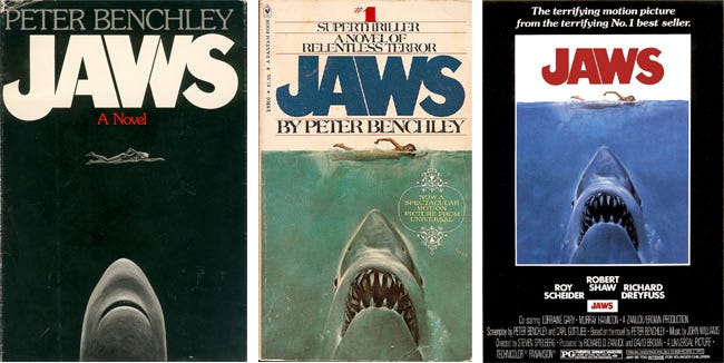
Most of you can likely picture this image: A nude woman swims in calm water as a great white shark — razor-sharp teeth on display — approaches her from beneath. A simple title in blood-red block letters completes the scene. It’s a composition that communicates thematically, tonally, and emotionally with only five visual elements: Woman, shark, water, sky, and title.
Like any good movie poster (or book cover), it tells you exactly what the story is about while also making you want to see (or read) more.
“Perfection is achieved not when there is nothing more to add, but when there is nothing left to take away.” –Antoine de Saint-Exupery
Achieving simplicity requires continuous review
Achieving simplicity of any design solution requires you to follow both a deductive and a reductive process, reviewing and removing detail and complexities until you’ve communicated that idea in the simplest way possible, with just the right amount of information.
In visual design, this means letting go of redundant details. When designing a…


