The three tab bar problem on a mobile website
Some background for the company
A tech company that offered various products and services to forex companies. Products such as MT4-MT5 platforms and telecommunications application software product integrated with AI, and services such as website designs, landing pages amongst others.
The website I worked on for my first task was the mobile website for one of the products that the company was offering (telecommunications application software product). This website had some problems that needed a solution. It was clear that there was lack of structure and lack of prioritising the information offered, but first we needed to identify what these problems were in order to find a solution for them.

The Problems
The screen of the website consisted of three tab bars. On each tab bar there was a different kind of information. First tab bar had a dropdown menu where the visitor could select one of two different country numbers to call from. Second tab bar had the logo of the company, because the website was for a telecommunications application software product that had its own logo and branding and the company logo needed to be easily accessible so that the visitor could navigate to the company website and view other products/services. Third tab bar’s purpose was to hold the burger menu that was the main way to navigate the product’s website. Some other design problems of the website were the lack of balance, lack of consistency and overload of content.
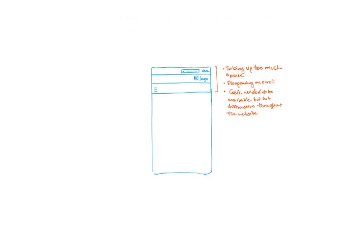
- Call Dropdown
- Include more than one telephone numbers
- Have it be accessible throughout the website
- Don’t take up too much space or cover up content
- Make it so that its engaging to the visitor but not distractive
- Earn the trust of the visitor by giving the user control (or the illusion of control)
2. Three Tabs
- Eliminate the three tab bars because they are unnecessary and they create clutter that take too much space and are destructive to the visitor.
3. Company Logo (linked to the website) / Burger Menu / Call Dropdown
- Prioritize based on importance
The Compromises
For this mobile website there were some compromises that needed to be made in the sense that I had to work with what I had solving these problems in as little time as possible and with the highest efficiency possible without having to restructure anything. I also had to compromise with some requirements that were requested since the beginning. The company’s logo needed to be on top of the page so that the user could jump into the company’s website in order to further browse the products, and the call dropdown menu needed to be in common view and always accessible without taking too much space or be distractive to the user.
The Solution
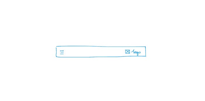
First things first, we needed to get rid of the three unnecessary tab bars. As I mentioned before, there was a type of structure that was required to be kept. Therefore, the tab bar with the burger menu was required to stay as the main navigation system. In order to eliminate the two tab bars, I needed to understand the priorities. Yes, the burger menu needed to be on the top left hand side of the screen. But obvious things such as this needed to be explained and clarified so that all people involved with these changes understood, agreed and were on board with them. So after we established that the burger menu would be on top of the screen, we decided after some discussions that the company’s logo would be kept on top and on the tab bar together with the burger menu. This would establish the hierarchy where the first logo, that was the company’s logo, had to be on top and kept separated from the products’ branding. If they decided to keep the product independent and have no connection to the company, the company’s logo would appear either in the “About” section, in the footer section, or mentioned within the content at some point in the website. That wasn’t the case, therefore we needed to prioritize and create the hierarchy.
The call button
The next step was to find a place for the call option. Here we needed to ideate and find a creative way to solve the problems this feature had. There were different ideas between having a FAB and a button in a fixed position amongst others.
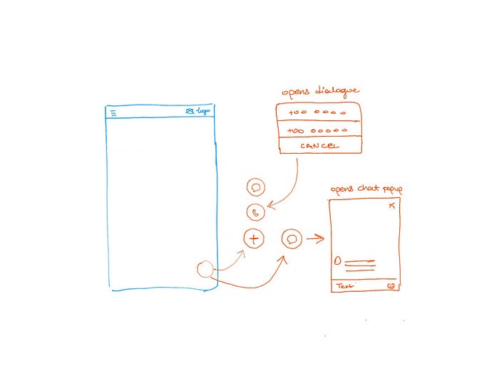
The FAB was not possible to be applied because there was a chat FAB already and we wanted something in plain view and not grouped with other features, which would be the case if we combined this action with the already existing FAB.
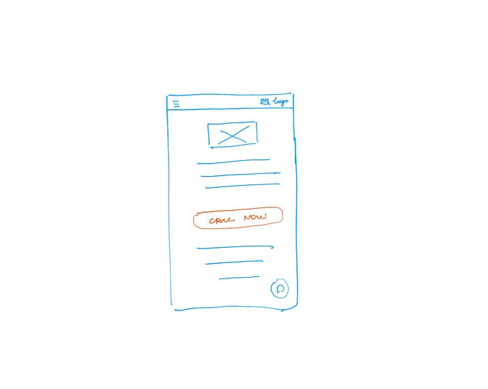
One other idea was to include a call button in between content possitioned in the website but it wouldn’t be in common view.
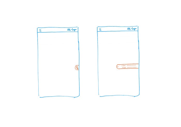
The last idea and the one we all agreed upon and finally the best solution for this problem (at the time at least), was to place a sticky side button on the right side of the screen, with an interactive animation when the visitor opens it, that has two slots instead of one. The reasoning behind this decision was to create an illusion of control and therefore make the user trust the site and have the feeling of safety, because the sticky side button is stable when the user is scrolling. The priority of this action was to have it always accessible without taking up too much space or being destructive. Since the company was still new, they wanted to be trusted by their customers and have real people talk to the potential customer. This was the main reason, for the need of this action to be easily accessible and in common view, not disappearing like the FAB would or the tab bar on scroll.
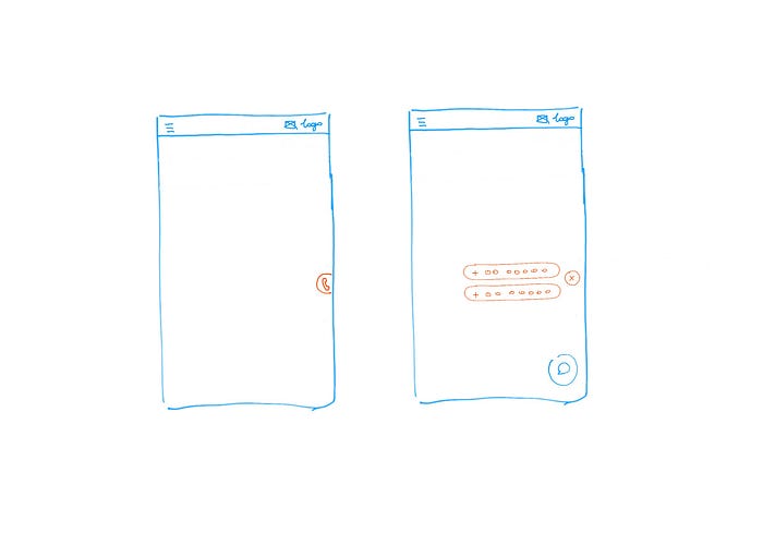
The first version had both numbers in one slot, but since the button was too narrow and it wasn’t helpful when the user tried to select one of two numbers since they were too close to each other and got mixed, a better option was to separate them and introduce an interaction for the transition of opening and closing of the slot. The transition was a simple animation that made the button rotate and the slots slide from the centre out and into their place.
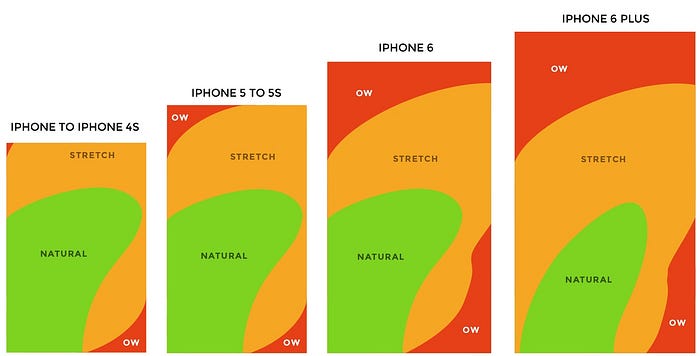
The position of the sticky side button was suggested to be on the bottom of the left side of the screen where the natural touch zone is (http://scotthurff.com/posts/how-to-design-for-thumbs-in-the-era-of-huge-screens), but because of the FAB position the final decision was to keep both the FAB and the sticky side button on the right side of the screen.
Conclusion
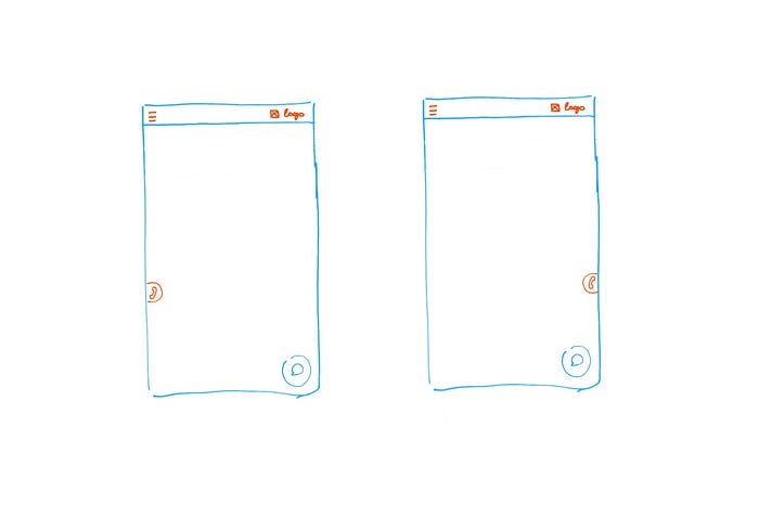
All problems were addressed and solved without wasting extensive amount of time. The one tab bar decision created space for the content of the website. The burger menu and main logo were kept on the top of the screen based on their importance of prioritization. And finally, the sticky side button kept the call action on top of the screen so that the user had access whenever they want, without hiding any content, without making the button disappear because of lack of space, and by solving the two country number problem without taking up space or having them crammed up together to save up space.
Thank you for reading! 🎈

