The Transformative Power of Motion
Why motion is an essential part of the designer toolkit

Motion is a storytelling medium. It builds a narrative that provides context to the user. By visibly linking screens and elements together, it provides structured guidance. In establishing spatial relationships between elements it helps us understand the organization of an application.
Through fluid, dynamic and purposeful use, motion can improve the user experience in a number of different ways: it can be used to convey status changes, guide the user to where we want and need them to go, influence their behaviour and distract them from what’s going on in the background. Motion reduces cognitive load, by making the spatial relations between elements more clear and making it easy to understand how elements are linked.
Meaningful and well thought out application of animation can transform a user interface and provide a better, user-friendly experience. By understanding and leveraging the core strengths of motion, this experience can be drastically improved.
Motion is Transformative

The image above might convey a message along the lines of “Motion is love”, recalling the ever-so popular “I ❤️ New York” T-shirts. Maybe it’s an expression of my love for motion design — which, given my enthusiasm for the topic, it very well could be.
But what happens when the emoji in this image is animated?

By animating the heart in the image, it is transformed. In technical terms, all that happened is that the emoji is scaled up and down again at set intervals. But the resulting animation attaches a different meaning to the image. Instantly, the idea of a beating heart is called to mind. An image of a pulsating heart, an image of life. This outlines one of the most powerful ways in which motion improves the user experience:
Motion brings the digital environment to life.
Much like cinematography brings still images to life, the core strength of motion is the way in which it transforms digital products. It breathes life into what is otherwise a static, lifeless environment. Digital products like smartphones and laptops are cold media. They don’t inherently possess any form of life. Through motion we can transform this cold medium, snapping it out of it’s cold, lifeless state.

An example of this is Google Assistant’s idle animation. As it’s waiting for input, the four iconically colored dots — an indication of how well-established Google’s brand colors are — gently float up and down in a wave-like pattern.
While Google could’ve just displayed a microphone icon and a string of text instructing you to speak, they instead opted for this subtle animation. The animation is what brings the assistant to life. It’s calmly, yet actively waiting for your command. There’s no rush here, as indicated by the gentle pattern of the motion.
Motion is Informative
Digital products can be complex, tricky things. At any point in time, there can be a dozen things happening in the background, out of sight of the user. While we might try our hardest to run background processes as fast as we possibly can, there will be times where the user has to wait for a response.
Before motion became a more integral part of the digital environment, users would simply be staring at the screen, waiting for something, anything to happen. Younger me would be looking at the blinking LEDs on my computer case, assuming that as long as it was blinking it was still processing and I should just wait patiently for information to be loaded.

With animation, however, we can inform the user of these processes. By now, most of us are familiar with loading animations. They’ve been engrained into our minds because of their abundant use in a large variety of websites and apps.
These spinners, whether they’re circles, cubes or triangles and whether they actually spin in circles or not, are all indicative of the same concept. Something is going on. Somewhere in the background, data is being processed and results are being fetched.
While the primary idea of the animation here is to indicate that something is happening in the background, it also has a secondary effect. By association, the user now knows that when this animation is over, things will have changed. As such, the user becomes aware of an impending change and is prepared for this event. They know to be on the lookout for new information.
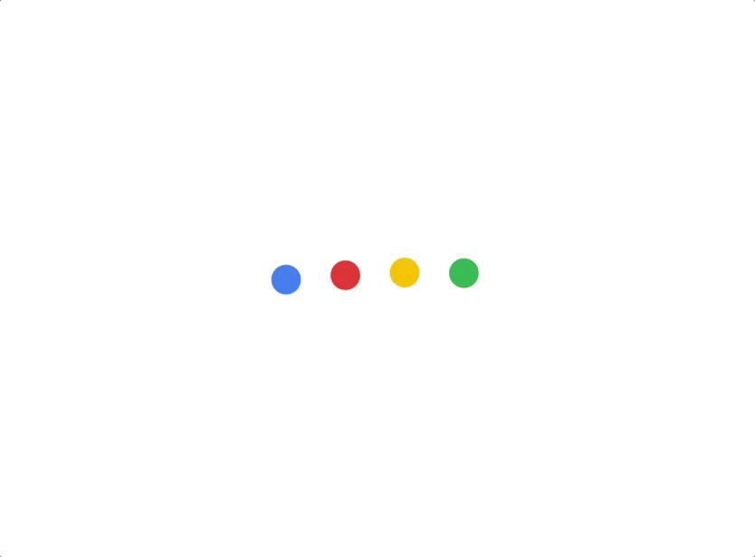
In this example, the assistant’s four dots change their shape to indicate a state change. This change in shape informs the user that the assistant is not only listening for a command, but is now actively hearing your voice and interpreting what you’re saying.
“Motion should above all else help guide users, providing them with the right information at the right time.” — Google
Both the spinners and the assistant’s shape changes provide the user with the right information, in the right amount, at the right time. There’s no cognitive overload, nor dissonance. The user is informed of changes and processes that are currently ongoing, without going too much into detail.
Motion Provides Guidance
Applications regularly consist of layers upon layers of information that are somehow connected to each other. We’ve all grown accustomed to hard cuts when navigating websites, that flash of white while moving from one page to another. On smartphones this brief period where there’s nothing on screen has mostly disappeared, instead jumping instantly from one section to another.
The problem in both cases is that it’s hard to discern any tangible relationship between the different parts of the website or the different screens in the app. Sure, we mostly know how we got from one place to another because we’re the ones who clicked or tapped our way there.
But how are these screens connected? What is the spatial relationship between the two?
By animating the transition between different elements we can provide clarity. It becomes more clear how different sections are related to one another and it allows us to understand the structure and hierarchy of the application.

In the example, two separate elements are connected through the use of animation. The simple play button and the more complex control panel share the same functionality: they control and influence the playback of video or audio.
The animation reinforces this link and builds upon it by visually linking them together. By showcasing how the play button grows into the control panel upon being tapped by the user, it becomes even more clear that the two are interconnected.

This interrelation is all the more apparent in the animation of the menu icon — or hamburger menu — and the back arrow. By transforming the back arrow into the menu icon, it’s signified that the two elements are mutually exclusive; they cannot exist at the same time. To navigate back to the previous view, the back arrow must be pressed.
By smoothly transitioning from one icon to another over a short span of time, the spatial relationship between the two becomes more tangible. It becomes easier to understand the connection between the elements and, in turn, their place in the application’s structure.
Animate with purpose
Above all, animation should be meaningful and purposeful. We shouldn’t animate for the sake of animation. Motion should provide guidance by making the experience more reliable, consistent and understandable. It should be applied deliberately and with care. Getting these details just right will greatly improve the overall user experience.
“The details are not the details; they make the product”. — Charles Eames”
Thank you for reading! Follow me on Twitter to stay up-to-date with my latest articles, tips and insights:


