The true cost of a redesign

I have spent a vast portion of my UX design career working agency-side. That gives one an opportunity to learn about many different business models, organisational cultures and approaches to change management. I work mostly with start-ups and scale-ups, who rely on digital products in their businesses. That makes them exposed to the ever-changing demands of a global market and global trends.
In UX, or particularly UI design trends come and go every couple of years. Some of them are driven by new technology, such as touchscreen devices or emergence of new CSS properties (remember the creativity frenzy when CSS3 launched?). Organisations have different ways of tackling these trend shifts and one of them is, in my opinion, an extremely risky, yet popular approach.
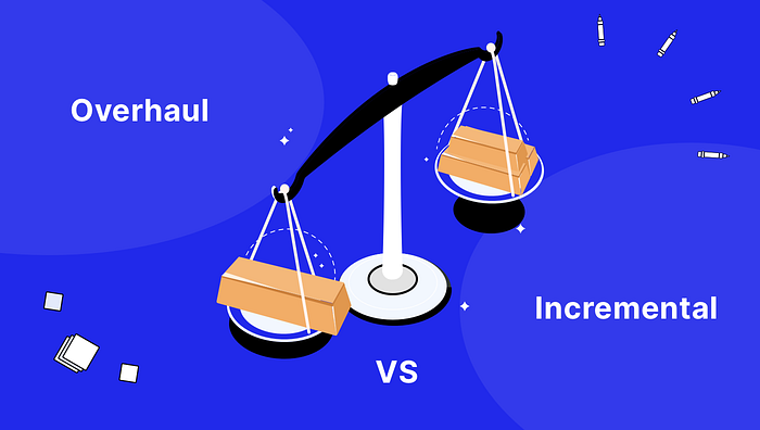
Incremental improvement vs complete overhaul
It seems as if companies that achieve a certain level of design maturity always approach an interface redesign through incremental improvement. Think of applications such as AirBnB, Spotify or the Google Suite products — how often do you see one of them do a 180-degree turn overnight?

Redesigning an interface incrementally seems easier to manage, more responsive to the needs of the digital ecosystem and less costly — no need to fight for a big budget for a massive project, as you can simply scratch exactly where it itches.
Yet so many organisations don’t go that way and feel comfortable taking on larger risks, but operationally and financially. Is it a sign of design immaturity? Perhaps yes, but you can’t build up design competencies overnight in a large organisation, who have historically put their focus elsewhere, perhaps on engineering or sales. However, the risks of doing a full design overhaul will touch on every aspect of the business — from sales and customer support to engineering and PR. What are those risks exactly?
Risks attached to a full design overhaul
🧠 Messing with a habits and loyalty
I am a designer, therefore I always start with the user. Imagine how does a loyal, heavy-user feel when their beloved product changes overnight? They get frustrated, as the thing they grew loyal to does not exist anymore.
Rishma Hansil, a designer based in Japan observed that in Japan it’s common to avoid rolling out major design overhauls. Instead, teams tend to stick to incremental change, because loyalty and respect for the customer are very important values there. You don’t want to mess with a habit that took 20 years to form!
“…loyalty comes a lot to where the customer just feels connected and feels like they’re growing with the brand, rather than the brand growing so fast that they can’t catch up with it.” — Rishma Hansil
👨🎓 The cost of re-education
Scrolling through the Instagram feed or starting a new Tweet —muscle memory comes into play when you repeat those actions several times in a day over the course of years. Imagine that suddenly the Instagram feed has an inverted order and you need to scroll up instead of down. Or that instead of pressing the Compose Tweet button you need to triple-tap in the top right corner of the screen. It would be annoying, wouldn’t it?
Well, many B2B or public government applications do exactly that to their users every couple of years. They receive new funding, generate ideas and decide to… revamp the interface completely to make it more usable.
And it becomes more usable… once the users learn it! And this crucial transition period may be costing a customer or citizen hours of overhead work. So in order to make up for it, the organisation needs to:
- Communicate the changes effectively (cost of communications and ads)
- Recreate their training collateral (cost of rewriting articles and reproducing tutorials)
- Retrain the customer support in new features
While changing documentation of a single feature every week seems a manageable task, having an avalanche of hundreds of new pages will choke up any organisation.

📞 Increased need for support
During the early weeks of any major design overhaul for an application, any company needs to get ready for an increased volume of incoming support calls and support tickets from the customers. Even rearranging only the navigation in an application can confuse the users completely. Don’t even get me started on removing a popular feature 😅
This, of course, in turn, can incur additional costs to those organisations that need to hire additional support staff or scale up their support services if they use a third party.
👩🏻💼 Politics as unusual
In large companies getting stakeholder sign-off may take longer time than designing and developing a feature. Smaller initiatives mean smaller presentations and less friction with feedback. Large design overhauls quite often require sign-offs from the C-suite or go through a tender process, even if the people pulling the strings don’t typically get involved in the design process.
📊 Tracking the impact
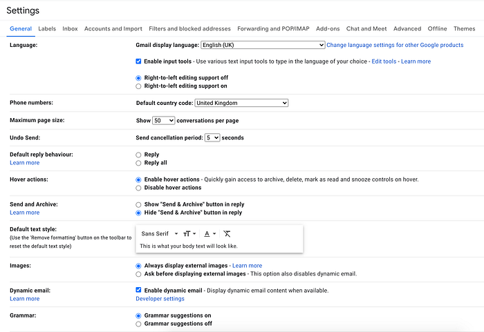
After changing too many gears at the same time, you may never know why the machine broke. In complex B2B products, tens of features compete with each other for the user’s attention. If you change a single feature, you can easily track how users changed their behaviour within this feature and all related ones.
To give you an example: imagine Google Docs changes the way you format tables. To measure the success of the redesign they might look at:
- The speed of creating a new table
- The ratio of formatted to unformatted tables
- The amount of re-styling done by users after pasting a table from other sources.
These metrics revolve around the tables. Now imagine all formatting features in Google Docs change at the same time and the list of metrics to track the success suddenly increases 10-fold. Is it possible to notice which change improved the user experience the most?
Be mindful of the challenge
When preparing your product’s roadmap for the following months (or years, which you definitely shouldn’t do) — be mindful of the challenges that come with a complete overhaul of the design. The effort to implement the new design is only the tip of the iceberg, and more hidden costs are there to follow.

