Member-only story
The typographic voice of London
Edward Johnston’s diamond-shaped “tittle” and the origins of a classic typeface design

In London’s central Piccadilly Circus shopping and entertainment district, giant electronic hoardings encircle a statue of Eros that treads one-footed upon a fountain. An ever-flowing river of pedestrians, spilling out of shops and restaurants, circumambulates the fountain’s platform. The fountain is raised by a hexagonal rise of steps. Tourists and shoppers often sit on the steps and watch performances by street artists. Below wheels and feet at street level lies the main concourse of the Piccadilly Circus underground station.
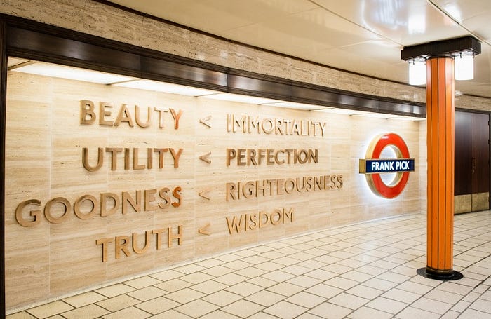
A small segment of this circular concourse is dedicated to a man named Frank Pick.


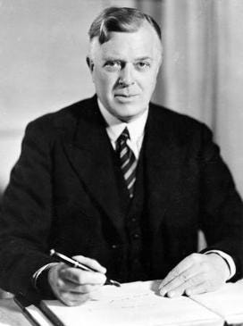
Pick was a British transport administrator deeply interested in design. Born in Lincolnshire in 1878, Pick helped the organisation of what had previously been a disjointed collection of companies and transport modes into a coherent, well-regarded whole: the Underground and London Transport.
Pick possessed the rare ability to understand that good design played an intrinsic role in the way people identify and interact with an organisation’s product. In this case, it was the necessity to move through spaces and absorb information. It was Pick’s idea to commission a unique corporate typeface that would not just aid legibility but also create a unified identity for London transport.
The purpose of the typeface was to strengthen the brand identity of the electric underground railway corporation by imbuing the signage of the London Underground with a distinctive, recognisable look and feel. Moreover, the typeface would not just be ornamental, it would have to be highly legible in order to help usher commuters and revellers…

