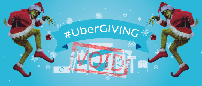
The Uber Christmas nightmare — a UX audit
T’was the night before Christmas, and all through the house, not a creature was stirring, not even a mouse…[except the mouse on my computer trying to delete my Uber account].
For me, and many of you, Christmas means a lot of travel, which also means a lot of Ubering.
As you can imagine, the last couple of weeks were madness. Arguing politics with family, eating too many cookies, drinking too many glasses of eggnog, and the only working out I was doing was running…….. to the kitchen to eat more HoneyBaked ham.
The holidays are about giving, being merry, binging on 24 hours of A Christmas Story, and eating all the junk you can fit into your belly.
During the busy holiday season, bad in-app experiences really upset me.
As a Designer, it's my job to fix these little problems that 99% of people just glance over and ignore. The Goal; Make peoples lives a little easier and less stressful especially during the holidays.
I received an UBERCASH gift card from Santa and the frustrations I went through the past couple of days is what prompted me to write this article.
I decided to run a UX audit of the UBERCASH experience within the UBER [iOS] app.
In this article, I’ll be explaining a UX problem that Uber users are dealing with, and how the Uber Design Teams can go about designing a simple, viable solution.
Ill review the problem[s] and present some low-fidelity wireframes that might help them come to a solution. Because right now[and not to sound harsh], the UBERCASH experience within the Uber [iOS] app is horrible.

Picture This; Its Christmas morning, my family and I are all sitting around the Christmas tree gleaming of cheer and delight. Subtley, We point and smile at the gifts Santa had brought us, all neatly wrapped, trying to decide which ones we wanted to tear open first.
In the background, the soft sound of chestnuts roasting on an open fire [Mele Kalikimaka is playing on repeat].
The perfect ingredients for a wonderful Christmas morning.
We start sifting through the presents under the tree, my aunt hands me a card, “To John. From Santa” the card read.
I scratched the sleep from my eyes, yawned once more, and opened the card carefully.
Inside was a very sweet note that said, “keep up the hard work at your new job, Santa is very proud of you.” I looked at my mom and smiled :)
There was also an Uber gift card in the envelope, the gift card read “UBERCASH” with the words “SIGN UP IN SECONDS,” printed across the top in big bold letters.
I had no idea that Santa [my aunt Carlyn, shes the best] knew I loved UBER rides.
I quickly grabbed my phone off the table where it was plugged in.
Without hesitation, I opened the UBER app and began entering the 16 digit number located on the back of the card to load my account up with the new UBERCASH funds I just received — $25 to be exact.
I was so excited that I had received a gift card for Uber, I was thinking to myself, “This is awesome, now I can have a few rides that won't charge my bank account.” — Who wouldn't love free uber Uber rides!?
After I saw the UBERCASH was added to my account I was ecstatic!
[After entering in the number] the UI looks something like this…

As a user, I can see that the funds were added to my account — That is confirmed once the 16 digit number is entered. The easy part is over…
Ok, so the UBERCASH is in my account…now, how do I apply it?
Take a close look at the UI above for a second [don't mind my 4.99-star rating…what can I say? I'm nice to the drivers, they like me :]
Since I couldn't easily find how to apply the UBERCASH to my rides, I assumed that the funds would be applied to my next ride, based on the confirmation of the funds in my account.
I wouldn't say I'm an EXPERT Uber app user, but I have used the app enough to know my way around its prominent features. Type in the address you’re at, where you want to go, confirm a ride, add a payment option…ya know, basic stuff, average user stuff.
By no means would I consider myself a novice Uber app user.
The next day, I'm travelling back home to Denver. Once my flight landed here in Denver, I quickly opened the Uber app excited to use up some of the UBERCASH I just received.
I think to myself again, “Is there a way to add the UBERCASH directly to my upcoming ride? If so, how would I do it?” I still couldn’t figure it out, so as I said, I imagined it would just be applied to my next ride.
Bad UX — Users assuming.
Good UX — Don't make your users assume things.
As I said, I assumed [and maybe this is my fault for assuming] the UBERCASH would be applied to my next ride, so I ordered a ride and I was dropped off at home 30 minutes later.
Come to find out that the UBERCASH was not applied to my ride and my credit card was charged the full fare, disappointing, to say the least.
As I frantically sifted through the app trying to find out why the UBERCASH was not applied to my ride, I STILL could not find any information at all.
I still saw the full amount of UBERCASH displayed on the payments screen, but there was no way to apply it to a ride.
At least not a streamlined way…
Before I move on to where more UBERCASH information is hidden…
Uber, let’s think of two FUNDAMENTAL characteristics of good experience design for a second. 1. Discoverability and 2. Understanding.
As Don Norman says….
Discoverability: The product must be self-explanatory, the user should be able to discover what actions are possible and how to perform them.
Understanding: Users must be able to understand how the product is supposed to be used and what all the features mean.
In this UBERCASH experience, neither of these foundational design principles are applied.
I was at a loss, I didn’t know what to do, I was stuck. I landed on the HELP tab, and I was hoping to find something in that section.
After a few minutes, I finally found out the step-by-step process on how to apply the UBERCASH. It was located on one of the Uber Help pages.
It took me 5 steps to get there. Before that, I just figured I would have to contact the Uber support team.
Searching through the app for a few minutes, I read the step-by-step process but it was still rather confusing…worst of all, I STILL didn't know how to add the UBERCASH to my existing/upcoming rides.
The “help” was not very helpful…Ironic right?
What would be your first action after struggling for a minute or two? Keep looking? Or, close the Uber app and open LYFT? I mean, after all, Uber is not your only ride option anymore.
Keep this quote below from Don Norman in mind as we proceed.
“On the Web, usability is a necessary condition for survival. If a website is difficult to use, people leave. If the homepage fails to clearly state what a company offers and what users can do on the site, people leave. If users get lost on a website, they leave. If a website’s information is hard to read or doesn’t answer users’ key questions, they leave. Note a pattern here? There’s no such thing as a user reading a website manual or otherwise spending much time trying to figure out an interface. There are plenty of other websites available; leaving is the first line of defense when users encounter a difficulty.”
See my point?
Finding the UBERCASH help WOOOOF That's a lengthy user-flow in itself, [and needs an audit as well, that's a topic for another discussion], but for the sake of time, let's say we found the “help” we were looking for…HOW TO USE UBER CASH.
FINALLY!!!!!!!!
Here are the directions below, on how to use UBERCASH [highlighted in yellow].

Ok so now we’re hunting down EXACTLY how to use the money that we can clearly see in our account, based on the previous two screens.
BAD UX.
One thing to note here, finding this in the UBERCASH HELP section took me 3 1/2 minutes, I timed it.
Let's follow these directions below.

Ok, we have finally found out how to use the UBERCASH…this flow is lengthy, frustrating and is flat out hard to find.
For a company that holds themselves to such a high standard, this experience is 1/10.
As a user, [espically with LYFT being a thumb swipe away], I’m surprised UBER has not designed solutions to this problem yet to not only help with customer retention but creating a more enjoyable experience for their users. Being a designer, I decided it was time to fix some of these problems I have been encountering with Uber lately.
UBER, why are these funds not just automatically added to my next ride?
As a user, do I have to go through 42 more steps to add [the already added] UBERCASH to a requested ride?
I have to do it only after I have selected a location and confirmed a ride before the UBERCASH is applied?
A couple of solutions their designers could validate…
- I think that UBER could automatically use the UBERCASH as a default until the users UBERCASH runs out, then the account would just switch over to the credit card that the user has on file.
- After the user adds the UBERCASH to their account, there was a quick step-by-step tip feature that would show them EXACTLY how to use their newly ADDED UBER cash, [think of this as a short stepper, 2–3 screens tops].
Below is a low-fidelity sketch I designed outlining the process for my second solution.

Not perfect, but HEY its a start. This could be designed and shipped in ONE sprint/release and would enhance the usability of UBERCASH greatly.
Users would appreciate the ease of use and be able to use the funds in their accounts and apply them immediately. Even if they chose not to apply them at that moment, they would have the option to add them later.
As a product designer myself, sometimes its hard to gain access to users, validating solutions can be tough, I get it. BUT, Uber, you have no excuse.
Take one step out of the front door at your fancy office on Market St., bump into the first person you see and ask them if they use the Uber app.
I would bet, 9 out of 10 times the person asked has used uber before.
One problem I ran into while thinking about that solution, “what if there is only $4 left of UBERCASH and the user requests a ride that is over $4?”
The UBERCASH [$4 in this use case] would be added to the final cost of the ride. So, if the ride was $14, the UBERCASH would cover $4 and the users credit card would be charged $10.
Regardless, I don't think that UBER should make using UBERCASH such a long, frustrating and strenuous process for their users.
As I mentioned above, if Uber is seeing some recurring themes in their analytics regarding UBERCASH, its time to start sketching solutions.
Uber, Do what's right for your users.
This is one of many issues I have dealt with inside the Uber app, from long sign up forms, to late responses for help questions.
After this UBERCASH is all gone, and my account is empty, I will be switching over to LYFT.
LYFT is more reliable, there are no hidden ways, or workarounds to apply gift cards. LYFT has rapid responses to customer questions, and it's relatively more affordable than UBER. The in-app experience [iOS] is a lot better [and in my opinion, the drivers are nicer and more pleasent]. It's a no-brainer!
Since I'm never on Santas naughty list, I will be asking Santa and his elves for a LYFT gift card for Christmas in 2019.
I hope some of the solutions I mentioned and sketched here will help Uber and the design teams come to a better, more streamlined solution to this problem.
I hope everyone had a Merry Christmas and has a safe and prosperous New Year!
-JC

